Jump to content

  • Free consultations and support
  • Live chatClick Here for Live Chat
  • Call ico 1888-906-1888
    Phone support: Open

    Ready for your call :)

    Our business hours:

    Mon — Fri, 2am — 8pm (EST)

    US & EU support teams

    Phone support: Closed

    We are back in: 1h 20m

    Our business hours:

    Mon — Fri, 2am — 8pm (EST)

    US & EU support teams


Financial Services Company Logo Concept (please critique)


  • Please log in to reply
&nsbp;

#1 alltherage

alltherage

    Apprentice Designer

  • Designer
  • 5 posts

Posted 10 June 2009 - 08:28 PM

Hey Guys, I've been lurking for a while without signing up, but I want your opinions on this. I am creating an identity for a company who's purpose is succession planning for privately owned companies. It helps owners get their money out tax free, and sell or pass on the business.

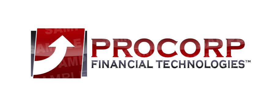
Here is an example of what I've made. Please critique (positively if you can) and let me know what your first impressions are:

What does this logo communicate to you? Does this company appear large or small? Do you trust this logo? etc are what I would like you to keep in mind. Be gentle!! This is my first submission ever.

Posted Image

Be gentle! Also, you should know I have flat color and black and white that this translates well to.

#2 Coy

Coy

    Elite Designer

  • Designer
  • 2534 posts

Posted 10 June 2009 - 08:38 PM

Do you want the critique to be HONEST or GENTLE?

Personally I'd ask for an Honest one. have them tear it appart if it needs it.

I really don't care for that font and usually try not to use it.
the image doesn't really say much to me, it's eye catching.. Don't know? I'll have to stare at it somemore..

bbl

Edited by Coy, 10 June 2009 - 08:42 PM.


#3 alltherage

alltherage

    Apprentice Designer

  • Designer
  • 5 posts

Posted 10 June 2009 - 08:51 PM

Thanks for your response, Coy. Unfortunately the company really likes this font. It's not my first choice either, but at least it somewhat reflects the professionalism and seriousness of their work.

I agree it lacks a real sense of identity, but I'm having a hard time getting my creative juices flowing. Any suggestions are much appreciated!

For the record, I am looking for honesty, I guess by "gentle" I just mean try to give constructive feedback, which this community seems to have a good handle on. Thanks again!

#4 Coy

Coy

    Elite Designer

  • Designer
  • 2534 posts

Posted 10 June 2009 - 08:57 PM

It helps owners get their money out tax free, and sell or pass on the business.


Sounds almost like money laundering? have any additional information about the process or company.

I like and dislike the image but can't pin point it at the moment.. Kinda preoccupied w/ something else at the moment, so my mind isn't with it right now.

and you can't help what the company likes.. I know how that goes.

maybe I'll have a better response for you later.. sorry

#5 alltherage

alltherage

    Apprentice Designer

  • Designer
  • 5 posts

Posted 10 June 2009 - 09:04 PM

Don't be sorry at all, i'm happy to have your insight. The company is not involved in money laundering, hahahaha that's for sure. They use different insurance/investment/idon'tfullyunderstand tactics, but it's entirely legal, it's actually embedded in the Canadian tax laws.

I am simply contracting this out to them, I am not employed by them in any other sense.

#6 alltherage

alltherage

    Apprentice Designer

  • Designer
  • 5 posts

Posted 10 June 2009 - 09:43 PM

I also had this logo mocked up as well:
Posted Image

#7 Deathdart

Deathdart

    Senior Member

  • Designer
  • 140 posts

Posted 11 June 2009 - 02:57 AM

Honestly, I would suggest that you steer clear of the extremely over-used arrows, locks, dollar signs for the symbol and instead come up with something original, if you feel that a symbol is required. The company's problem is its name much more than its logo or branding right now. Procorp sounds like something out of a sci-fi movie and the font that you've used to represent it further makes it look like that to me.

If they like a serif font, try going with something better instead of this. Go to commercial font websites such as fontshop.com, look through the font catalogs of foundries such as ITC, FontFont, Adobe etc., they have fonts which are a million times better designed than free fonts. Spend a few $$ on a good font and use that, charge your client for it. And, now this is really important, try to avoid ALL CAPS with a serif font. It's very disturbing to the viewer's eye and looks completely unprofessional. I'd suggest Title Case if you're using a Serif font or if the company wants ALL CAPS then try a bold geometric sans-serif font.

Now for technical issues - try to avoid gradients, they don't translate well to print except on the best of presses which can be really expensive for your client. Try using solid colors instead. Also, the tonal contrast between your red and your gray is non-existent; so if this is printed in grayscale, it'll all look like almost the same tone. This will create inconsistency between the color and gray versions of this logo. Don't use colors which have similar 'brightness' together. Instead, try using a brighter color with a darker color, or if you want a look similar to the current one, try making the whole thing a single dark color.

I hope this feedback helps you. :)
[SIGPIC][/SIGPIC]
AbhaySingh.in - Graphic Design Portfolio
___________________

#8 smack

smack

    Senior Member

  • Designer
  • 99 posts

Posted 11 June 2009 - 03:16 AM

The use of the font (copperplate?) is not ideal and does not seam to reflect what little I know of the client. Whatever font your client decides to go with, I would suggest exploring type contrast within the company name, Perhaps a colour or scale variation between "Pro" and "Corp". Just keep experimenting. Bang on advice from Deathdart.

#9 alltherage

alltherage

    Apprentice Designer

  • Designer
  • 5 posts

Posted 11 June 2009 - 03:37 PM

Honestly, I would suggest that you steer clear of the extremely over-used arrows, locks, dollar signs for the symbol and instead come up with something original, if you feel that a symbol is required. The company's problem is its name much more than its logo or branding right now. Procorp sounds like something out of a sci-fi movie and the font that you've used to represent it further makes it look like that to me.

If they like a serif font, try going with something better instead of this. Go to commercial font websites such as fontshop.com, look through the font catalogs of foundries such as ITC, FontFont, Adobe etc., they have fonts which are a million times better designed than free fonts. Spend a few $$ on a good font and use that, charge your client for it. And, now this is really important, try to avoid ALL CAPS with a serif font. It's very disturbing to the viewer's eye and looks completely unprofessional. I'd suggest Title Case if you're using a Serif font or if the company wants ALL CAPS then try a bold geometric sans-serif font.

Now for technical issues - try to avoid gradients, they don't translate well to print except on the best of presses which can be really expensive for your client. Try using solid colors instead. Also, the tonal contrast between your red and your gray is non-existent; so if this is printed in grayscale, it'll all look like almost the same tone. This will create inconsistency between the color and gray versions of this logo. Don't use colors which have similar 'brightness' together. Instead, try using a brighter color with a darker color, or if you want a look similar to the current one, try making the whole thing a single dark color.

I hope this feedback helps you. :)

Thanks for your feedback! I know about the gradients, (perhaps you missed the end of my post? ;)) I do have flat ones. I agree about the arrow being over-used, and not really communicating the purpose of the company. The font, unfortunately, is not my decision, and neither are the colors.

Man I'm really in a rut here... that pretty much sums up your feedback, which is painful because I agree with you... yet my hands are tied. I think the part you mentioned that I can run with is to abandon the arrow.

#10 Deathdart

Deathdart

    Senior Member

  • Designer
  • 140 posts

Posted 11 June 2009 - 04:28 PM

Hey, seems like you have an overly controlling client on your hands :) Try to explain to them that you are the graphic designer and you know better about what's good for their logo and hence you should be allowed to make decisions about font, color etc. If they don't agree, then just try to finish it off ASAP, ask them what exactly they want you to make, make it, and be done with the client. Or just call it off and refund their money. ;)
[SIGPIC][/SIGPIC]
AbhaySingh.in - Graphic Design Portfolio
___________________

#11 Coy

Coy

    Elite Designer

  • Designer
  • 2534 posts

Posted 11 June 2009 - 05:35 PM

OK I think i've figured out what I didn't really like about it and it's kinda been mentioned.
I think I liked it for the same reason I didn't. It's too simple. As stated the arrow is over used in many ways. If the client likes the arrow concept think of a different approach or view of it. An arrow doesn't always have to actually look like an arrow, maybe a simple 'motion'... less detailed triangle on a line. I also feel that P and the C should be more dominant in the lettering... You could even just play off the P as the image???
also didn't really like the drk gray behind it.

Maybe try merging images togeather. sketch out all the symbols that represent trust, security, money, strength.. do some google searches on animals (or something else) even that have these traits perhaps..maybe fictional characters, greek gods ect..?

If the client is dead set on this font and wants it all caps make the P&C slightly larger than the rest of the letters present that to them.

the colors I actually like and possibly know why the client wants them used.. and as you said you have the black and white and flat color versions.

#12 smack

smack

    Senior Member

  • Designer
  • 99 posts

Posted 13 June 2009 - 04:42 AM

It just dawned on me that Procorp is a palindrome. I don't know if you have explored this, but It can add an interesting design element.

#13 madelikethis

madelikethis

    Apprentice Designer

  • Designer
  • 14 posts

Posted 29 August 2009 - 08:07 PM

Regarding the font...even if the company is as married to it as you say, you can point out to them that Copperplate is a very overused and common font, and that you would like to explore similar fonts that portray the same feelings of stability and timelessness and then give them a number of different options.

#14 Compactive

Compactive

    Junior Member

  • Designer
  • 9 posts

Posted 15 September 2009 - 12:05 PM

Well at least the second line of CP is too much. Like using it as a breadtext... By the way how did it end?

#15 bunker

bunker

    Banned

  • Banned
  • 92 posts

Posted 21 September 2009 - 04:24 PM

There is a problem whit the proportions... it's seams that this won't be a high light in your portfolio but as a designer you should try to defend more what you think.

At last the client it always right! Don't they?

#16 shefshef019

shefshef019

    Senior Member

  • Designer
  • 131 posts

Posted 27 September 2009 - 03:43 AM

It just dawned on me that Procorp is a palindrome. I don't know if you have explored this, but It can add an interesting design element.


@smack: I was just going to mention this! I think this could result in some new and refreshing designs. It might make for a more interesting way to incorporate an arrow or other somewhat overused symbol.
Designs by Jenna Sheffler: Professional portfolio
Design Intervention: Freelance graphic and web design
Technicolor Carnival: One-of-a-kind handmade jewelry and gifts

#17 TheNutz

TheNutz

    Member

  • Designer
  • 57 posts

Posted 27 September 2009 - 06:31 AM

i don't think red and dolar signe it's ok for Financial Company.

#18 gdeetan

gdeetan

    Member

  • Designer
  • 63 posts

Posted 27 September 2009 - 06:55 AM

how about experimenting with different colors, red is pretty common, try thinking "out of the box here" unless ofcourse the client specifies that they wants red...
Online Portfolio - Still a work in progress

#19 tyleronline

tyleronline

    Junior Member

  • Designer
  • 10 posts

Posted 28 September 2009 - 03:33 PM

Hey there,

If your client is married to using that font for the Title, try to get them on board with a sans-serif font for the sub text. Interstate (by Emigre) or Akzidenz Grotesk would probably both suit your serif Title. They would simplify the design a bit and create a more "strong institutional" look which people dealing with money should have.

It might help to refer your clients to other identities related to financial instutions. citibank and HR Block come to mind as good examples of simple clean logos.

Hope it helps!

#20 shefshef019

shefshef019

    Senior Member

  • Designer
  • 131 posts

Posted 01 October 2009 - 12:21 AM

Hey there,

If your client is married to using that font for the Title, try to get them on board with a sans-serif font for the sub text. Interstate (by Emigre) or Akzidenz Grotesk would probably both suit your serif Title. They would simplify the design a bit and create a more "strong institutional" look which people dealing with money should have.


Yeah, I really like Akzidenz Grotesk. The standard version has different weights and it's a classic simple font that goes with almost everything.
Designs by Jenna Sheffler: Professional portfolio
Design Intervention: Freelance graphic and web design
Technicolor Carnival: One-of-a-kind handmade jewelry and gifts


0 user(s) are reading this topic

0 members, 0 guests, 0 anonymous users