
Well,I try to post here the making off of my Evil Santa...
My dear Santa...
Well,I try to post here the making off of my Evil Santa...
&nsbp;
#2

Skanda
-

- Designer
- 33 posts
Member
Posted 16 December 2009 - 08:28 PM
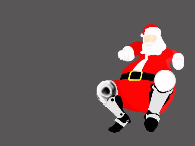
First,I made a basic "chasis" with general details,as furniture,low detailed with 2D simply colored...
Just I begun to apply shadows with airbrush option in Brush mode.Low flow and opacity,over 20%...with patience,we could give some fine smooth gradient effects and begin to bring to life our evil santa...
Edited by Skanda, 19 December 2009 - 01:48 AM.
#4
Skanda
-
- Designer
- 33 posts
Member
Posted 16 December 2009 - 08:47 PM
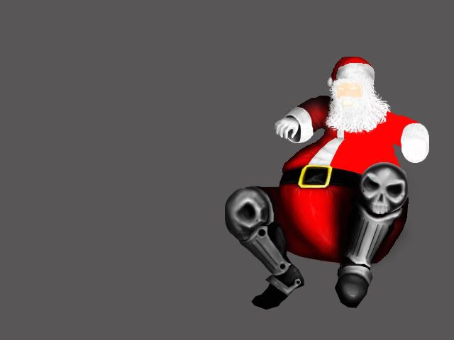
Ending last details and begun to apply the "atrezzo" and equilibrate all objects...
I prefer to use black/white smoothness to create shadows/lightness effect,allways I try to begin at very low opacity/flow over 13% and covering with a big basic blur brush.Upper opacity/flow,smallest brush area,deepest into shadow areas and borders between"areas" (as in the case of the santa´s belt and his pants).It gets deepness,but beware with overcharge areas.U could fix that kind of mistakes with a correction with a touch of the base colour and another bit of an opposite,as white against black,etc...
Edited by Skanda, 19 December 2009 - 02:01 AM.
#6
Skanda
-
- Designer
- 33 posts
Member
Posted 16 December 2009 - 08:56 PM
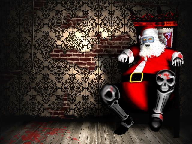
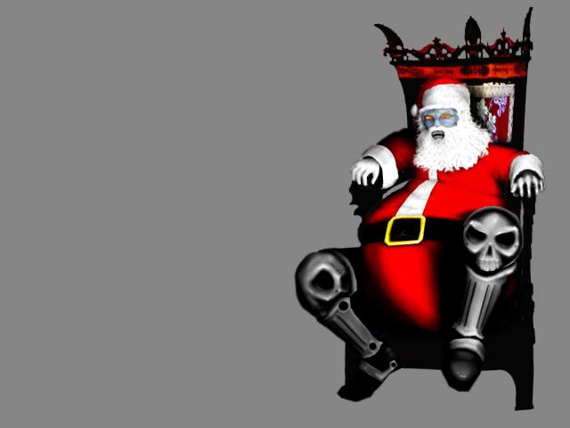
For finishing,some blood (splatter brush) and some droping shadows will help a lot to give coherence to all...
Ready,an scary fucking fat bastard...
I hope to be usefull (sry,for my english faults,I´m not english native...)...
Edited by Skanda, 19 December 2009 - 02:06 AM.


1 user(s) are reading this topic
0 members, 1 guests, 0 anonymous users
