Edited by morabira, 08 August 2012 - 06:29 PM.
Producing font using CorelDraw and High Logic Font Creator
#26

Posted 09 August 2012 - 02:50 PM
Continue...
Now we are ready to get working in High Logic program.
Download this template first...
http://www.layarbaht...om/Template.ttf
Much more easier as the glyphs are already matched with the sample that I provided at the beginning of this tutorial..plus...already has list for kerning pair ( a pain job if we want to list it on our own )
Now open the High Logic program...Make sure it looks something like this...

Open font file ( that template )
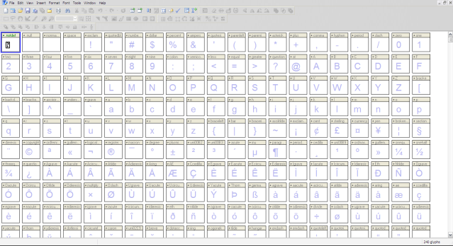
Now, we need to do some initial setting....
Go to "Format > Setting" ,a popup window will appear.
On Header section, set your time and date

On Classification section, set it something like this if we're creating regular weight font.
If we're creating bold font...select "bold" for the Weight, tick the "bold" checkbox for both Windows and Mac.
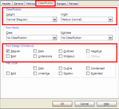
Then click OK....
Now we need to give our font name...
Go to "Tools > AutoNaming" ...put in our font name...No need to put Regular or Bold...Just the name...
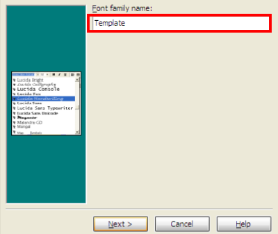
Click "next", and then click "Finish"...
Now, go to "File > Save as" ....Up to us....Maybe "Ourfont_Regular" etc...
...Save, and now we're ready to import our eps (transfering our design into HL)....
Edited by morabira, 09 August 2012 - 02:53 PM.
#29

Posted 11 August 2012 - 08:58 AM
So my projects are done in High Logic...Means, I only have full experience using High Logic to be shared here.
Whoever use fontlab, I believe you all can also read and apply the technique into FontLab especially the way to transfer the eps, and that provided tips when do kerning...You all can also use that provided ttf template to begin..
Edited by morabira, 12 August 2012 - 03:58 AM.
#30

Posted 11 August 2012 - 09:11 AM
Edited by morabira, 11 August 2012 - 09:15 AM.
#32

Posted 11 August 2012 - 02:28 PM
Now, we need to insert the first letter in our eps (an "a")...
Double click on "a" glyph box to open "a" glyph window...Should look something like this now.
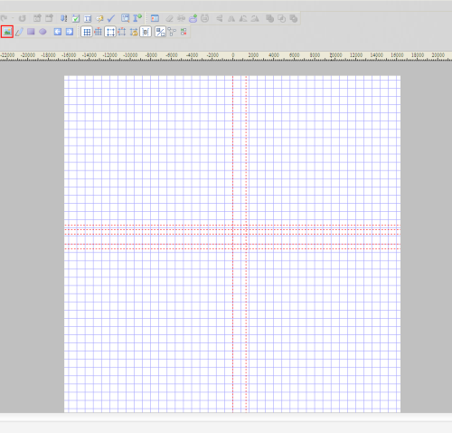
Then we import our eps...(use that red highlighted tool above)..
Should look something like this now...
After the import, make sure the "transform box" (highlighted in red below)...is up there.
If it is not, go to "View>Toolbars>Transform"

#33

Posted 11 August 2012 - 02:51 PM
[ BY SETTING NUMERICAL SCALING VALUE (THEIR HEIGHT) and THEIR Y COORDINATE POSITION IN "TRANSFORM BOX" ]
By this title, you should can guess why we need that guideline rectangle in our eps...
To be continued...
Edited by morabira, 11 August 2012 - 04:55 PM.
#34

Posted 11 August 2012 - 08:37 PM
Make sure we select the whole imported eps (by dragging box....similar in CorelDraw or AI)...
Now, in the "transform" box, for the "size" section: tick the "lock aspect ratio" checkbox, set the height to 2940...Hit Apply button or keyboard "enter".

For the "position" section: set y position to -980 (negative 980)...Hit Apply Button or keyboard "enter".
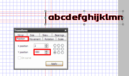

Edited by morabira, 13 August 2012 - 06:52 PM.
#35

Posted 11 August 2012 - 08:57 PM
It is what I normally used recently...But when it is typed in same pt size, some of my font is a bit smaller in height than Arial...Why?
I like a cute looking one....heheheh
If you want to follow Arial "dotless i" height...you can use 3186 for the height and -1062 for the Y position (Arial dotless i height is 1062). Different font vary a bit in these value...up to you...just don't go too far (for document font)...
You can inspect your "dotless i" size by selecting only the i (without the dot) and look at it height in the "transform box" size section...
If you use capital letter "I" to make your rectangle guide, I believe you can do the Math on your own...
Edited by morabira, 11 August 2012 - 10:47 PM.
#36

Posted 12 August 2012 - 11:11 AM
Now, delete all of them except the "a" (by dragging selection box and press delete on our keyboard)...
In the transform box "bearing" section, set both Left Side Bearing and Right Side Bearing to 0.
Make sure the small checkbox is ticked (as below)...Hit "Apply" (or just press enter on our keyboard). This Left Side Bearing and Right Side Bearing is values that we need to set later when do kerning. For now, just set them to 0.

Close the "a" glyph window...We should can see that our "a" is already set in place (but has not been kerned yet).
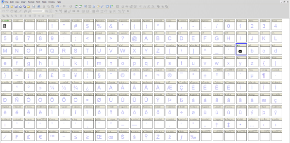
We continue inserting our next character (b)...
Double click the "b" glyph box to open its glyph window.
Paste (ctrl +v). Delete other characters except the "b".
Set it Right Side Bearing and Left Side Bearing to 0 (make sure the checkbox is ticked)
...apply(enter)...Close the "b" windows...
Continue for the rest of the characters....until all of the characters for this "eps importing" round is completed.
For the next round...You should know how to do it...
In CorelDraw or AI, place the rectangle guideline in front of "o"...
Select "o" to "z"(including the guideline), export the selected as eps...
Repeat the eps importing process in High Logic. Use the same value for the Size, Y-position and Bearing....
Repeat until all of our designed characters are transferred.......
After that,
have a break, have a kitkat...hehehe....as probably now we feel ourselves like a supermarket cashier
(I'm ok with that, as I have a one year experience working as one before)
Edited by morabira, 12 August 2012 - 11:38 AM.
Also tagged with one or more of these keywords: waterfalls
Designer's Resources →
Photography →
waterfallsStarted by SmartWeb, 11 Jul 2013 |
|
|
1 user(s) are reading this topic
0 members, 1 guests, 0 anonymous users


