Jump to content

  • Free consultations and support
  • Live chatClick Here for Live Chat
  • Call ico 1888-906-1888
    Phone support: Open

    Ready for your call :)

    Our business hours:

    Mon — Fri, 2am — 8pm (EST)

    US & EU support teams

    Phone support: Closed

    We are back in: 1h 20m

    Our business hours:

    Mon — Fri, 2am — 8pm (EST)

    US & EU support teams


New Logo design


  • This topic is locked This topic is locked
&nsbp;

#1 Ghastly

Ghastly

    Member

  • Designer
  • 30 posts

Posted 29 May 2007 - 04:38 PM

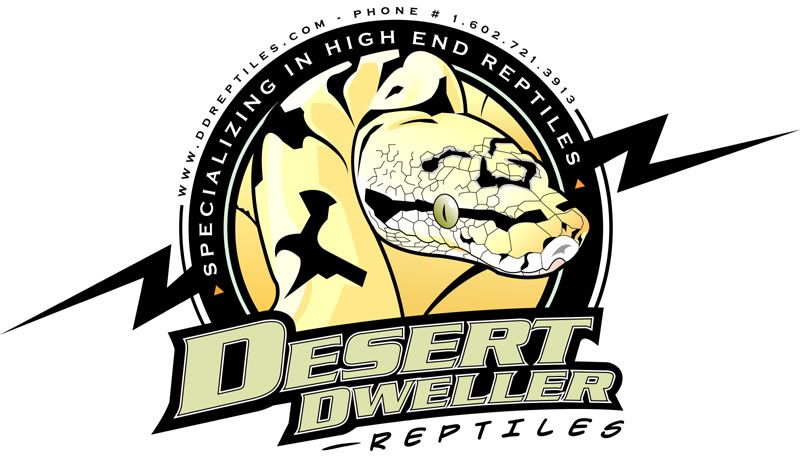
Been at this one for over 2 weeks off and on. Done in Illustrator.
-
Posted Image

#2

  • Guests

Posted 29 May 2007 - 08:59 PM

not bad at all! but I would simplify the skin on the snake's head - in this format it looks like random lines in illustrator and if scaled down, it will look like noise. But I like the overall look!

#3 Ghastly

Ghastly

    Member

  • Designer
  • 30 posts

Posted 30 May 2007 - 12:53 PM

I work and constantly scale back and forth and look and it actually holds up nicely. If he goes too small Ill knock out the lines etc....Thanks for the the feedback.

#4 harrisp9

harrisp9

    Apprentice Designer

  • Designer
  • 54 posts

Posted 30 May 2007 - 03:30 PM

Sweet! I agree with resurepus - esp. the scales above the eye, but overall - great job!!

#5 guetizo

guetizo

    Guru

  • Designer
  • 1867 posts

Posted 30 May 2007 - 04:40 PM

Nice job.
I always love rounded logos.

Overdetailed on the head.
If the tongue is out you - or we - can better define the mouth.
Also, drop the lightning bolt.
You could made the tail come out (like the left lightning bolt part) and then put it under the bid "D" and side of the small "D".
Just and idea... :)
thanks
guetizo origin~all portfolio | guetizo's logo~blog (showing new logos!)

#6 Ghastly

Ghastly

    Member

  • Designer
  • 30 posts

Posted 03 June 2007 - 03:32 PM

Lightning bolt is not my idea but the clients...I already tried but he likes and want it there. Yeah the head is over-detailed but its for a banner and t-shirts mainly. I also am ginving him a reduced detail logo for cards and letterhead etc...


Nice job.
I always love rounded logos.

Overdetailed on the head.
If the tongue is out you - or we - can better define the mouth.
Also, drop the lightning bolt.
You could made the tail come out (like the left lightning bolt part) and then put it under the bid "D" and side of the small "D".
Just and idea... :)


#7 paulojuarez

paulojuarez

    Apprentice Designer

  • Designer
  • 11 posts

Posted 28 June 2007 - 05:15 AM

I would suggest getting rid of the Grey strokes around the black shapes on top of the snake's head. For some reason that is the first thing my eyes jumped to, and if you get rid of them, i feel it might make the piece feel better as a whole. Try it and let me know...I could be wrong. Would you be opposed to reducing the letter spacing from the word "reptiles" below "Desert Dweller", and making it a little bit smaller, while still keeping that right alignment? It feels like those two lines deserve a little more contrast in regards to size.

The overall concept of the logo is good. Very strong. If your client does want the lighting bolt there, you could talk him into making it just a little bit smaller, so that it's brought closer to the circle, making the whole thing more proportional, more unified, and also easier to place on restricted mediums, crowded pages, or whatever.

#8 Tatty

Tatty

    Apprentice Designer

  • Designer
  • 10 posts

Posted 01 July 2007 - 09:50 AM

Overall I like the design except for the word reptiles, I think it could do with another font altogether.

And if I was being picky i would also comment on the scales above and behind the eye, is there a way that you could phase them out, lighten them so that they are there but they blend into the rest of the snake..

nice work though

Tatty
"Bringing Productivity & Creativity to your ideas"

http://www.dbyt.co.uk
http://www.myspace.com/designsbytatty

#9 brand7

brand7

    Apprentice Designer

  • Designer
  • 52 posts

Posted 04 October 2007 - 09:46 PM

I think its a little too busy, this would be good for a sticker but you dont need contact information on a logo. I like the idea though. Keep working it!


0 user(s) are reading this topic

0 members, 0 guests, 0 anonymous users