
Hello Design community! If you have a minute please take a look at the three following concepts I'm working on for a Stock Market Analysis website that I'm currently working on. The first 2 are fairly solid which i think require a few minor tweaks to improve readablity, spacing, etc. The 3rd however, I'm feeling rather stuck and was wondering if anyone had any thoughts/initial reactions.
The client is fairly corporate in nature as they are stock market experts who deliver insightful analysis to their subscribers. The current site is www.briefing.com
I'd like to keep the 3rd option feeling open but not sure where to take it. Even if there's some sites you could send me to reference it'd be appreciated. I should also add that in the first concept the original logo is used but in 2 & 3 I've taken liberties in making a light and simple update. Lastly, text and images are FPO (For Placement Only).
Many Thanks!
Christine
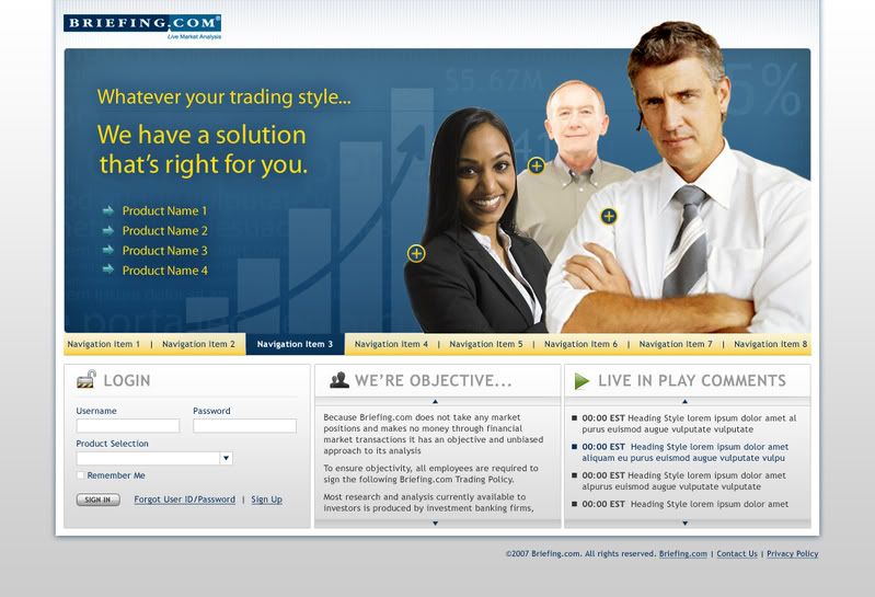
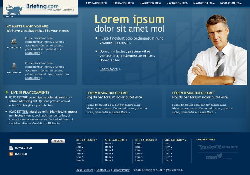
Concept 1
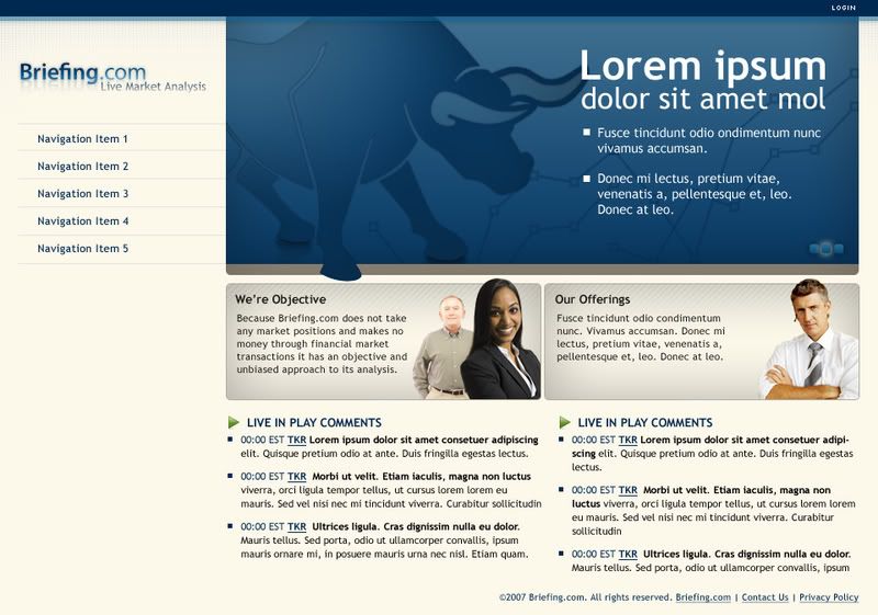
Concept 2
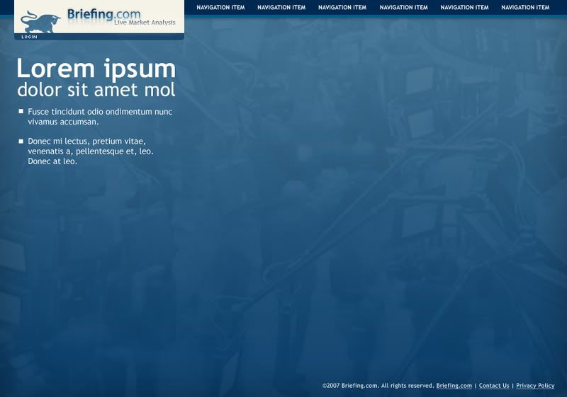
Concept 3- not finished
Site Concepts in progress...feedback/suggestions please
Hello Design community! If you have a minute please take a look at the three following concepts I'm...
&nsbp;
#1

cmortensen
-

- Designer
- 12 posts
Apprentice Designer
#2
mossiwo
-

- Designer
- 7 posts
Apprentice Designer
Posted 06 January 2008 - 10:14 PM
Like option 1 for several reasons:
PROS:
1. menu is intuitive,
2. the graph that shows grow,
3. featured products or offers,
4. its well sectioned.
CONS:
1. I will remove any over smiling face (this is serious business, to trust investments),
2. Demographics should define colors but for the industry I would add the beige (light brown color) from concept 2, and probably add some variance of gold in a horizontal bar of white links over gold background (probably the featured products),
3. Not sure what the little + means?
Hope it helps some!
Pop Upon Magazine http://popupon.com
#3
cmortensen
-
- Designer
- 12 posts
Apprentice Designer
Posted 07 January 2008 - 08:11 PM
Thanks for the feedback!
Good question. The "+" is intended to expand on rollover and reveal more information such as a customer quote. See an example here.
Any thoughts on what could be done with the 3rd concept?
3. Not sure what the little + means?
Good question. The "+" is intended to expand on rollover and reveal more information such as a customer quote. See an example here.
Any thoughts on what could be done with the 3rd concept?


#8
cmortensen
-
- Designer
- 12 posts
Apprentice Designer
Posted 10 January 2008 - 08:23 PM
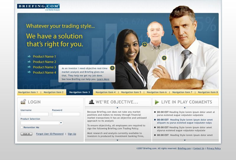
I like this one,but try to add a shadow or something (blur the edges a little...) to the guy.
I like this idea...perhaps a subtle warm glow!
Thank you for the feedback!!!
#9
cmortensen
-
- Designer
- 12 posts
Apprentice Designer
Posted 10 January 2008 - 08:29 PM
I dont agree with removing smiling faces. I think they are attractive in that kind of business
These photos, as I originally mentioned, are for placement only (FPO) but generally I find that people who are smiling too widely like the female in these designs tend to come off looking more cheesy and unnatural. I chose to use her for now anyways because I felt she brings a great sense of diversity to the grouping. I was trying to shoot for an age and gender range in concept 1 to represent the different user groups that will be using the site.
I totally agree with you though on one point...It is nice to see warm faces in such a seemingly cold industry.
Thank you for adding your thoughts!!!
#10
mgustofson
-

- Designer
- 11 posts
Apprentice Designer


0 user(s) are reading this topic
0 members, 0 guests, 0 anonymous users
