
5 Most Recognizable Logo Designs
Have you ever thought about the way well-known logo designs looked before? Perhaps it will be difficult for you to imagine, but so familiar things were completely different a few years ago, they looked not the way we used to see them now. In this article, we suggest you look at the distinctive marks of famous brands at different times, and at the same time learn how they changed. But first, it is necessary to explain what is logo design?
Logo design is the design of the graphic representation of the individual image of the company, as well as the most important basis of the corporate identity.
1. KFC
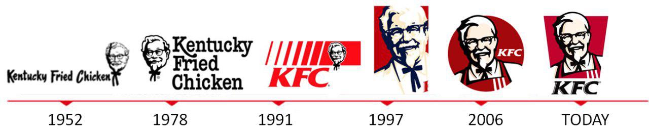
If you like fast food, then at least once you were at one of the restaurants KFC. They are located around the world and in everyone you can enjoy a juicy chicken with a special batter, the recipe of which is the secret of the company. The first restaurant outside Kentucky was opened in 1952 and the first logo has been invented at the same time. It included a bulky white inscription ‘Kentucky Fried Chicken’ and an image of Colonel Harland Sanders, the founder of the company. The good-natured mustachioed grandfather in a white suit moved to the second logo, his image changed a little, but anyway it was still far from the usual red signboards, that we are used to see.
The famous abbreviation KFC was used only in 1991 for the first time, and in 1997, along with it appeared an updated, more realistic colonel, who looked a little blue. The last change to the logo of the famous chicken from Kentucky occurred in 2006. Instead of a white suit, Â grandfather Sanders was dressed up in an apron, and the colors and general appearance became more definite. The president of the company said, that this appearance should remind visitors that a colonel is a real person, and at the same time that he was the first chef of the restaurant.
2. Pepsi
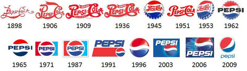
This drink was born much later than its main red and white competitor, but quickly gained popularity and unlike Coca-Cola, it was never afraid to change the style of the logo.  Originally a very beautiful inscription Pepsi Cola with a lot of scribbles served as a brand name, but gradually the font began to straighten, and the inscription became more legible so the buyers had not squint to understand what was written there anymore. Then the inscription was placed on the bottle cap, painted in red, white and blue, but then the lid itself was used as a logo. Over time, the ribbed edges were flattened and the lid turned into an ordinary tricolor circle. Such logo looks more recognizable to you, doesn’t it?
The last, eleventh changes, the Pepsi logo survived in 2008. The designers tilted it a little and changed the width of the white strip. Now it looks so, but who knows what will happen in a couple of years.
3. Nintendo
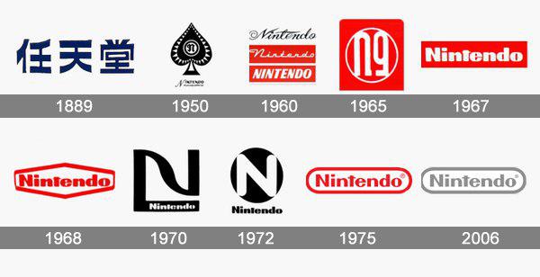
The logo of the Japanese company Nintendo remained unchanged for sixty years until time to go beyond the home country to attract Western buyers hasn’t come. The traditional writing of hieroglyphs had to be replaced with a more understandable word in Latin, and it was the right decision. Â You can’t disagree that a few mysterious characters cannot be called memorable, they can not even be read without proper preparation. The other transformations of the logo design can hardly be called significant ones.
The inscription moved, the fonts, colors, shapes, and thickness of the frame changed, in general, nothing especially interesting. The last time the logo design has been changed was in 2016 and while the owners of the company seem to have decided to stop.
4. Apple
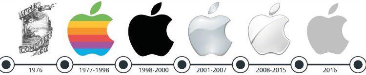
The author of the first logotype of this world-famous company was Ron Wayne. Not everyone knows that he is the third founder of Apple and even the biggest loser of the twentieth century. And all because he sold his part of the actives after only 11 days from the day of foundation. Imagine how much money he could have now!
By the way, the logo that he created is very different from the current one. The center depicts the English scientist Isaac Newton and the apple that is about to fall on him. The logo design in such form lasted only a year, unlike the next one, which was the face of the company for 22 years. Newton was removed from it, but the half-eaten apple painted in rainbow-colored stripes remained.
And only in 1998 the Apple logo acquired a familiar look, the colors disappeared and now it has become monochrome. Perhaps in this way, the company showed maturity and seriousness, or maybe Steve Jobs still succumbed to his love for simplicity in everything. Anyway, today the famous apple image is recognized all over the world and even other companies try to imitate it by biting other fruits.
5. Chupa Chups
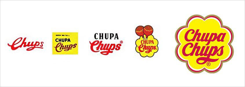
It would seem that this is the most common sweet, that is known by every child in the world, but there is something interesting in its history. Widely known caramel on a stick was invented by Enrique Bernat. The founder of the company wanted to create such a sweetness that the child ate and did not get dirty from head to foot and did not even begin to wipe his hands on clothes. So his brilliant idea of caramel on a stick was supported all over the world.
Naturally, such a popular candy needed a recognizable logo design. Initially, the logo was very simple: the red text on a white background. Several times the logo was changed, but it still remained faceless. Until the time when El Salvador Dalà took up the design himself. Yes, the well-known artist really put his hand to create this logo. It was a personal request of the founder of the company, to which Dali agreed and within a few hours created the Chupa-Chups logo, reminiscent of a chamomile.
And what famous logo designs would you include in this top, maybe we missed something? Let us know in the comments 😉


