
I like graphman's suggestion. Would be cool if easily done. Each designer could choose the background color they want behind their thumbnails (they could choose to leave it white, change to gray or change to black).
New profiles discussion
I like graphman's suggestion. Would be cool if easily done. Each designer could choose the background...
&nsbp;
#62

Ridder
-

- Designer
- 123 posts
Senior Member
Posted 08 April 2015 - 09:20 PM
A suggestion.. attached file
Execuse me eximius!
And I don't support graphman's suggestion. I think we should stick to DC overall theme. We might end with strange colors themes. Profiles should have a united theme, I thinks.
Attached Files
-
 Untitled-1.jpg 39.91KB
0 downloads
Untitled-1.jpg 39.91KB
0 downloads
#64
GJR
-

- Designer
- 2637 posts
Moderator
Posted 08 April 2015 - 09:58 PM
It's looking nice and it's good to see the missing medals back.
There are a couple of problems remaining
1) As ECOdesigns said the medals in the winning entries tab are "all mixed up". Please take a closer look. Mine go gold, silver, bronze, gold, silver, bronze.
I can make a screenshot if you like but it's clear to see from my profile.
2)Portfolio tab is in front of winning entries tab and we cant move them.. Winning entries should be first, this was one of the most common complaints about the previous version of the portfolio.
3) All medal winning designs in the portfolio tab are displayed as gold medals.
#65
PaintedPony
-

- Designer
- 1376 posts
Guru
Posted 08 April 2015 - 11:50 PM
A suggestion.. attached file
Execuse me eximius!
And I don't support graphman's suggestion. I think we should stick to DC overall theme. We might end with strange colors themes. Profiles should have a united theme, I thinks.
Each designer now has the option to customize their own cover banner/header on their portfolio page. Several designers have already done it. I look forward to seeing everyone's creative banners. 
I believe graphman was referring to the background color behind the thumbnails on individual designers' portfolio pages. Would basically be like a mat in a frame - we could choose whether we want the background to be either white, gray or black on our own individual folio page.
I do think if we are able to do this, that only 3 solid color options should be available (such as white, gray or black) and not offer textures or a rainbow of colors or images. That would start to look very busy.
- Oleksandrm and graphman like this
“No hour of life is wasted that is spent in the saddle†– Winston Churchill
#66
PaintedPony
-
- Designer
- 1376 posts
Guru
Posted 09 April 2015 - 12:01 AM
@Gary~ This is the way the medals are being organized per Oleksandrm. So that would explain why some golds are showing up below bronze:
"4) You can move designs at any tab except winning - there are such order => NON PRIVATE contests => Gold by date, silver by date, bronze by date =>PRIVATE contests => Gold by date, silver by date, bronze by date. Private medals are hidden with LOCK image if you are not logged in."
- GJR likes this
“No hour of life is wasted that is spent in the saddle†– Winston Churchill
#67
EcoDesigns
-

- Designer
- 278 posts
Senior Member
Posted 09 April 2015 - 02:25 AM
Wow Gary, great catch! Yes, all medals (silver & bronze) are showing up as gold on the 'portfolio tab'
3) All medal winning designs in the portfolio tab are displayed as gold medals&&0){for(var>
- PaintedPony, Oleksandrm and graphman like this
#68
Ridder
-
- Designer
- 123 posts
Senior Member
Posted 09 April 2015 - 08:35 AM
Thanks for the replys; I was referring to add "Contest Holders' reviews" in addition to the "Client's (1-on-1) reviews". Because I think DC is much about contests. Sorry I didn't explain before.
syyar you can already do that, make copies of your designs, make the jpg of required size and upload that image
Each designer now has the option to customize their own cover banner/header on their portfolio page. Several designers have already done it. I look forward to seeing everyone's creative banners.
I believe graphman was referring to the background color behind the thumbnails on individual designers' portfolio pages. Would basically be like a mat in a frame - we could choose whether we want the background to be either white, gray or black on our own individual folio page.
I do think if we are able to do this, that only 3 solid color options should be available (such as white, gray or black) and not offer textures or a rainbow of colors or images. That would start to look very busy.
Yes I see I believe graphman was referring to the background color behind the thumbnails. I think it's too much customization I'd like to keep the main DC theme.
And PaintedPony, you need to shorten your "About me"; It's limited. We found another thing to complain about
I still can't add image to the post! even from more reply options.
Attached Files
-
Untitled-1.jpg 39.91KB
0 downloads
- PaintedPony likes this
#69
graphman
-

- Designer
- 894 posts
Member
Posted 09 April 2015 - 09:45 AM
Thanks for the replys; I was referring to add "Contest Holders' reviews" in addition to the "Client's (1-on-1) reviews". Because I think DC is much about contests. Sorry I didn't explain before.
Yes I see I believe graphman was referring to the background color behind the thumbnails. I think it's too much customization
And PaintedPony, you need to shorten your "About me"; It's limited. We found another thing to complain about
I still can't add image to the post! even from more reply options.
I got a hug for you.

#71
Oleksandrm
-

- Administrators
-

- 264 posts
Administrator
Posted 09 April 2015 - 02:13 PM
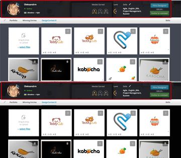
Thanks Sharie. Great work on the pages guys! Look awesome! I attached a sample of the background color edit I was talking about. It kinda gives the thumbs a pop.
Got it. Hmm, we will think about this too Nice suggestion.
- graphman likes this
#73
PaintedPony
-
- Designer
- 1376 posts
Guru
Posted 09 April 2015 - 05:54 PM
I noticed if you click on the 'skills' under your header/banner, designers can confirm your skills. That's cool.
- sharie, Oleksandrm and EcoDesigns like this
“No hour of life is wasted that is spent in the saddle†– Winston Churchill
#75
Oleksandrm
-
- Administrators
-
- 264 posts
Administrator
Posted 09 April 2015 - 06:20 PM
Checkout our article in blog Anastasia tried to explain some key features Comments are welcomed too
- PaintedPony likes this
#76
EcoDesigns
-
- Designer
- 278 posts
Senior Member
Posted 09 April 2015 - 06:27 PM
Great article Anastasia Kulik. Very Helpful! I really like the customize your own page option.
@Oleksandrm, my profile still doesn't have the reviews from One-on-ones. Is this still under development?
Checkout our article in blog Anastasia tried to explain some key features
#77
GJR
-
- Designer
- 2637 posts
Moderator
Posted 09 April 2015 - 07:37 PM
@Gary~ This is the way the medals are being organized per Oleksandrm. So that would explain why some golds are showing up below bronze:
"4) You can move designs at any tab except winning - there are such order => NON PRIVATE contests => Gold by date, silver by date, bronze by date =>PRIVATE contests => Gold by date, silver by date, bronze by date. Private medals are hidden with LOCK image if you are not logged in."
Thanks PP for clarity. this solution is not ideal though. When the medals are visible then they should be displayed in the correct order. Also many of the designs "hidden" have been visible in the past, some for over a year so it not right for them to be hidden now. Is there any chance this will be fixed?
Also, will we be able to move the tabs as requested?
Thanks.
--------- Edit -----------
In the blog it shows that we can reorganise the tabs so that winning entries are first:
https://designcontes....ZQ3KKi1uoT.jpg

- PaintedPony and EcoDesigns like this
#80
sharie
-

- Administrators
-
- 21873 posts
Admin


1 user(s) are reading this topic
0 members, 1 guests, 0 anonymous users
