Jump to content

  • Free consultations and support
  • Live chatClick Here for Live Chat
  • Call ico 1888-906-1888
    Phone support: Open

    Ready for your call :)

    Our business hours:

    Mon — Fri, 2am — 8pm (EST)

    US & EU support teams

    Phone support: Closed

    We are back in: 1h 20m

    Our business hours:

    Mon — Fri, 2am — 8pm (EST)

    US & EU support teams


Finished but I don't like it.


  • Please log in to reply
&nsbp;

#1 Coy

Coy

    Elite Designer

  • Designer
  • 2534 posts

Posted 29 May 2009 - 04:29 PM

OK so here is the deal.
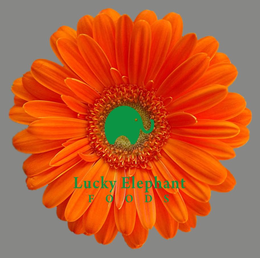
the customer wanted to use a flower, change the color to orange and use the green elephant I made.
The photos were small at first and didn't come out great so they took another large photo to use so that it can be scaled down to look ok.

Now here lies the problem. when made small for adds you can't really see the elephant. I've suggested making it larger and/or going w/ a different color that will contrast better. (you can see th problem in the add below)

Now I've been asked to make the labels for the product. but before I go any furthure w/ this company I'd like to propose some suggestions for different logo look. I'm doing this for no fee cause it'll help me in the long run...

another thing is I'm not liking having the logo done in photoshop, it feels like it limits me somewhat.. so if anyone has any suggestions on taking the image to illustrator I'm all ears.

Here is the logo as they want it. They are dead set on the font used (but would like to suggest others. The elephant and text is all done in illustrator.

Posted Image


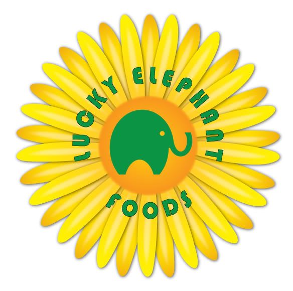
Here is one with a larger elephant.
Posted Image

This is the one I did that is all vector and based off the first two flowers they gave me. I feel this is more scalable and like the way the text circles the elephant. they didn't want that..?
Posted Image

Here are the three mag/newpaper???(didn't give any demensions or specifics) ads as they wanted them.
Posted Image

Posted Image

Posted Image

#2 .:FMD

.:FMD

    Senior Member

  • Designer
  • 188 posts

Posted 29 May 2009 - 05:10 PM

ok, first thing is first...The green text on the orange/red flower is very difficult to read.

Second as far as the text circling, it looks good, however if the client doesnt like it...you cant really complain about it. You can try and persuade them by giving them the reasons why it works but in the end, they are paying you.

Third, definitely play around more with the type on the ads as it is kinda boring and doesnt really grab the viewers attention.

I'll be pming you shortly...

#3 Coy

Coy

    Elite Designer

  • Designer
  • 2534 posts

Posted 29 May 2009 - 05:47 PM

agree on all subjects.. but as you said they are paying me so I feel somewhat limited.

I've asked for the mag they are placing these with so that I can kinda match what is going on with in the mag. conservative, trendy or whatever the case maybe. Then send them a different font and placement optioins. as of now I've done exactly as they've asked. ;D

#4 merchantweb

merchantweb

    Junior Member

  • Designer
  • 24 posts

Posted 29 May 2009 - 10:16 PM

agree on all subjects.. but as you said they are paying me so I feel somewhat limited.

I've asked for the mag they are placing these with so that I can kinda match what is going on with in the mag. conservative, trendy or whatever the case maybe. Then send them a different font and placement optioins. as of now I've done exactly as they've asked. ;D


It's weird....I kinda like it...and I think that's probably what the client likes. The green is hard to read and that is the main problem. If it could pop off that flower somehow rather than receding into the shadowy pit of the sunflower then it might solve the problem. Still there is something about it I like. I like the orange sunflower and I think that....I know that it is competing with the actual mark(the elephant) of the company. I feel that the orange flower is a clever idea to incorporate into ads and it works in a juxtaposition kinda way. I would like it if the elephant was lighter when used on the orange flower but back to the green when used without the flower. The elephant is the real mark and the sunflower is a supporting graphic element.

You can make the flower and the elephant all one mark by creating a graphic out of the flower...the problem is complicating the form of the logo...and the flower is complicated...also the client likes that look. You would have to create an orange sunflower logomark to go with the elephant that looks better to them than the photo of the sunflower..

The problem is definitley the two images competing and the solution is to incorporate the two together in a scalable mark...

...or use it like that but when it comes down to it there needs to be a elephant and letter mark combo without the sunflower as the identity.

Hope this helps! I really like the elephant!!

Edited by merchantweb, 31 May 2009 - 08:55 PM.


#5 QuirkDesign

QuirkDesign

    Apprentice Designer

  • Designer
  • 30 posts

Posted 30 May 2009 - 09:18 PM

I agree with what's been said so no need to repeat it. Sounds like the client has you backed into a corner though.

I found this tool on the internet a while ago. It's pretty impressive. It might help you vectorize the flower:
VectorMagic.

Good luck!

#6 Coy

Coy

    Elite Designer

  • Designer
  • 2534 posts

Posted 01 June 2009 - 07:39 PM

last time I used (tryed it) vector magic the image came out just as if I would of used my live trace tool.. maybe I could give it another try though. Thanks for the link.


had a crazy ass weekend and couldn't work on it (or anything else) but I'll post up some variations for you all to view in the next day or two.

Edited by Coy, 01 June 2009 - 08:57 PM.


#7 merchantweb

merchantweb

    Junior Member

  • Designer
  • 24 posts

Posted 01 June 2009 - 09:20 PM

last time I used (tryed it) vector magic the image came out just as if I would of used my live trace tool.. maybe I could give it another try though. Thanks for the link.


For starters, I don't think any good logo has ever been made with live trace alone unless it was a trace over a highly refined ink drawing.

The purpose of that vectorization program is not to make logos out of photos. It will make a vector image of the photo but if you try to simplify the extraction then there is always editing to be done. It's a scalable logo not a scalable cartoony photo of something.

If you want to do it....
Print the flower fairly large take a piece of trace paper to the print over a lightbox of some sort.....I use my laptop screen as a lightbox:eek:

Now trace the flower, pick out elements to break down and simplify so that you create an abstraction of that image. Look up logos of flowers and I bet it is hard to find one with all the petals defined completely....Its a hard call because your client doesn't understand the importance of a clear, well defined mark. Read this article I looked up to explain:

LogoBang.net good logo elements

Have you thought about how to pull that logo off in black and white. The elephant by itself would be awesome but ask yourself what good an orange sunflower will do for the brand in a b&w fax Not to mention how hard it will be to see the elephant. If you resolve the combined logo images into one image then make sure it also looks solid in B&W. In fact. Design with the goal to make it look perfect first in B&W

Also, I think there needs to be a clear lettermark that is associated with it. I like the logo above text more than circling around. Google identity guidelines and make one for this logo before it is passed on to the client.

#8 Coy

Coy

    Elite Designer

  • Designer
  • 2534 posts

Posted 01 June 2009 - 09:57 PM

These are all points I've made to the client.. Ultimately I'd suggested loosing the flower alltogeather as the elephant would be an ideal brand.

I also highly suggested the "drawn" flower I'd done over the picture flower simply because of usability and it can be done as a b&w easily w/out loosing the flower.

I think the b&w will end up being a black flower w/ a white elephant. which I'm not crazy about. the flower I feel is fighting the elephant and each one now has an identity crisis.

I'm working on conclusions to this and feel the customer is coming around to our point of view. They really like the flower though and I'd like to give them what they want so I'm increasing my creativity. :D

#9 Coy

Coy

    Elite Designer

  • Designer
  • 2534 posts

Posted 02 June 2009 - 06:35 PM

crunch time.. LOL
They need labels for drinks, dip and spa products by friday.
So were working on finalizing the logo today and tomorrow.

be back later to see what you all think as well. ;)

#10 Coy

Coy

    Elite Designer

  • Designer
  • 2534 posts

Posted 02 June 2009 - 07:39 PM

OK so here are the options I sent them. I tried to keep it with in what she wanted. for me I like the elephant on it's own.
The numbered ones are all vector I used the vector magic site for the flower and liked the way it came out. The only part I didn't like was the middle of the flower which the elephant covers up. lol..
The ones w/ the gray background are photoshoped.. I honestly didn't take much time on those two. enlarged one and simply airbrushed yellow behind the other.
Posted Image

#11 .:FMD

.:FMD

    Senior Member

  • Designer
  • 188 posts

Posted 02 June 2009 - 10:05 PM

I still like the elephant on its own as well. If i had to choose a flower one...it would be the yellow logo with black type...reason is the yellow sticks out pretty good on the flower and the black is so strong that it does not get lost like the other colors in the flower.

#12 jmgarrido

jmgarrido

    Apprentice Designer

  • Designer
  • 13 posts

Posted 03 June 2009 - 07:11 AM

I think that the flower must be an vectorized one, like number 7, but with more details. try to vectorize one of those pics.
I dont like very much to mix vectors and pics like this... :)

#13 .:FMD

.:FMD

    Senior Member

  • Designer
  • 188 posts

Posted 04 June 2009 - 05:09 AM

I think that the flower must be an vectorized one, like number 7, but with more details. try to vectorize one of those pics.
I dont like very much to mix vectors and pics like this... :)


How has this anything to do with a critique of his work?

#14 Coy

Coy

    Elite Designer

  • Designer
  • 2534 posts

Posted 04 June 2009 - 07:01 PM

OK so were are getting down to the end of things here and for the most part I'll be using different colored elephants for different products.

They like the black type on most of them and I've completely convienced them to go with the all vector flower and the photoshoped version on back up for whatever reason.
sold it like this: if you wanted a 5foot banner/poster the 2 foot flower would look better vectorized than the 2 foot photo of the flower for the most part.
I also added a khaki or olive color elephant from my earthtone swatch which they loved.

but we are going to come down to one version for the Trademark today.

Thank you all for your feedback. I'll post some additional images here shortly.

#15 primebrat

primebrat

    Junior Member

  • Designer
  • 2 posts

Posted 04 June 2009 - 10:33 PM

Hi! =)
I'm a new kid on the block here, and it looks like this process has been going on for awhile, but here's my 2 cents/elephant-food-for-thought anyhoo... =)
I dig the premise and it's cool that your client is a bit outside of the box... fun & rare! However, the logo seems to be competing with itself. The elephant is a clean, strong image, and perhaps it would be better as the dominant graphic, let's just say, the elephant being the main focal point & the flower itself more subdued. Like the elephant wearing the flower instead of the flower wearing the elephant.
The logo type is getting totally lost & competing with the flower in the background. It's pretty tough to distinguish colors that share the same grayscale value (red/green), there's just simply no contrast there. Keep in mind various methods of printing and also conversions to grayscale. Keep it clean, keep it strong, and still maintain the 'funk'.
As for design purposes, you might want to invest in a software like InDesign. You can easily manage both vector & bitmap images, and have quick/easy control with your type. Additionally, you can work in layers, import/export various file formats including pdf's which make proofing much more expedient & efficient.
If it's too late for all this, oh well! Perhaps there is still something here that may be of help to you for future projects.
Good Luck! =)

#16 Coy

Coy

    Elite Designer

  • Designer
  • 2534 posts

Posted 04 June 2009 - 11:33 PM

thanks primebrat.

I've commented to the client that the elephant and flower are "fighting" w/ each other and have stated on a number of ocassions that the elephant is strong enough an image on it's own, but they do want what they want.
I've since convience them to go w/ the vector flower and they are still deciding on the color choices (i'll upload them here in a minute).
The text is not going to change either. I've showed a few options and they are wanting to keep it as is.

Since they are targeting upscale buyers they believe this image will work and I want to give them exactly what they want, as well as make suggestions to help them convey what they want that will work. They will use the no flower elephant on anything that is black and white.

They have currently shown me some looks they are after and I do have to say that the flower will fit nicely with that look but so would the elephant on it's own.

In the end the customer is always right. :D

#17 Coy

Coy

    Elite Designer

  • Designer
  • 2534 posts

Posted 04 June 2009 - 11:44 PM

OK here are their final choices.
What I did before this was give them seperate files with just one color(Green, Gray, Yellow, Blue and Khaki) and with in those images were 7 options for that one color (1, 1a, 1b, 2, 2a, 2b, & 3) they then chose their top choices from them and I've combined them to this image. I also went with a lighter blue.
Posted Image

#18 jecrt

jecrt

    Junior Guru

  • Designer
  • 432 posts

Posted 05 June 2009 - 10:13 PM

wow - I've been really out of the loop!

If it's not too late - what if you vector the flower simply - or even as linework - to match the elephant? More than an outline, but just solid color fill? As for typefaces - could you try something like Lubalin Graph, Platelet or - if they REALLY want a serif - Clarendon?

The images/copy for the ads work really well - the type is REALLY hard to read, though (for me at least)...and it's kinda lacking. What about a thinner serif typeface in white with a SLIGHT drop shadow (with the offset distance set at zero)? It might class it up a little bit more and improve legibility. It'd also be good to give it a "light" feeling...just some thoughts.

good luck man!

#19 Coy

Coy

    Elite Designer

  • Designer
  • 2534 posts

Posted 06 June 2009 - 12:28 AM

wow - I've been really out of the loop!

If it's not too late - what if you vector the flower simply - or even as linework - to match the elephant? More than an outline, but just solid color fill? As for typefaces - could you try something like Lubalin Graph, Platelet or - if they REALLY want a serif - Clarendon?

The images/copy for the ads work really well - the type is REALLY hard to read, though (for me at least)...and it's kinda lacking. What about a thinner serif typeface in white with a SLIGHT drop shadow (with the offset distance set at zero)? It might class it up a little bit more and improve legibility. It'd also be good to give it a "light" feeling...just some thoughts.

good luck man!


not too late..
The last one is a vector flower. They REALLY wanted to keep the flower so that is how it'll be and as far as the font that IS what it'll be. There was no liking any of my suggestions and I tried a few.. other than the ones I've shown here.

The ad's have taken a back burner to labels now. They have a meeting w/ a whole sales food person coming up soon and want to have labels ready for demo's.

So far the logo will be one of them that I posted last and working on MANY labels for sauces, ice cream, tea/lemonaid, rubs and a slew of other items.

#20 Coy

Coy

    Elite Designer

  • Designer
  • 2534 posts

Posted 06 June 2009 - 12:30 AM

This is the first lable submission. I'm working on something less swirly for the background.
Posted Image


0 user(s) are reading this topic

0 members, 0 guests, 0 anonymous users