
I bet you’ve heard the notions like “usability†or “user-friendly design†more than once. If you’re a designer, you surely stick to these principles. If you’re a client, you certainly want your product to meet the requirements those principles set down. In most cases, you do your best to fulfill these demands and do succeed in that if you pay enough attention to doing everything right. However, if you deal with mobile app design, you definitely fail in meeting those requirements no matter how hard you try. And here is why.
Your main mistake
What is the main principle any user-friendly design should follow? It’s all about making users satisfied by simplifying the process of using an app. When it comes to simplifying the design, we think of a hamburger menu, calm colors, and suitable icons. We think of the way to hide everything or to make everything as reachable for a person as it can be. What we probably never think of in the mobile app design is a person’s thumb.
Yes, a thumb. Though it is one of the key factors you should pay attention to when providing a mobile app design.
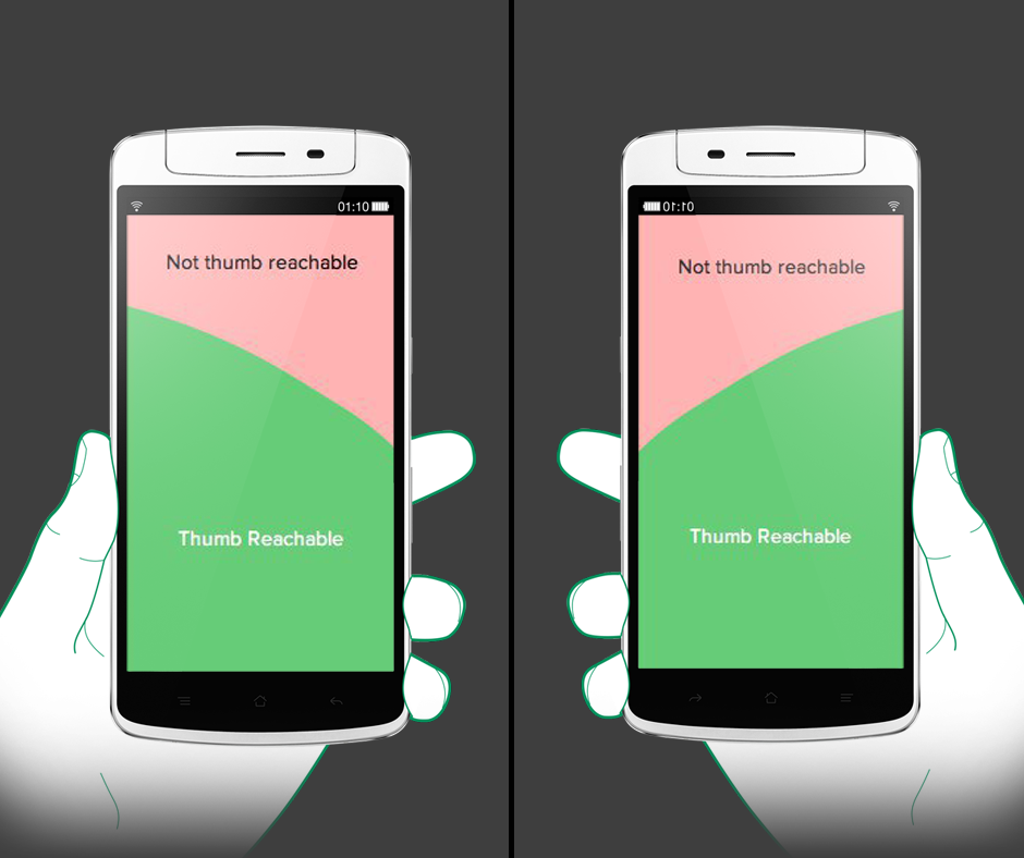
As a rule, we got used to seeing a menu in a mobile app design on the upper right corner of the screen. For once, it can be placed on the left corner above. And almost never you can see it at the bottom of an app. Here comes the question “Why?â€.  If you think logically, you’ll understand that a menu at the bottom of a screen is totally user-friendly because it facilitates the process of reaching the key features your app provides. A person doesn’t need to make any additional moves or tries in order to click the necessary button. Thus, it raises the convenience and productivity of the app itself.
How to fight this problem
Though it might look a bit unusual, mobile app navigation placed at the bottom is much more efficient. You need to show the most important destinations (e.g. your app’s menu or a call-to-action button) to make sure your users can reach them with their thumbs. Pure convenience and nothing else. What’s more, you should avoid scrolling menus and everything that can decrease the convenience of the app and its navigation.
Icons
If you decide to place the navigation at the bottom of your app, you need to make your icons very simple. In most cases, it’s better to use geometric patterns or other universal symbols so that the navigation wouldn’t look too crammed. In addition to that, you should pick colors that make a calm and peaceful impact on people. This way, you don’t disturb your users from the content and don’t irritate them with unnecessary splashes of colors.
Text labels
The shorter, the better. You need to make your text on the mobile app navigation meaningful and eloquent but also not to forget that you don’t have much space for the long speeches. Have you heard that brevity is the soul of wit? In the case with mobile app menu design, this quotation gets a whole new meaning. The fewer letters you use, the cleaner your design will look like.
Bottom line
Even though your mobile app design might be good, you can make it much better. The first step towards perfection would be placing your navigation menu and the most important buttons the way it would be reachable for a thumb: this way, you’ll definitely make it user-friendly by showing that you have your users’ interests as your own top priority.
Moreover, your navigation design should be visible and well-structured. If your icons are too close to each other and users accidentally click on false ones several times, they will simply get irritated. It won’t serve you in increasing the loyalty, will it?
Do you have any other tips that deal with mobile app navigation? DesignContest is eager to hear your thoughts!