If we look for definition of a contrast, we’ll find out that contrast is a visual difference used for distinguishing a certain object (or objects). Contrast is often used in different areas of design, but sometimes seems too complex to master. It isn’t surprising at all: usually beginners learn about the basics of color contrast and that’s that.
However, smart use of contrast can benefit both a designer and a client. Today I’m going to tell you more about perks of contrast, its types and how it’s made.
Perks Of Using Contrast
Why contrast is so important:
– as said above, it helps distinguishing an object. Moreover, it catches attention, which is extremely important nowadays, when people look through webpages only briefly. A bright, well-done contrast can get visitors to pay attention not only to design but also to message you want to deliver;
– it can be used for organizing information on a webpage. Whether you want to create a focus on a certain part of a page or to make a webpage easier to navigate, it can be easily achieved with a help of a contrast;
– it simply looks good (of course, if it’s done professionally).
Questions To Ask
But before you rush to Photoshop or Illustrator to create some amazing contrast design piece, you should ask yourself two simple questions:
– Is using contrast is appropriate in my situation?
Sometimes a contrast can strengthen your idea, but sometimes it also can ruin it. Not every design needs contrast in order to look good and be effective, so you should take your time to think.
– How should I create a contrast?
A contrast is achieved not only by smart color combinations, but also with a help of fonts, textures and shapes. You have to choose the right method for every design you make.
Basic Types Of Contrast
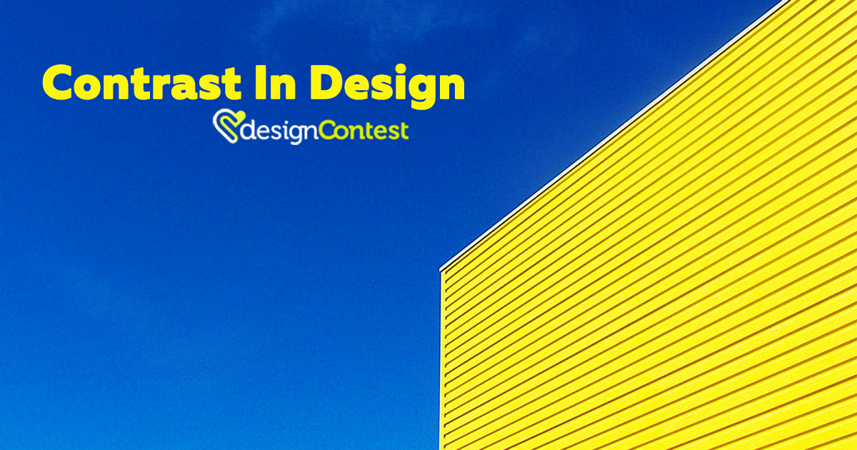
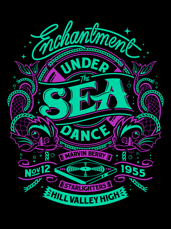
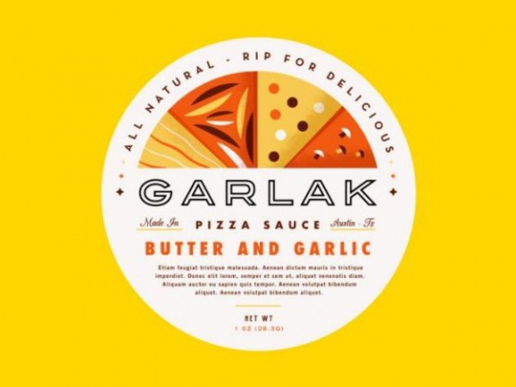
1. Color contrast
Probably the most well-known and commonly used type. Even the beginners are familiar with it. However, it’s quite hard to master: if you choose wrong color combination, your design will be ruined. The important thing here is choosing complementing colors (Adobe Kuler can help you with that) and ensuring that they won’t make people’ eyes bleed.


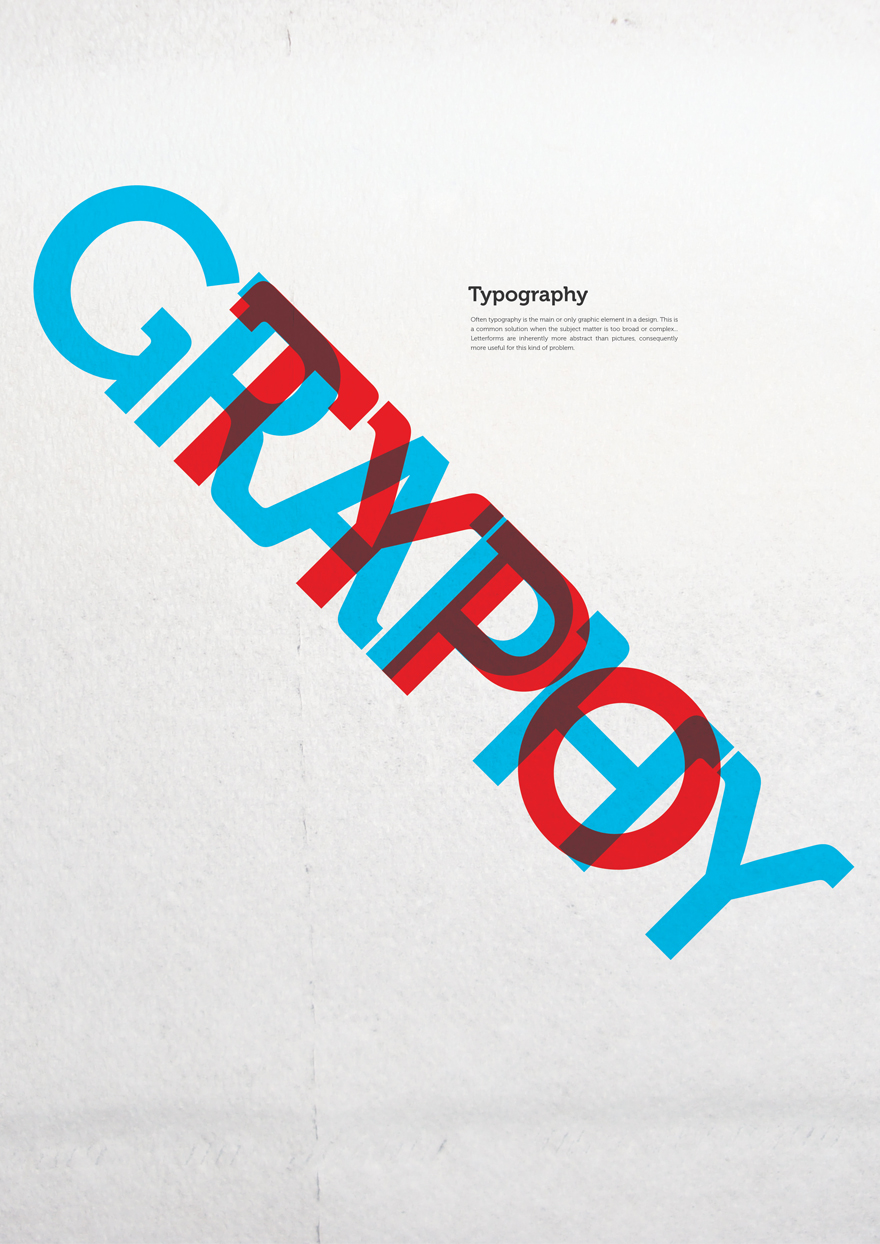
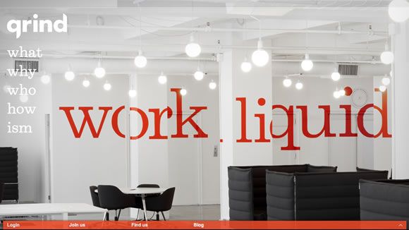
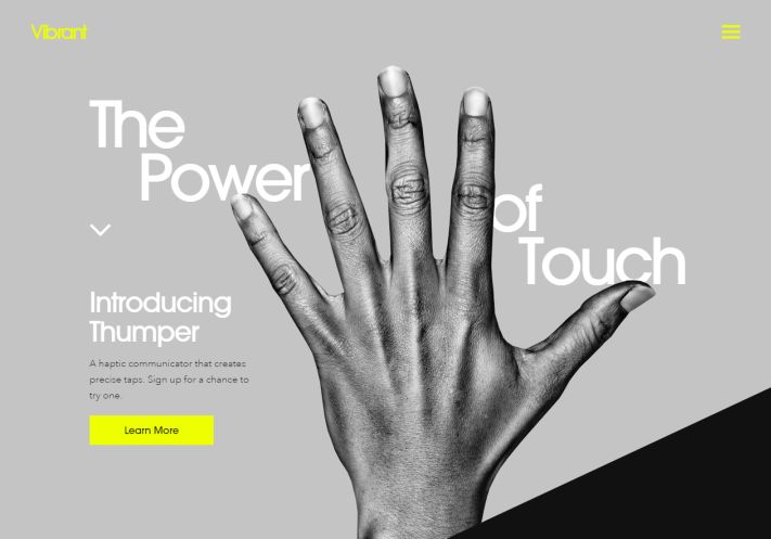
2. Size contrast
If you want to show that certain information is important, why not try making it big! Size contrast is one of the easiest and the most understandable contrast types: when you make a certain part of a text bigger, it immediately catches attention and stands out.
However, it’s not just about text: you can make images smaller and bigger too. The most important thing here is to find areas that need to be distinguished and to make enough variations: after all, if all webpage is done in the same size, it might look pretty boring.
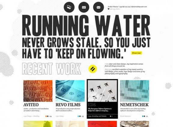
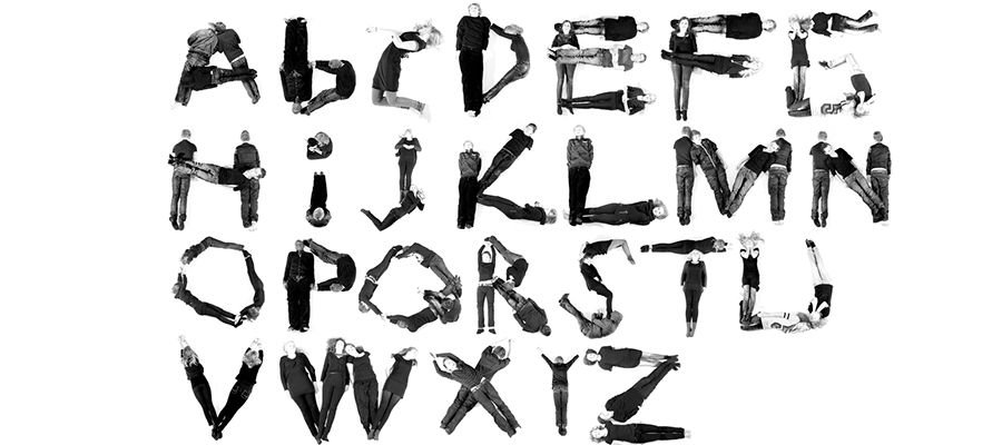
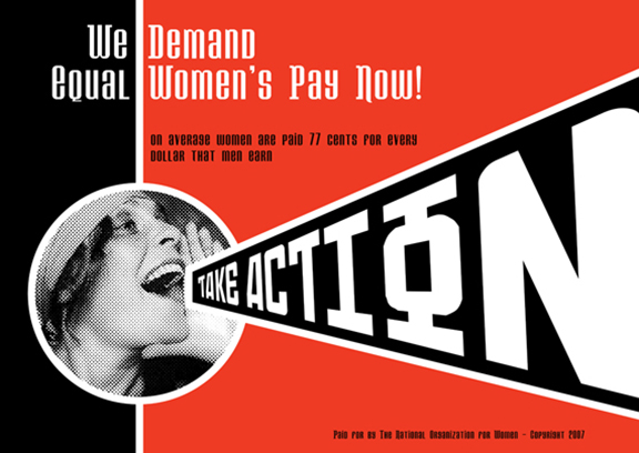
3. Shape contrast
You can use interesting shapes (or just pick ordinary ones and make them noticeable) in order to create interesting contrast. Experienced designers are able to create amazing shape contrasts on one website page.
Remember: if most or webpage’s elements have one shape (for example, a square one), you can easily add contrast by creating one element of other shape (like rounded). Even one element can be enough.
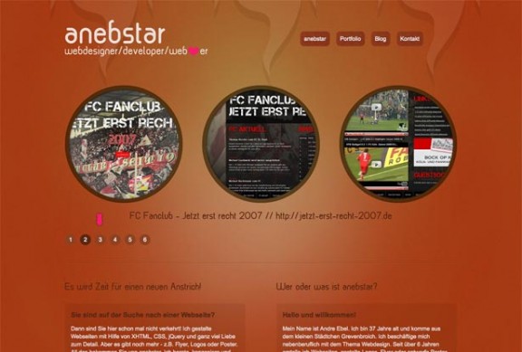
4. Positional contrast
It’s a good way to attract the attention of the visitors to a certain parts of a site. Moreover, it also helps to organize the elements on a page better, to make the hierarchy more interesting and convenient.
Things like fonts, textures, etc. also can help you in contrast creation. However, if you are a beginner, you should learn more tips first before starting your experiments with contrast.