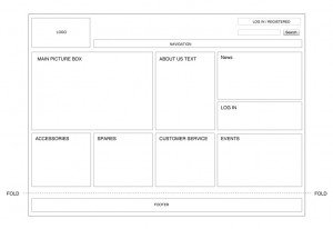
 If you’re like us, one of the things you struggle with most during your website designs is the page layout. You can do just about anything else in the design world with absolute ease. This means you can chuck out a quality website in hours, fashion up a business card like nobody’s business, and otherwise make a name for yourself without sweating. But when it comes to page layouts, you’re absolute rubbish. Sound familiar?
- Break the Grid: We’re going to metaphorically tell you at this point to take that big fat page layout grid in your hands, and then smash it to etsy betsy tiny bits. Yes, just huck it right out your metaphorical window. We know your professors in school really encouraged you to stick with the rigid formula a grid offers, but to be honest, it’s just so boring to look at! Instead of using a grid, try to focus on using blocks. Think of each element as its own block, arriving with form and weight. Where do the blocks stack up so that the proper content is highlighted, and the page itself balances out? If you can keep this in mind, you hardly need to worry at all about using a grid. We promise.
- Be Tasteful With Your Graphics: If you’re not already doing so, try to be very careful with the graphics and images that you use. When faced with a wall of text, an image can be a great way to break your page’s monotony. It can also be a great way to busy the whole thing up! Be careful that you aren’t using too many images or graphics within the work, otherwise the reader will have an hard time getting any information at all out of it. Instead, try to work the images in so that they compliment the text you’re using. Wrap the text around them, put them shadowed in the background—just do anything, so long as the world of text and pictures isn’t some kind of diaspora! And when in doubt, always remove before adding. In most cases, taking a photo or graphic out of the picture is the quickest path to success.


