Do you think that design trends is not a topic you should know more about to help your business?
If you have planned to get some graphic design in 2016 – creating a new logo or building a website for your company or even doing some landing pages and t-shits as a promo gifts – you’d better know what design trends will be at the top. You’ll find out how to make your visible objects catchy and what to write in your design brief to get an up to date design. Enjoy!
Each specific field of design has its own detailed trend predictions – logos, colors, webdesign, technical solutions… Here’s our top list of the best points to stay ahead, which impressed us most of all.
1. UX (user experience) and UI (user interface) are a new black
If you won’t take real users into account, it’ll be hardly possible to grow your online business. The main options of your website are to give the user a good experience, to be quick in downloading and to be easy to use. The central idea is that you as a client should correctly explain the designer how your final user interacts with your site, his expectations, methods and ways of search, places/buttons of his greatets interest. The designer’s task is to make the final user feel clear and comfortable.
How to use it:
– Account registration by means of registration button or social networks.
-Â Humburger-menu: wide usage makes this function easily recognizible for a certain group of users. If you target audience is among them – use it!
-Â Card based design helps in quick scanning of information and searching necessary things. With a help of this type you can easily create content for displaying on different devices.
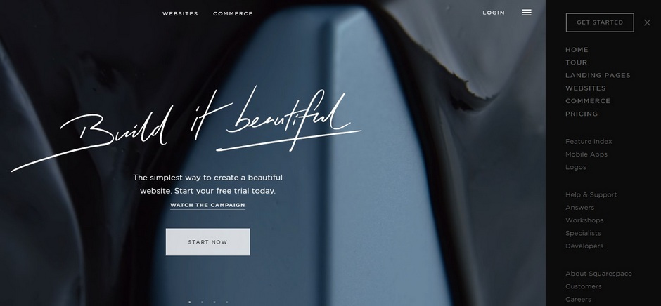
- Large images on the background help to catch user’s attention very quickly. Just avoid stock imagery, use only custom illustrations.
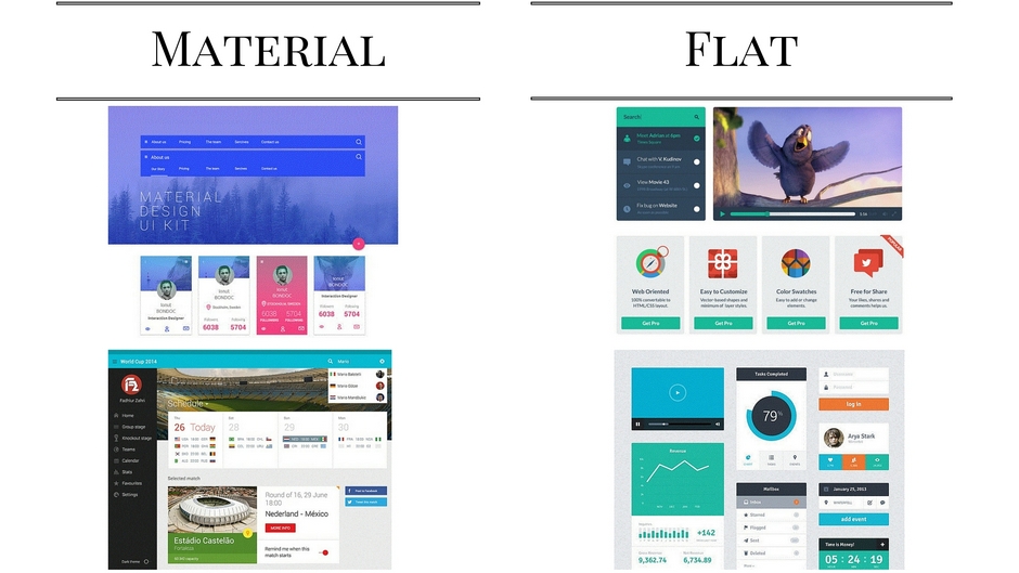
2. Flat and Material design – less is better
It is not something new, but in 2016 flat and material will be used more and more often, they will destroy the border of mobile and desktop browsing. For sure, responsive design will grow, mobile-friendly website is not optional any more, it is a must-have.
Flat design is perfectly matching with other tendencies such as minimalism and responsive design. 2016 will be the year of long shadows that make design more deep and volume, bright color schemes, simple typography and transparent buttons. We will use simple typography to make the text readable, and minimalism to make neat interface without needless details.
Material design: as some experts in design area say material design will be on the top for websites, apps, artworks and so on. The goal of such a design is to create a pure, modern design and pay more attention to UX. Unlike flat, material design uses more depth, more shadows and this makes it more interesting, texture; the usage of grid-based layouts makes the site more flexible. The better layout is, the better user experience will be.
How to use it:
Think how to make site interface minimally pure, simple and clear. Do you need every detail, every block exactly here? And be free to ask designers to make mobile-friendly design.
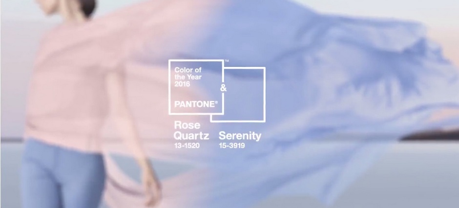
3. The most populat color of 2016
Pantone says the 2016 is a year of pastels that are optimistic but stable and calm. Here is The Fashion Color Report Spring 2016:
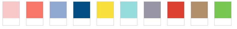
Warm orange Echo, etheral and light Serenity, energic and bright Fiesta – remember they should not be boring and fuzzy. And the PANTONE Color of the Year is Rose Quartz and Serenity
How to use it:
You can build a site/logo on the monochrome pattern like in minimalism, or you can use one of the colors for contrast or you can even offer designers to highlight the most important text and buttons with some bright color.
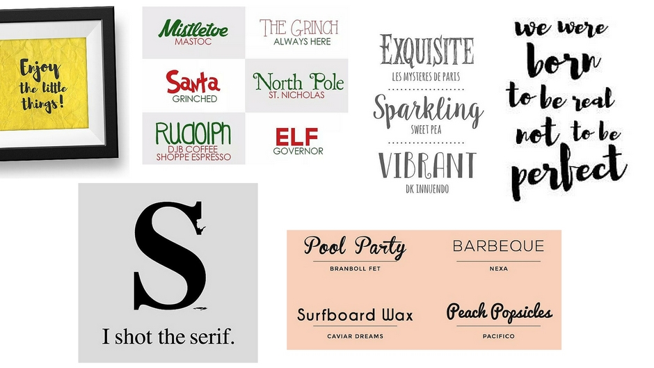
4. Custom fonts. Text + graphic = love and “bold” typographic
You can see artistic, custom fonts everywhere.
Typography has already become bold and will be even bolder in 2016.
2016 is a year of return of caps logos and fonts as if they were painted by someone’s hand. It is possible that designers will use text composed from images, textures and geometric structures more flexible. The better layout is, the better user experience will be.
How to use it:
Don’t be afraid of new fonts, of the fonts drawn by hand and forget about Lobster (it is more than enough).
5. Custom illustrations (including large background images)
Usage of stock photos is one of the most boring things you can do with you website. Yes, the access to cool pictures is easier but are you sure that you are the only owner of such a picture? The simpliest way to avoid this problem is to take the photos you need on your own or with a help of professionals. You can also use hand-drawn illustrations or a custom graphic. They will be perfect for background images, icons etc. Moreover, personal interpretation of each user will be a second huge plus of your website design . It is easier to relate yourself to an image on the drawn picture than to the polished perfect image on the photo.
more flexible. The better layout is, the better user experience will be.
How to use it:
If you think of your site/landing page design, better decide if you can change official stock photo for more “emotional†illustrations.
6. Animation
It is used more and more often and makes user experience more interesting and playful. It can be large (for example, parallax effect), and it is used as a tool of a team play between user and website. It can be small (counters, download icons) and has a goal to make the time spent on your website more pleasant.
Where can you use animation more often?
– while downloading site/page. If a page is downloading very slowly and you know about that –  don’t get the user bored.
– hover-animation – the object changes when you mouse it, creating feedback and hinting that it is time to click.
– tween animation – can help with visual ierarchy, spark user’s interest to a site and to the most important elements of this site.
– background animation (use it carefully)
– galleries, slideshow – a good way to show some monochrome blocks/pictures not  overloading the user. It is often used for designing comments and portfolios.
How to use it:
Think where on your site/app such animation will be good and place it.
If you have some questions/additional information and you want to discuss whether to apply something from here – make comments, we check them and answer regularly!
*Sources for illustrations:  squarespace.com, christmas.express, 34.ge, abduzeedo.com, dribbble.com ( Riki Tanone and Sergey Shmidt), pinterest.com, pantone.com and the film “RUSH HOUR”