In September, we want you to find out more about DesignContest magnificent logo designer who has reached level 10, having earned 18 Gold, 27 Silver, and 14 Bronze medals so far. This true talent shares the second name with Stephen King (who, by the way, should have considered this designer to provide him with illustrations to It (because the CreepyClown logo design by this person is much more terrifying than Pennywise in both films). Meet VictoireKing and enjoy the designs of this exceptional logo designer!
VictoireKing, thank you for agreeing to answer our questions! In your profile on DesignContest, you position yourself as a logo designer. Why do you like creating logo designs so much?
Since I started learning about graphic design, I got focused only on learning about logo design. Designing a logo is very challenging to me because I am very satisfied when I can create a simple but very meaningful logo.
Your own logo is simple and yet brilliant. How did you come up with it? Why did you choose letters instead of any other symbols?

My logo comes from my business name “VictoireKing”, the logo is the initials of my business name “VK”. I wanted to make it as simple as I could so that people could easily recognize it. And I chose letters instead of any other symbols because I understand my business name is a bit hard to read and write :(, so I needed a nickname which can be easily read, written, and spoken, that’s why I use “VK†as my logo.
Which logos do you personally prefer to create: iconic, wordmark, or combined?
I prefer a meaningful iconic logo, so the icon will have the initials of the business name and also can describe what the business is all about, but it’s all back on the client’s request, what they need and want.

What is your secret of being a successful logo designer?
I think I am still on the stage of climbing the ladder of success. All I can do is always doing my best in creating each and every of my designs, ensuring my clients are satisfied with my designs, and making sure that they get positive responses from people when using a logo.

If you hadn’t become a graphic designer, who do you think you’d be?
Maybe I’d have become a salesman. I’d been working as a salesman for more than 5 years. Then, I tried to become a designer and really loved it. So, I’ll always be a graphic designer. 🙂
What influenced your choice to become a graphic designer?
At first, it’s just because I really wanted to work from home, so my brother who, by the way, is also a graphic designer, started teaching me to become one as well.
What is the most time-consuming design you’ve ever created?
It’s a logo for Creepy Clown, the logo is a picture of a creepy clown face.
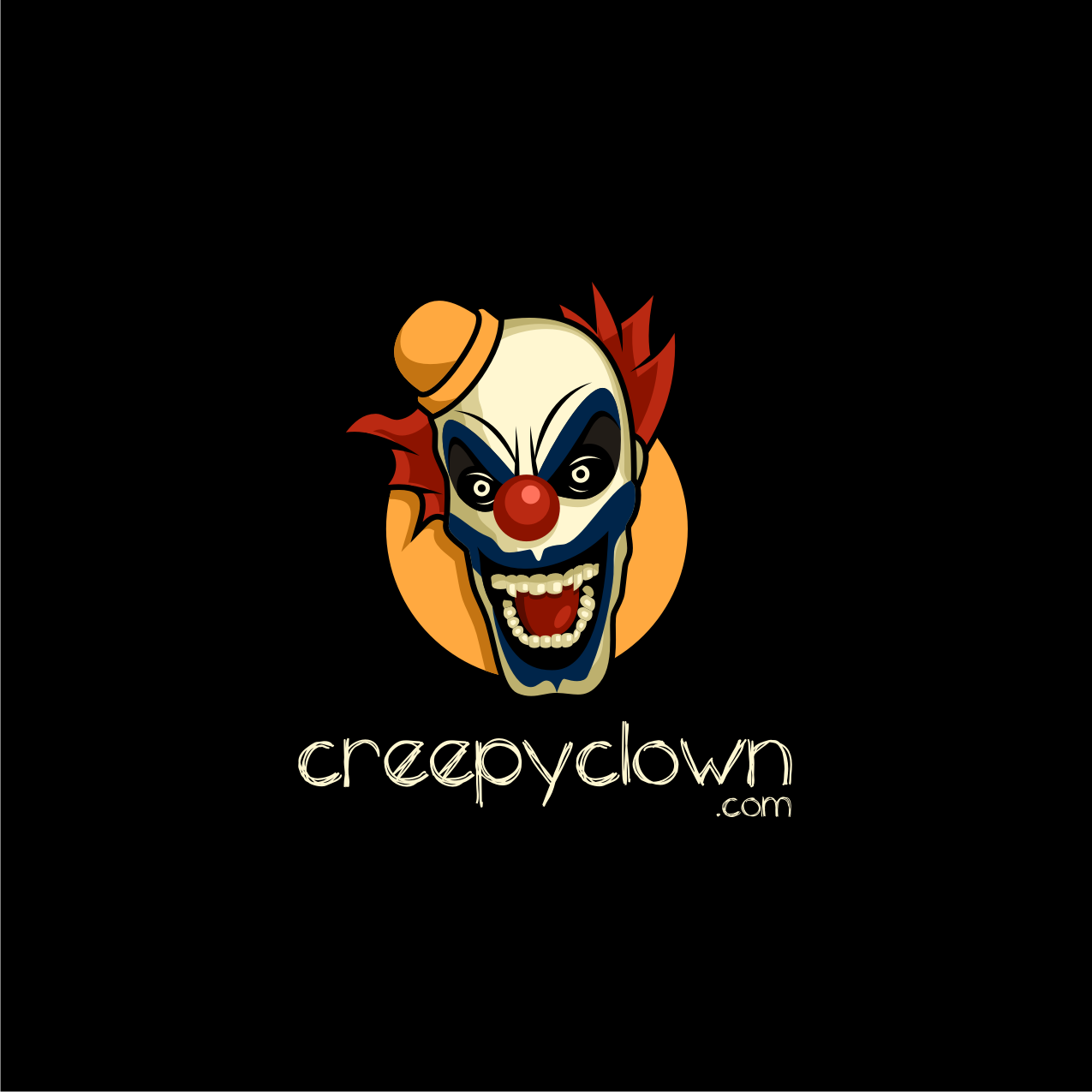
To tell you the truth, you did a great job because this clown’s face on your logo design does look creepy. What was so tough in creating this very logo design?
The hard part of designing the Creepy Clown logo was not even the fact there were lots of details on that logo design I had to combine. As far as the name was Creepy Clown, I had to make the logo look as creepy as possible. Making a creepy expression was a new thing to me because, to my mind, angry and creepy expressions are a bit different.
Do you have any graphic designers whose designs you admire?
Yes, it’s Ruth Kedar, she is the designer of the Google logo, and definitely my brother who taught me from the beginning.

Where do you mostly look for inspiration?
I always take inspiration from any media and any source, from the internet or sometimes I just look at inspiring things around me.
Are there any designs made by you on DesignContest you’re particularly proud of?
I like my design for Illuminate Health contest because I do find it meaningful. Illuminate Health is an app to show people the path in terms of how and when to take their medications and make their medication schedule easy, so I use “+” to describe “health”, “capsule” to describe “medications/medicine”, “clock” to describe “medications time/schedule”, and “checkmark (the clock needle is a checkmark)” to describe “everything goes right / the medicine has been drunk / etc”.
![]()
What is your advice to DesignContest newbies?
Always do your best and be original.
DesignContest wants to thank Victoireking for the amazing job done on our platform! We wish you lots of inspiration, patience, and challenging projects worth your attention!