 In an era where you’ll find high competition in every industry, getting the correct image for products and companies is very important and led to a high increase in rebranding. Don’t think that revamping is just something small, struggling companies do, though. Many leading companies across the world are known for their ever-evolving logos including Microsoft, Canon and Accenture. Cleaning up your image has become the norm and makes a lot of sense in a world where culture is always in a state of flux.
Here are some of our favourite rebrands:
STARBUCKS
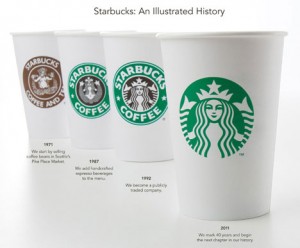
In celebration of their 40th birthday, this year, Starbucks have ditched the white-on-green lettering from the logo, just leaving a close up of the “Starbucks siren†on the front of their mugs. This is not the first time the coffee company has changed its look. As you can see from the image below, we’ve become more and more drawn to their ‘siren’ over the years. We originally could see her mermaid tails on show on the icon.
Talking about it on their website, the interactive content manager said, “For communication professionals and design nerds like me, this is an exciting time. Watching the reaction to any new logo is fascinating, because people can hold such passionate attachments to these marks.â€
PEPSI
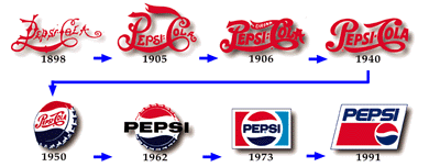
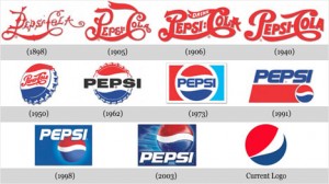
Another popular drink, Pepsi last changed their logo three years ago which was apparently motivated by a significant drop in sales. Pepsi chose to simply slant the white stripe on their red and blue circle making it look more like a smile. On AdAge.com, Indra Nooyi, the Chairman and CEO of Pepsi described the brand change as “every aspect of the brand proposition for our key [carbonated soft drink] brands. How they look, how they’re packaged, how they will be merchandised on the shelves, and how they connect with consumers.†Whether it was liked or not, the rebranding caused much commotion among many consumers which, of course, brought it much needed attention.
APPLE
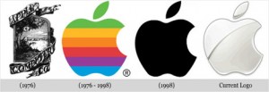
What started off as a humble computer company with a colourful apple has grown into one of the biggest multinational corporations of our time, with products such as the ipod, iphone and ipad being popular on a global scale, not to mention the Mac computers and laptops. With this massive popularity in mind, it makes sense that they’ve never had to change their Apple logo much. Although looking at the image on the left, you will see their original logo was quite old fashioned and very busy compared to the dynamic recognisable icon we know these days.
NIKE
A running theme in all of these designs and other famous brands is that they no longer need the name of their company within their logo. The logo becomes an icon and when that logo is out of date or the company is stuck in a rut, there is always plenty of ways to spruce up their icon to something even slicker.
Obviously, these are just a few examples. But they all show how logos need to change with the times to stay current. Something important to every business.


