You do not need to be a fine art connoisseur to know about the Louvre and those masterpieces this museum possesses. Nowadays, you cannot come across so many artists as it was in the days of da Vinci. With the way technologies have rushed in our lives, artists have been replaced by the occupation that isn’t less creative or fascinating: graphic and web designers. If previously artists painted pictures, now designers create posters. Some of them are so ingenious that should take well-deserved place in the Louvre among other world’s pieces of art. DesignContest offers you to visit our own digital poster Louvre and enjoy the magnificence of those designs (and their creators).
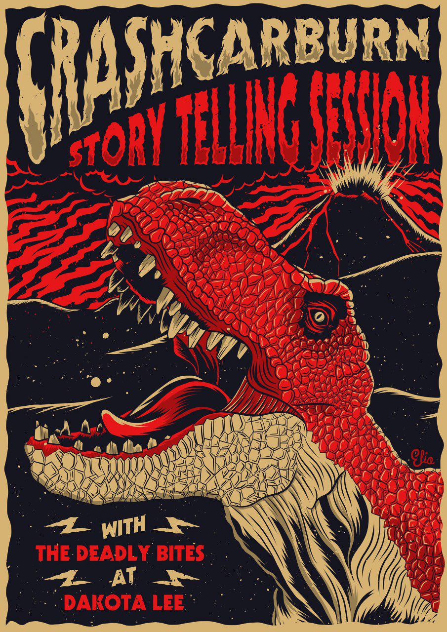
1. Elio Moavero: the art of making posters spooky
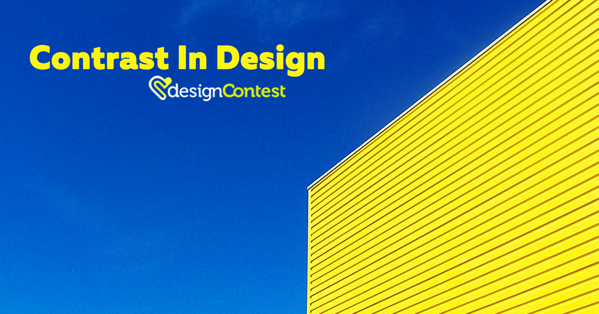
When people seem to have seen everything, it becomes impossible to surprise them, let alone to frighten them with a simple poster design. However, Elio Moavero succeeds in this task. Take a look at the poster designs made by Moavero and you will understand that playing with characters and fonts can bring some unusual results. While designing a poster, you don’t need to use a wide variety of colors to make your design sell. Similar shades and playing with the contrast should be more than enough.


2. Mika Makinen: the art of making posters airy and light
Oversaturated and heavy poster designs are opposed to those light and airy ones created by Mika Makinen. Smooth colors, bold typography, and an unusual placement of design elements: this is the key to these poster designs success. The way geometry is used to design these posters proves once again that shapes and figures will never bore people due to the countless options that can be implemented in a poster design.


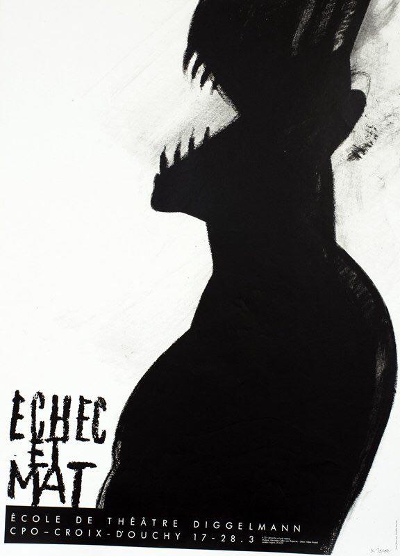
3. Werner Jeker: the art of making posters look floppy
Talking about serious things in a nonserious way is also a kind of art. This kind of art is greatly produced by Werner Jeker. The posters created by this graphic designer are strong and eloquent, with dozens of tiny details hidden inside. Combining the reality with fictional scenarios, this design will show you more than you expect.


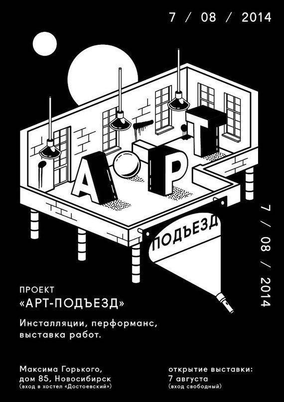
4. Тимур Zima: the art of making posters look bold
The color black seems to be the best solution when you want to hide something. Or, on the contrary, to reveal. This color is capable of turning posters into incredible pieces of art. Playing with shadow, volume, and content allows Тимур Zima to impress each and every person who sees his posters..


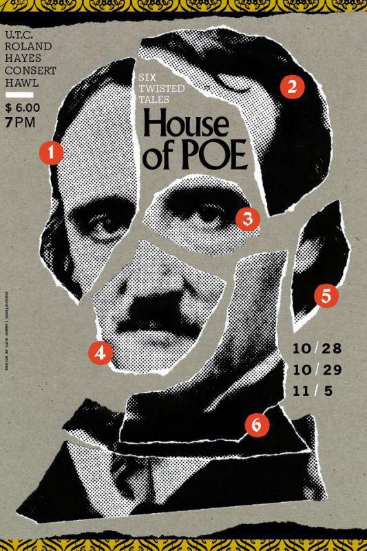
5. Zach Hobbs: the art of making posters look alive
The poster designs created by Zach Hobbs express more than one could expect. They fascinate, intrigue, and mesmerize. This designer uses faces to bring his designs closer to life. At the same time, this technique makes these posters abstract, a bit weird, but not less gorgeous.


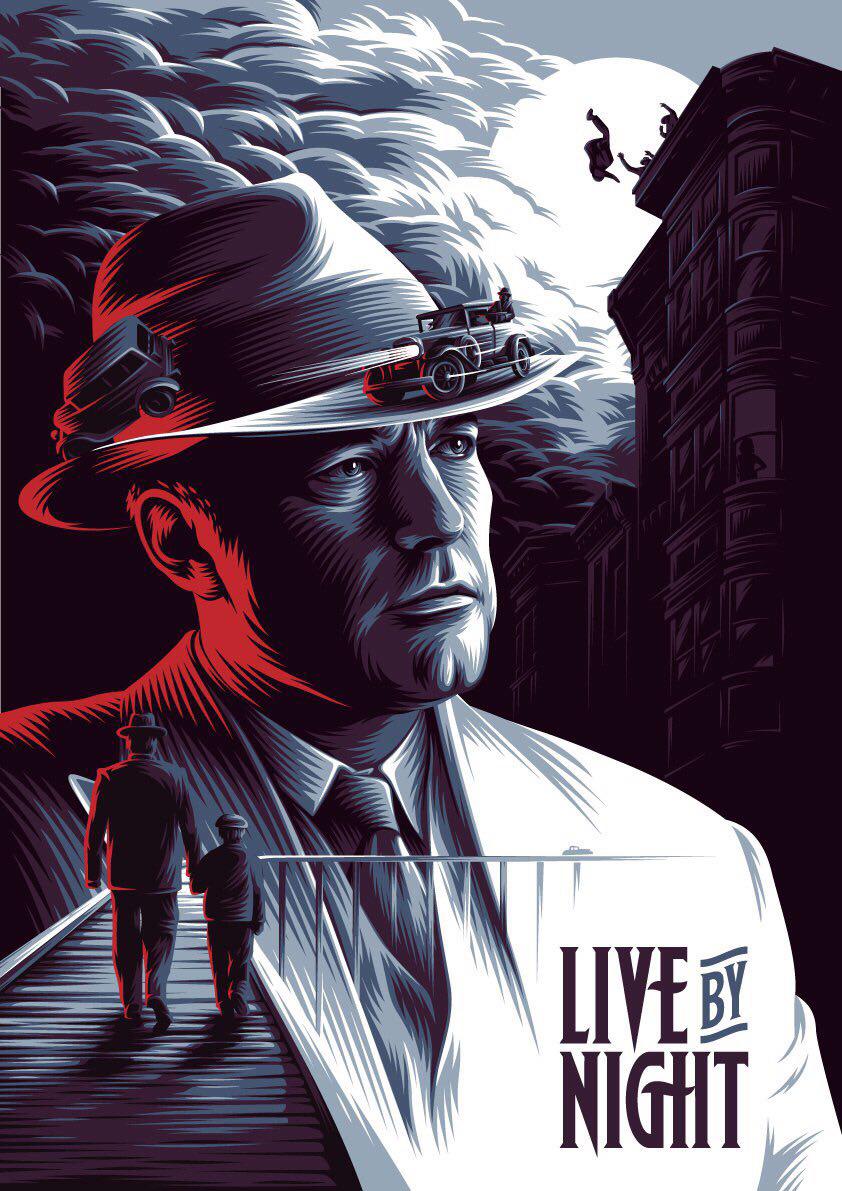
6. Леша Рикошет: the way to make posters catchy
If you have designed a movie poster at least once (or have needed one for your own movie), you know that the more details from the film you manage to depict, the more intriguing your design will be. These poster designs are a “printed” proof of that. Different colors, different characters, different special effects, and just one result: splendid custom poster designs that can rarely be come across.


7. Michael Crampton: how to make posters look nostalgic
Retro designs never go out of fashion. They look stylish and fashionable, and yet they have a sparkle of old-fashioned creativity everybody needs. That is why these posters carry a shade of nostalgy as well.


Bottom Line
Want to have a custom poster design worth everybody’s admiration? Launch a poster design contest on DesignContest and enjoy the creativity from all over the world!