A logo should shout who you are, nothing less. It is then crucial to take the time to create an emblem that will represent you and your values well. But what is the line between a good logo and a bad one? What can you do to maximize your chances of succeeding during the logo creation process? Here are five mistakes to avoid if you want a professional-looking logo.
Do Not Follow Trends Blindly
The first rule you should follow when creating a logo is not to follow trends blindly. Trends can help you find inspiration and stimulate your creativity; however, logos that focus only on fads often have the disadvantage of aging most of the time badly. Do you remember how the Airbnb logo used to look like? It smelled the 2000s with its bubbly font. Instead of looking for the newest or more popular trend, you should aim for a timeless logo. It is one of the recurrent criteria that we find in many logos of prominent companies today. Besides, you will not have to have many rebrandings if you start with a more classic logo than a trendy one.
Logo Doesn’t Rhyme with Rainbow
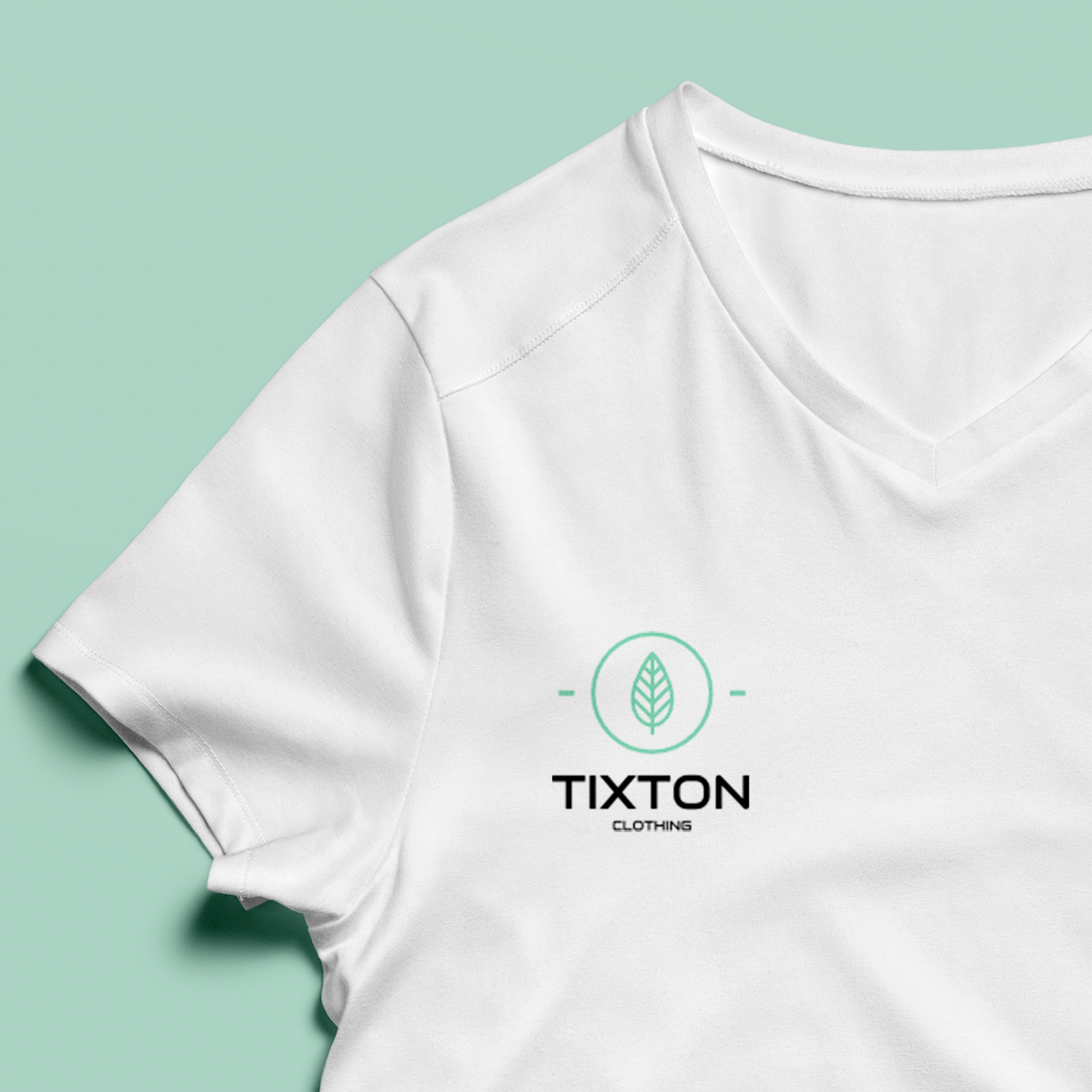
When creating your logo, you might need to choose the colors that suit best your brand and your company. First, did you know that colors have meanings? For instance, red symbolizes courage and passion, yellow represents wealth and joy, and purple is associated with spirituality and royalty. Choose the colors that fit your values or your products. Moreover, you should not choose more than three colors when making a logo if you want it to look professional. Have you ever realized that most business logos have three or fewer colors? It is because it is difficult to work with many nuances at once and it often looks chaotic. It is even the reason why Slack needed to rebrand their logo last year!
![]()
Too Many Fonts Is Like Not Enough
In a similar vein, you should not use more than three fonts when creating your logo. More than that will mostly give an unbalanced result. If you need to use fonts, it is totally fine, but choose some that are readable. You might have to try many fonts too before finding the perfect one. Do you know the difference between serif and sans serif fonts? In short, a serif font is a font with little extensions creating a line that ease reading. They are mostly used in books or prints. Sans serif fonts, on the contrary, are fonts without these extensions and have the advantage to be better for computer screens, as well as seen more accessible. Why not try a sans serif font for the title and a serif font for the slogan or vice versa to maximize the effect?
Keep It Simple
Sometimes less is better. What makes the logos of businesses like Target, McDonald’s or Apple great? Amongst other things, it is because they are simple! There are many advantages to making a simple logo. First, it is easier to use it on different mediums. Your logo must be as flawless on a Facebook page than on a printed document. Second, it is easier to remember logos when they are simple. Today’s trend is simplicity and minimalism. It is why businesses like Starbucks have chosen to rebrand their emblem without all the small details.
![]()
It’s Your Logo, Not Someone Else’s
Why are you making this logo? It would help if you were making a logo that represents your business well, as much as its values. Therefore, you should take the time to think about what you want your logo to represent before touching a pencil. Sometimes, the relation between a logo and its meaning is awkward, as we have seen in the past with the rebrand of Cardiff’s football team, for example. This team called the Bluebirds ended with a logo with a red dragon for a while. On another topic, even if it could be tempting to copy famous logos, it is something to avoid. They can inspire you but everyone will doubt your credibility if you use a version of Apple’s logo in another color. Dare to be honest and answer your needs!
Let’s Wrap it Up
In conclusion, the sky is the limit in logo design. You only need to avoid those common mistakes and you should be able to create something great. Make something unique that will tell who you are at a glance. Feel free to look at different tools like Free Logo Design if you want to practice or find interesting articles on branding and design!