
Google is a universally celebrated brand, and possibly the biggest one in the world.
Over the years, Google has successfully experimented with brand extensions, viral marketing, public relations and, of course, an ever-evolving logo.
However, what may be most impressive is that a logo as recognizable as Google’s has been able to constantly evolve with the times.
So how did the search engine giant manage to stay so relevant as it adapted its logo design to changing trends? By following a cleverly devised strategy which we will explore today.
![]()
This was the very first Google logo. It was used purely as a test logo design during Google’s early days as a research project created by co-founders Sergey Brin and Larry Page. However, this primitive GIMP-based design would soon evolve into the Google logo that we so easily recognize today.
The Primary Spectrum
Two versions of the “primary-colored” Google logo then followed. One utilizes a more subdued look, while the other pops with its Baskerville Bold Typeface, 3D effect, and famous exclamation mark!
The exclamation point logo is still used today on special occasions when the company reflects on its earliest days.
![]()
![]()
Designer Ruth Kedar
No piece on Google’s logo would be complete without mentioning talented designer Ruth Kedar. Ruth introduced the Google brand to fresh interpretations and dabbled with a variety of intelligent and quirky logo designs.
In the first, she used Catull font and tinkered with using designs in the logo’s two Os while employing black and greyscale. Ruth is also responsible for adding the supplemental purple color into the mix and including a magnifying glass to signify a search. Though Ruth introduced creative new concepts, none of her designs were selected as the official logo. However, it’s still interesting to see what this innovative designer came up with.
![]()
The Final Cut
The first official Google logo was introduced to the world in May 1999.
It’s very similar to the original design, yet more refined. The logo uses deep, rich colors while also utilizing a more minimal shadow effect on the lettering.
The original Google logo showed true staying power, serving as the brand’s official logo for the next 10 years.
![]()
The Two-Dimensional Logos
In September 2013, Google adopted the use of two-dimensional logos, opting for a look that would be easier to load, read, or print out. This, of course, meant the complete removal of any shading or 3D effect. But that was not all…
The first adaptation of the flattened Google logo had a few minor adjustments from the earlier logo. The second flat logo, introduced two years later, was altogether different.
Flat logo Type A
![]()
Flat Logo Type B
For this special version of the two-dimensional Google logo, the Google design team created a new font called Product Sans. Product Sans is a Google-owned geometric sans-serif typeface that has become an industry staple. It makes use of bold lettering, which adds density to make up for the lack of shadow, and it looks like a unique work of art.
Have a look!
![]()
The Google Doodles
Though Google’s doodles come and go, the concept is a ground-breaking one and cannot be separated from Google’s brand identity.
Google began this tradition for the Burning Man event in 1998 as a warning to Google users about the possibility of a server crash due to high traffic!
![]()
Since then, the witty idea grew to include many events, birthdays, holidays, achievements, and tributes. Naturally, as doodles became more popular, the quality and intricacies of each design increased.
In 2010, as a tribute to the arcade game Pac-man, Google displayed its first interactive Google Doodle. This genius idea drew almost 1 billion players worldwide.
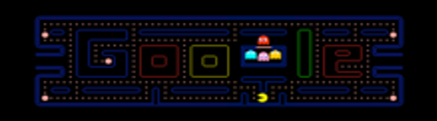
Post Pac-Man, there have been numerous video doodles launched by Google. Occasions for these included John Lennon’s 70th birthday, the 2012 Summer Olympics, and the 40th Anniversary of the Rubik’s Cube, to name a few. On Halloween 2018, there was even a doodle on Garden Gnomes!
By 2019, the creative artists at Google had developed more than 4,000 different homepage Doodles.
The Google Favicon
Today, the famous Google stand-alone G is as legendary as the company’s name logo.
Though linked intrinsically to Google’s main logo, the favicon has its own identity and evolution path.
From 1999 to 2009, the favicon design was a simple uppercase G in the red, blue, green palette against a white background. But in June 2008, Google announced a favicon designing competition which was won by Andre Resende, a Brazilian Computer Science student. That winning design is the left aligned G you see above, chosen for its attractiveness, high memorability, and strength in portraying the Google brand.
Conclusion
The strategy that stands out from the Google logo’s dynamic journey largely revolves around sticking to the basics while tweaking minor characteristics of the logo as the brand grows. Why overhaul something that’s already working?
The only drastic change we’ve seen in the past decade was in the second version of the flat Google logo. For this, Google took the step to create its very own new font!
It will certainly be intriguing to see the next steps in Google’s carefully devised logo evolution process.


