Your logo is a visual representation of your brand. It helps you create a strong first impression and sets the tone for your quality of service, core values, mission and vision, and much more.
Unprofessional logos will make your potential customers and investors question your credibility. Chances are, if they open your website and see a poorly-made logo, they will leave immediately. Investing in good logo design is important as it helps you establish credibility, connect with customers, and empower your business.
Whether you’re setting up a business or planning on giving your current logo a makeover, these tips and tricks will help you design a logo that will stand out.
8 Tips for Designing a Great Logo
1. Mix Caps and Lowercase
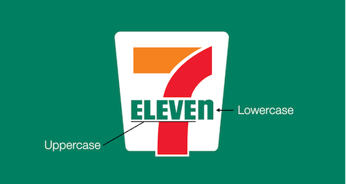
Good design is in the details. All-caps logos were the norm in logo design ten years ago, but the trend has taken a turn. Now, brands are opting for lowercase. Uppercase logos are associated with authority, while lowercase gives off a more casual vibe.
Brands like Facebook, Citibank, and Intel have dropped the first-letter capitalization in exchange for lowercase logos. But, this doesn’t mean that you should entirely abandon capital letters. You can play around with both caps and lowercase by utilizing the latter to soften the tone of your logo. Ultimately, capitalization rules depend on your brand identity and the kind of connection you want to build with your audience.
2. Balance Your Tagline and Name
If you plan on including your tagline in your logo, it’s best to stick to a tagline that is less than thirty characters. Anything longer than that, and your logo will look like a PowerPoint slide. The golden rule is to make sure that your brand name always takes the spotlight. Use a thinner and smaller font for the tagline, and a bolder font to emphasize your brand name. One thing to always keep in mind is to make the brand name occupy more space than any other text in the logo.

3. Frame Your Logo
Some logos look significantly better when they’re framed inside a shape, such as a square, circle, or triangle. If you plan on designing your logo in this style, be sure to give your logo space to breathe. There should be enough space between the logo and the frame so that your logo doesn’t look crowded. One great example is Uber’s logo, which simply features the word “Uber” within a black rectangle. The text is placed right in the middle of the shape with a consistent distance from the edge of the text to the border on all four sides.

4. Imagine Your Logo in Action
When creating a logo, it’s a good idea to think about how it is going to look when you print it on a shirt, slap it on a notebook as a sticker, or use it on your company website. When designing a logo, you should consider its intended use. For example, if you’re designing a logo for a coffee shop, try to see if it’s going to look good on a coffee cup. It’s a good idea to create several versions of a logo, including one with a transparent background. This way, the logo can easily be used on brochures, posters, t-shirts, and other marketing materials.
5. Think Timelessness
The cost of a logo can range from $100 to $1,000 or more depending on the complexity of the job. Since logos don’t come cheap, brands and companies need timeless logos. Logos should be attractive and relevant for the years to come. When designing a logo, avoid following design trends such as gradients, crosses, and stick-figure pine trees. While these trends might look attractive to today’s market, they may only become archaic-looking in the next ten years. Even luxury brands such as Balmain and Burberry have changed their logo into more simplified ones in recent years.

6. Use Design Elements
Logos that purely contain text look sleek and clean, but they do little for visual impact. Your logo should stand out from your competition and be recognizable at first glance. Make use of design elements such as illustrations, flat icons, and other graphics to give your logo personality. For example, Target keeps its logo simple yet quickly identifiable by placing its name below a large, red target symbol. Burger King literally sandwiched their name between two burger buns, creating a welcoming symbol that invites customers to try their food.
7. Ensure Visibility
Even if you have the most stunning logo, placing it over a background color that makes it disappear will leave you with a bad design. Make sure that your logo is visible by choosing a background color that makes it pop. If your text is in white, go for a dark background color such as dark blue, deep red, or black. The key is to stick with contrasting colors.
8. Be Literal
Selling donuts? Consider putting donuts in your logo. Are you in the classical music industry? Go for adding design elements like a treble clef. Designing a good logo can be as simple as that. Sometimes, all you have to do is to be literal with your design. Even Apple has utilized this simple technique to create a timless logo that even toddlers recognize.
When being literal with your logo, don’t just slap on the first relevant illustration you can find. Try to be clever with it, like how FedEx hid an arrow between the letters “E” and “X” in their logo design.

Take Your Brand Further with a Good Logo
By following the tips above, you can confidently design a good logo that represents what your brand stands for. While there are free logo makers on the Internet, you can always hire a professional logo designer to create a truly unique logo that exudes professionalism and quality. The key takeaway is to make sure that your logo conveys your identity and message clearly and uniquely.