

Greetings,
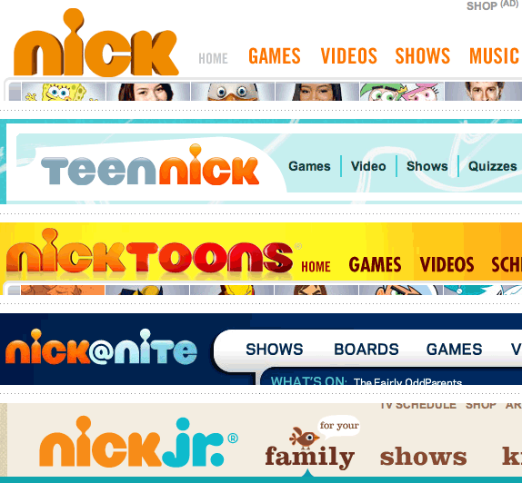
I was watching nick with my daughter and noticed the lack of slime and a new logo design. Nickelodeon would be a true designer's dream for branding!
You can check out the newest nick brand design here:
Nickelodeon cleans up: idsgn (a design blog)
I need some time to decide what I think. Perhaps some rainy days on the weekend with my daughter will help shape my opinion. But, my daughter likes the old logo better and I am not the target audience, right?
Cheers,
Brett
Nickelodeon cleans up!
Greetings,I was watching nick with my daughter and noticed the lack of slime and a new logo design. Nickelodeon...
&nsbp;
#2

DesignsbyALX
-

- Designer
- 65 posts
Member
Posted 02 October 2009 - 09:38 PM
I think the old one was better, more playful and toony... Never change a winning formula 
#3
Coy
-

- Designer
- 2534 posts
Elite Designer
Posted 02 October 2009 - 09:42 PM
noticed the change when I was waching it myself. lol
I don't like/dislike it I'm kinda neutral. The kids really didn't notice though, untill I pointed it out. Now if spongbob turns green or something they'll think something is wrong with the tv. hahaha
I remember the first one that had the rainbow colors.. dang I'm old.
I don't like/dislike it I'm kinda neutral. The kids really didn't notice though, untill I pointed it out. Now if spongbob turns green or something they'll think something is wrong with the tv. hahaha
I remember the first one that had the rainbow colors.. dang I'm old.
#4
Geko
-

- Designer
- 77 posts
Member
Posted 06 October 2009 - 05:24 AM
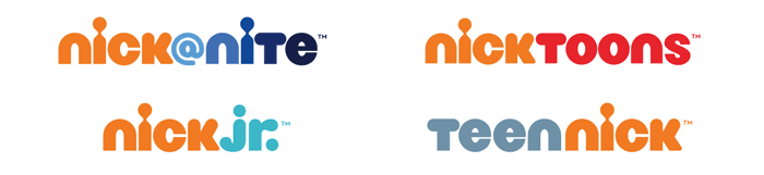
I got used to the old logo, the new typeface looks weird, maybe it would work for their subrand teennick or something, I like the idea tho. Having a single "nick" will get all the subrands identified as nickelodeon brand.
Love the color since im a orange fan
Love the color since im a orange fan

#8
TheNutz
-

- Designer
- 57 posts
Member
Posted 12 October 2009 - 11:39 AM
i'm not in the target but i love it.
look at this http://www.idsgn.org...sisters-new.png
the only problem i see is that it doesn't look good on small size
look at this http://www.idsgn.org...sisters-new.png
the only problem i see is that it doesn't look good on small size
#9
jmillgraphics
-

- Designer
- 20 posts
Junior Member
Posted 22 October 2009 - 12:30 AM
I super love the new logo. The old was good too, but the new one is great. I have a 3 year old son, and let's just say I get to watch a lot of Nick and Nick Jr. lol. I think the new logo fits very well with their identity and campaigning. They talk about families and kids doing things fun together, and I think the new identity does a good job of showing family. The old one was aimed more at just the kids. Besides it could be worse (ack... ah...pepsi... guah ah.. ahem) LOL.
J
J
Edited by jmillgraphics, 22 October 2009 - 12:32 AM.
forgot to add something
#10
monimen
-

- Designer
- 10 posts
Junior Member
Posted 23 October 2009 - 10:57 PM

The Brand name is too long and 1 long word.. It needs a logo rather than a logotype.. old one's splash was not unique but it also was a logo.
And the result its nickelodeon.com goes to nick.com :
Ok, here is the idea, they gonna cut the name to "Nick" .. how creative ... :|
#11
shefshef019
-

- Designer
- 131 posts
Senior Member
Posted 24 October 2009 - 09:40 PM
The new logo just doesn't have enough personality. I think the classic splat (or sometimes a blimp or other shape) makes perfect sense for the fun channel that brought us Doug, Double Dare, Rocko, and Ren & Stimpy. The new logo seems to bland and conservative. Powdered Toast Man would not approve 
Designs by Jenna Sheffler: Professional portfolio
Design Intervention: Freelance graphic and web design
Technicolor Carnival: One-of-a-kind handmade jewelry and gifts
Design Intervention: Freelance graphic and web design
Technicolor Carnival: One-of-a-kind handmade jewelry and gifts
#13
zugraphi
-
- Designer
- 4 posts
Apprentice Designer
Posted 03 November 2009 - 12:11 PM
If I may add my opinion to the discussion, I feel the logo on it's own is not as strong as the old one, but as a logo family, I think the whole system is very recognized while maintaining a good shift from one subrand to another.
#16
stratopeter
-

- Designer
- 10 posts
Junior Member
Posted 09 August 2010 - 08:56 AM
I think the old one was more concise and fun. The new logo looks just like any random toy manufacturer. It reminds me a bit of playmobil ( http://upload.wikime...aymobil.svg.png )...
And I'd also never associate the i with the outline of a child (which is written in the article)... Our perception is so conditioned to look at letterforms that a small change in a letter just doesn't have enough strenght to be seen as something different. At first I thought it was a reference to the old logo because it looks like the point of the i drops of the stem.
And I'd also never associate the i with the outline of a child (which is written in the article)... Our perception is so conditioned to look at letterforms that a small change in a letter just doesn't have enough strenght to be seen as something different. At first I thought it was a reference to the old logo because it looks like the point of the i drops of the stem.
#17
braja
-

- Banned
- 12 posts
Banned
Posted 09 August 2010 - 11:49 PM
For me, the old logo is iconical. Even at large distances, I know what it is.
(I think this is also the case with others)
If something "must" be changed, possibly I changed the interior of the logo. Maybe just a short name?... (As someone already said)
Splash would certainly kept!
For example, McDonalds. There are a hundred variations, but one distinctive thing never changes.
(Maybe not a good comparison but now it's my thought)
Please consider, not twice ... many times before you decide.
Regards


1 user(s) are reading this topic
0 members, 1 guests, 0 anonymous users
