
Hawk Logo
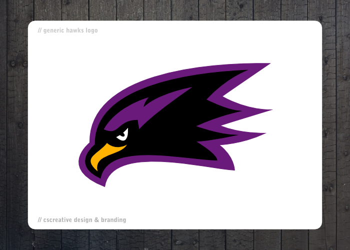
Hey guys. This is a logo for a hawk mascot, pretty much for any sport team. Let me know what you guys think:
&nsbp;
#3

lilpolcat1
-

- Designer
- 19 posts
Junior Member
Posted 05 April 2010 - 06:03 PM
I like the simple lines of it. But thinking it would look better with the inner "yellow" beak matching more to the flow of the purple outline. Cheers

#4
cclark413
-

- Designer
- 137 posts
Senior Member
Posted 12 April 2010 - 07:17 AM
I like the direction, but just a couple of things that stick out...
Outer stroke seems much to thick to me... I think maybe just half the thickness will better present the piece.
Also, most of the curves seem to "straighten out" throughout the logo. I think playing with the flow of your curves may help with the logo.
As far as the beak, I agree with lilpolcat1. Make the beak a little fuller and match the shape to the stroke you have. That will help.

#6
aset
-

- Designer
- 113 posts
Elite Designer
Posted 29 April 2010 - 09:35 AM
I like the colours and as Coy said it just needs a little something.
To me it doesn't look all that fast and dynamic like a hawk is meant to be.
Maybe needs some speed lines or something?
Have a look at the Atlanta Hawks logo should give you some ideas.
To me it doesn't look all that fast and dynamic like a hawk is meant to be.
Maybe needs some speed lines or something?
Have a look at the Atlanta Hawks logo should give you some ideas.
#7
quentinb
-
- Designer
- 10 posts
Apprentice Designer
Posted 02 May 2010 - 08:15 AM
It's simple, but nice as coy said..personnaly, i don't think those yellows and purple colors feat with a "hawk's image" i'd think about more dynamics, agressiv colors, like red, blue, but it's just my personnal point of view..anyway, i think it's a great job!

#11
mullethead
-

- Designer
- 11 posts
Junior Member
Posted 05 May 2010 - 01:59 PM
Nice job man! Totally looks really cool. Everything looks perfect to me, but the beak and outer part of the mouth don't seem to have the same flow. I think if you tweaked that area this would come out really flawless. It's definitely a keeper.
#12
KihnDesigns
-
- Designer
- 11 posts
Junior Member
Posted 07 May 2010 - 05:09 AM
I think the thing that stands out to me the most is the eye. While yes the outer stroke does look a little heavy, the eye looks "droopy" or "sad" in some way. I think if it was changed to more of the shape of one of the eyes that "aset" showed, it might make things flow better... you could also try flipping it so that the back is thicker than the front, don't know if it will work, but it might be a quick fix

#17
cmor
-

- Designer
- 12 posts
Junior Member
Posted 14 May 2010 - 05:57 PM
I agree with many of the posts concerning the beak, it needs to be thicker to show the Hawk, also the outer stroke is quite thick, maybe tone it down just a shade, the one thing I would mention is rotating the entire image up to the left (as looking at it) to show more of the Hawk Pride, instead of looking dow n, as if hunting. All in all, beautiful work.
#19
digitalmighty
-
- Designer
- 13 posts
Apprentice Designer
Posted 30 May 2010 - 04:10 PM
I like it too... some of the suggestions people have made may be worth exploring (making the beak bigger, the lines more speed-implicative). My first thought was "nice, but I'd like the see the purple spot inside the bird be something different". Not just because it's so dark and similar to black, but because it matches the outer color, making it like a "hollow" bird, know what I mean?
Anyway, good work so far - I bet you could make it even better with a couple of tweaks.
Anyway, good work so far - I bet you could make it even better with a couple of tweaks.


1 user(s) are reading this topic
0 members, 1 guests, 0 anonymous users
