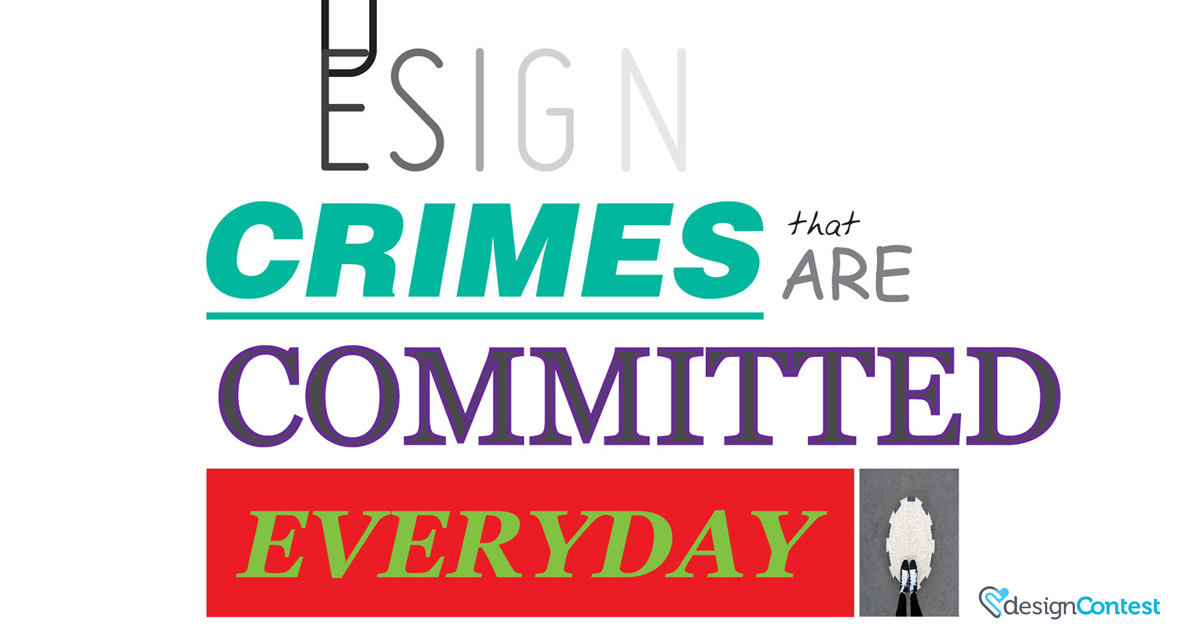
Brace yourself, for this article is going to be painful for the artist and designer in you. Angela Liao, of 20px has illustrated common mistakes (and annoyances) in graphic design.Â
Take your time, let it sink in, and see how many mistakes you can spot:
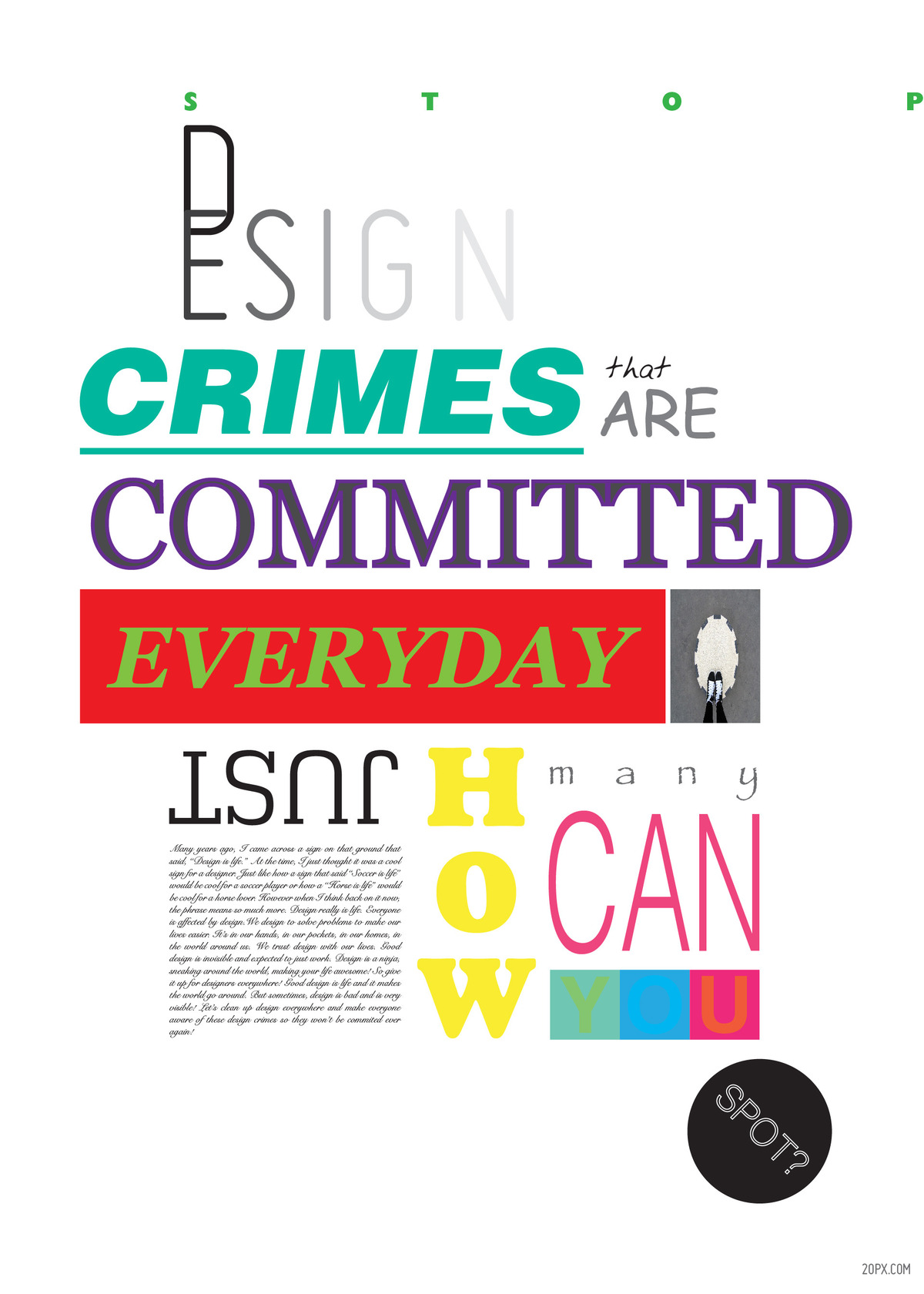
I’m sorry to have put you through this experience, but this illustration is a clever way to bring up the inevitable – DESIGN CRIMES. You know you spot them occasionally; communing to work, observing billboards, judging websites. If you’re aware of the mistakes, it’s much easier to acknowledge them and avoid the possibility of committing the crimes.Â
Common Design Crimes
If you haven’t found all of them yourself, here are the ones we’ve picked up:
Bad kerning
This is perhaps the most painful one. Kerning is an actual skill! The process of adjusting the pacing between letters to achieve visual harmony is no easy task. Here’s an excellent example that proves the point:Â
Wrong typography
No matter what typeface you choose, you know it will communicate something. So choose wisely!
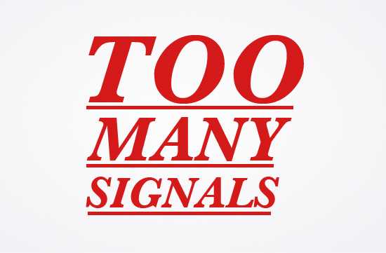
Too many signals
Bold. Red. Underlined. Italicized. This is just painful.
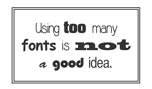
Font overload
Too many fonts is overwhelming to the eyes. Perhaps it’s the first thing you noticed in the design crimes illustration…
Wrong color choices
You can scare off your audience with a simple tweak of a shade, or plain awful color choice.Â
 Â
Â
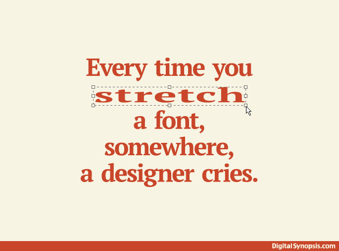
Stretched fonts
Did you know…
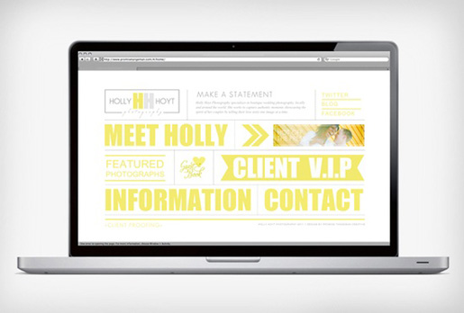
Clustered design
Even if you have an overwhelming amount of information to work with, use grids and guides to keep things balanced make the most of negative space to avoid making a mess.
There are so many things wrong with the humorous illustration, it’s impossible to pin point all of them. How many did you find? Leave your answers in the comments section below!