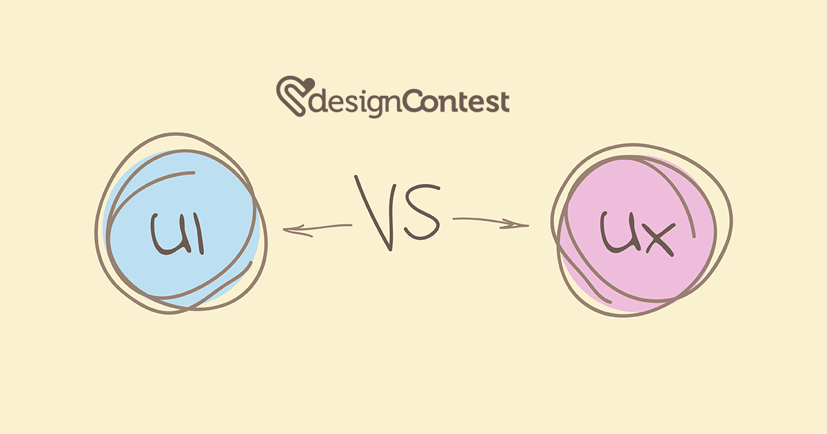
For people who belong to nowadays’ developed nations, having a smartphone is as trivial as having dinner or wearing socks. We need smartphones for both our work and personal lives. We need them to keep in touch with our friends, to stay up-to date to the work issues, and to know where our kids are. Some people have more than one smartphone; Paris Hilton has four. No wonder that designing various mobile apps has become such a profitable business. While others try to impress users with unusual icons (which is already a losing game because icons should influence people’s intuition not imagination) or fluorescent colors (which would never help for people’s eyes will easily get tired), you may pull a shrewd move and think of thrilling people with something far more common: dial-pad design.
Dial-pad design: back to the future
Back in 1950, the American company AT&T conducted a research trying to come up with the most convenient way to place the phone dialing buttons. The respondents were offered 16 options and chose the one we’ve been using even today (with some minor variations). It used to be rather favorable. However, due to the fact that now most people hold their phone with one hand and dial using a thumb, the numbers 1-3 are out of a thumb reach. Thus, 15 other ideas expressed in 1950 may come in handy again.
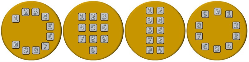
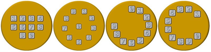
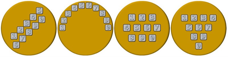
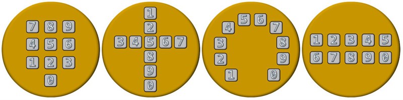
Unusual dial-pad designs
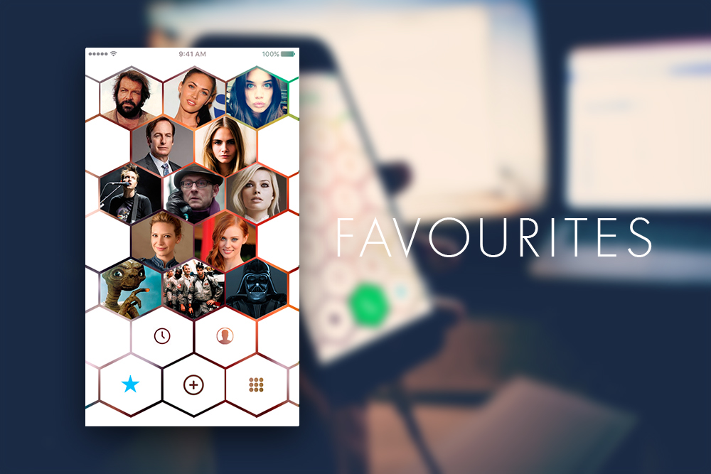
Dial-pad design: bee’s cells
Design inspired by nature is the most powerful one. It appeals to people because it seems to be the most organic and complementing kind of design. It’s built on associations and, therefore, is bound to be successful. No wonder that S. D., a designer on Behance, has turned a dial pad into bee’s cells. This way, dial pad looks far more entertaining and engaging. Though the numbers are placed in a different way than we got used to, it doesn’t create any imposition. This is a great example of how to make a dial-pad design not only user-friendly but also really fun.
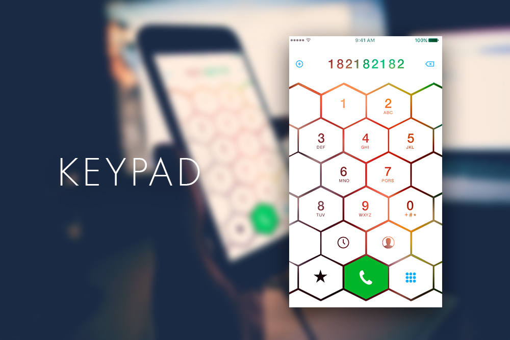
What’s more, with the help of natural elements you can give your dial-pad design a different, fresh perspective.
Animated dial-pad design
Dial-pad design is a logical continuation of a mobile material design. Which is why the animation that replaces flat design is so desirable. Highlighting buttons as it was before isn’t enough anymore.
To face today’s strong competition in the sphere of mobile apps’ design, the animation you use for a dial-pad should be expressive but not aggressive. Taking into account the fact that animation is also one of the biggest design for the upcoming 2018, you should do your best: if done properly, the dial-pad design created by you may set trends for the future generations.
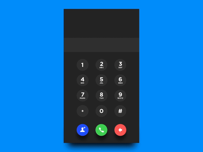
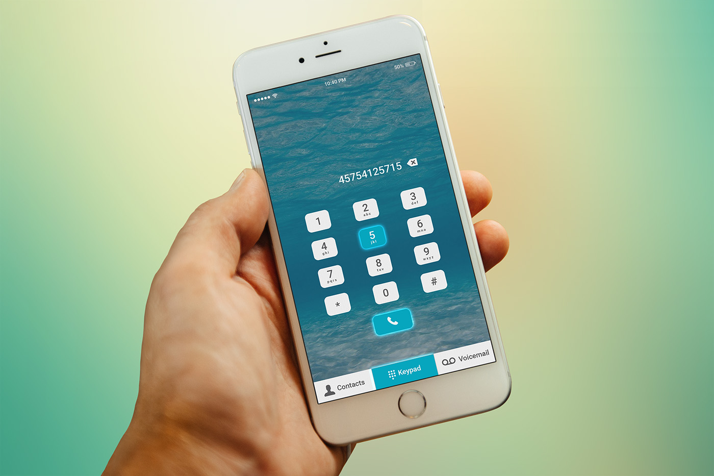
Dial-pad design: eye-pleasing view
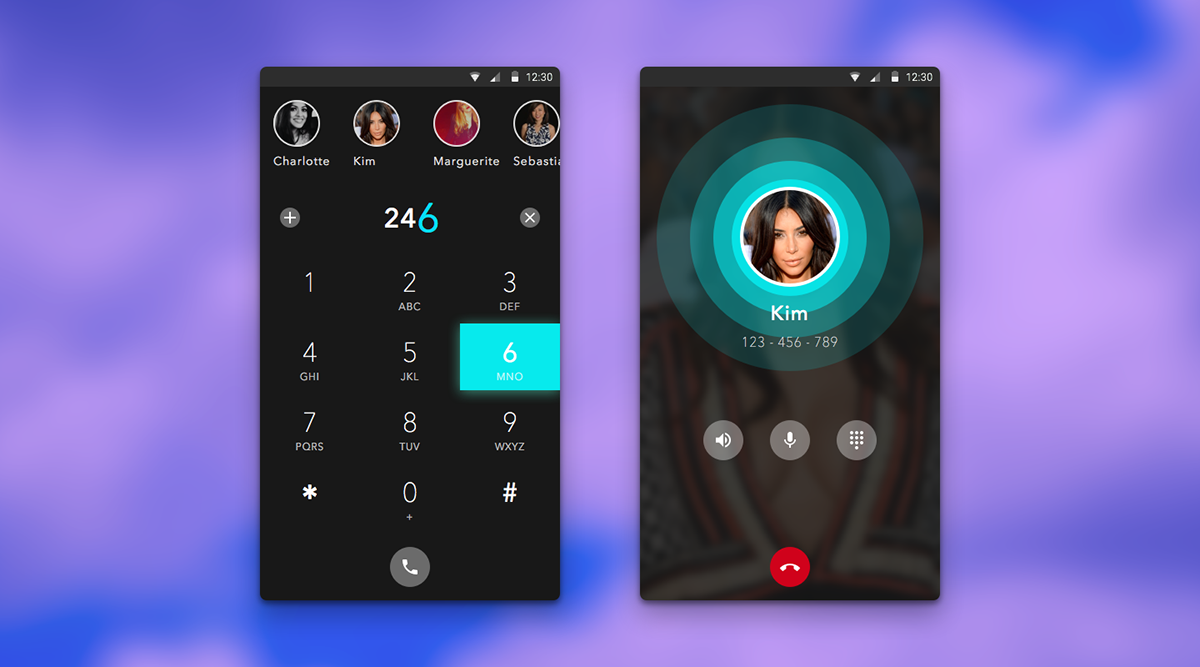
If you haven’t realized it yet, dial-pad design is a very bold and crucial expression of UI design. That’s why it is often lead by beautiful color combinations. Picking great shades is one of the main points on the way to success when it comes to dial-pad designs: users love with their eyes. The colors chosen for a dial-pad design may be pastel, calm, and peaceful. At the same time, one may use dark colors that will highlight the numbers even more.
Dial-pad design: unusual shapes
Get ready to some experiments. Everyone got used to seeing round buttons used to create a proper dial-pad design. This has become as much trivial as boring. That’s why square-cut or triangle buttons promise to win the market in the nearest future.
Bottom line
Dial-pad design is an inevitable part of any mobile design. With the rapidly changing world and the fast technological progress, it’s extremely hard to catch up with the progress, let alone being ahead of the progress. Nevertheless, dial-pad design is a tiny mobile design element that helps you to foresee the changes that are going to happen in the rest of mobile design spheres.