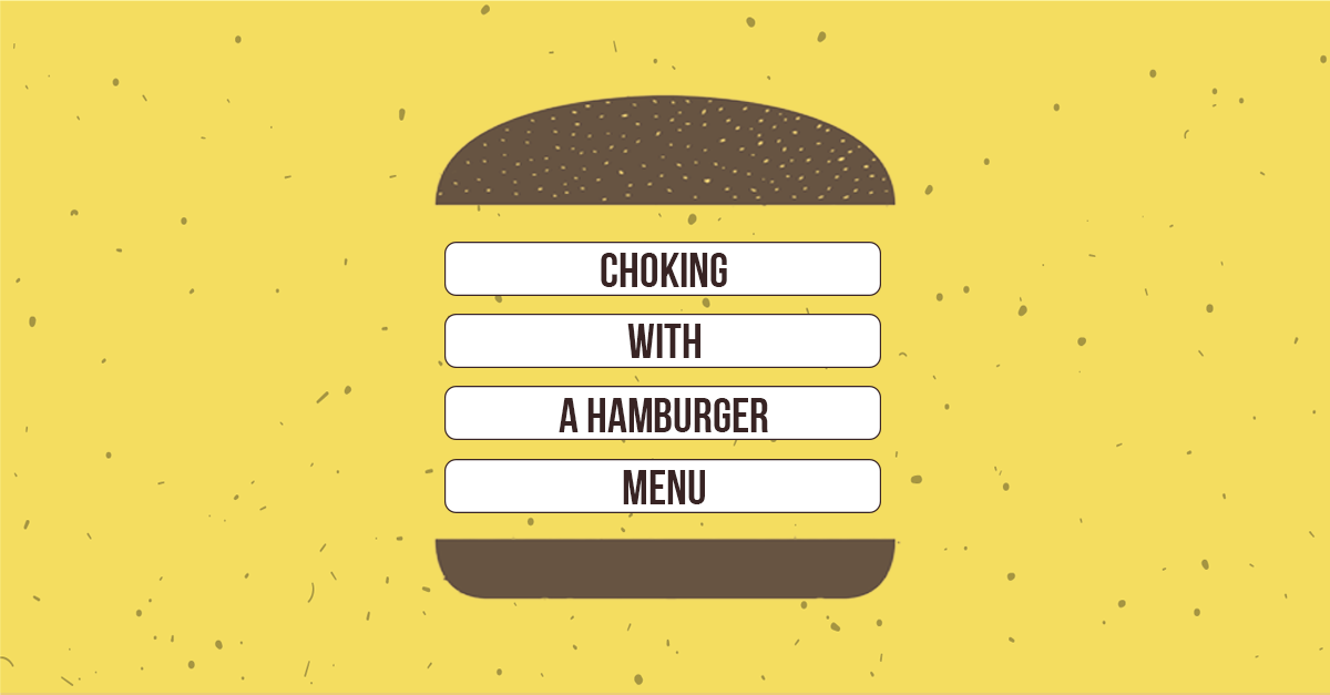
What are the key features almost every website has nowadays? A logical sitemap, a good hosting, a social media integration, reasonable FAQ, a mobile-ready version (with its responsive web design). Oh, there is something else we’ve forgot. A site menu. In most cases, websites use Hamburger menus so that people start choking with them. Nevertheless, there is always a way out. If you’re sick and tired with hamburgers on every website and want yours to distinguish, DesignContest has prepared hamburger menu alternatives for you.
Bottom navigation
Bottom navigation is one of the best user-friendly alternatives to a hamburger menu. Unlike the cases when the navigation menu is fixed on the top (which is also kind of boring), bottom navigation is quite convenient. It looks clean at eye-level and, if you’re opening the website on your mobile device, it’s thumb-reachable (which means your users don’t need to make any additional movements to press any of the bottom navigation button). The tabs you use there can also be a part of your dropdown menu which allows you to hide more elements and save more space.
Takeaways
One of the excellent examples of the websites that use a bottom navigation is LE ROCKWOOD. The website is devoted to the world of fashion, so there is no wonder it looks superb, with its smooth passes between the website’s blocks and large background photos.

The main thing you should remember is that your bottom navigation menu should coincide with the whole website’s theme. As you see, LE ROCKWOOD uses a white background for its navigation bar along with some white elements to match all the web design elements.
Interactive navigation
Sometimes, no menu at all is the best option. Instead of using a hamburger menu for your website or mobile app, you may think of an interactive navigation. This is the type of a solution that makes people say WOW if done correctly. It leaves room for your imagination so that you aren’t limited with anything but logic. People will be spending much more time browsing your website if you manage to compel their attention (even with the help of such a trivial thing as a navigation). This is a complete contradiction to trivial hamburger menus.
Takeaways
LITTLEFRAGMENTS is the website that has decided to go for a very unusual navigation type. Apart from an arrow navigation, it also uses other interactive ways that turn the website map into an experimental field and makes users spend more time trying to figure out what other opportunities are hidden inside the website.
However, using such type of navigation, you should be extremely careful if you don’t want to confuse your users. Remember the golden rule web design follows nowadays: the clearer, the better. If you use too much creativity and interactive passes, you can get a mish-mash as your final product.
Full screen navigation
A full screen navigation isn’t an easy thing to do. Firstly, it demands lots of space (and sometimes you either don’t have this space or don’t want to use it only for your website’s menu). Therefore, it is often combined with a dropdown menu to save more space. This hamburger menu alternative is perfect for those who need to operate with lots of buttons, tabs, and information.
Takeaways
The website Yelp has also refused from using a hamburger menu. Instead, all the menu components present a full screen navigation. Everything is done to facilitate the website for its users. The menu components are gathered close to each other in order for the website visitors to see them and to reach them.

Before using the full screen navigation on your website, you need to make several mockups to understand the best way to place the menu elements.
Bottom Line
If you want to try out something new, hamburger menu has lots of alternatives. However, sometimes easy things turn out to be the best solutions. Hamburger menus are simple, common and user-friendly. They save lots of space and make your website more accurate. Which is why don’t refuse from the idea with hamburger menus at once. Try out several options and see which one will truly work.