

You may have a beautiful website design; the perfect representation of your company but do you have an equally appealing business card? Your business card is also the face of your company, a representative of your business and a little piece of you.
Even in the digital age, business cards will continue to be a great tool for networking, acquiring new clients and introducing your business. You need to make wise design choices to make sure your business card catches the attention of your clients conveys the right message.
To make sure you nail it on your first try, follow these 5 general guidelines.
DO’S and DON’TS of business card design
Do opt for a professional design.
The design of your business card should be consistent with the design of your other printed materials. Do not settle for a generic business card design if you want to stand out from the crowd. A professional graphic designer will help you with a business card that reflects your personal or professional brand.
Do prioritise readability over creativity.
This point applies mainly to fonts. As tempting as it may be to introduce a ‘new’ font; decorative fonts can be hard to read. One of your main priorities is the readability of your card. Make sure your font size is not too big and overwhelming, as well as not so small that your potential clients have to squint to be able to read it.
Do make wise layout decisions.
The standard business card size is 3.5 x 2 inches. If you’re going with an unconventional design and size, it will stand out amongst other cards but may be difficult to store.
Your business card has two sides. Take advantage of having that extra space by filling it out with only the most vital information.

Do choose appropriate color schemes.
Aside from the legibility of the typeface, your color scheme and any other visual content will determine the success of your business card design. Bright, bold colors may grab attention, but are they necessary?
Keep your business in mind when considering the visual content and color schemes as, once again, consistency is key. Choose colors that won’t distract from your logo or key business information.
Do include only the most important content.
This is not a powerpoint slide; don’t cram information. The objective of your business card is to provide key information about your business and contact details. This includes your name (and/or your company name), website and email. Your potential client should be able to answer the basic questions (Who? What? Where? Why?) with a single glance.
DON’TS
Don’t use random visuals.

If you’re not sure what visuals to use, it’s best to not use any if they contribute nothing to informing your clients about you or your business.Â
Don’t use ANY of these fonts.
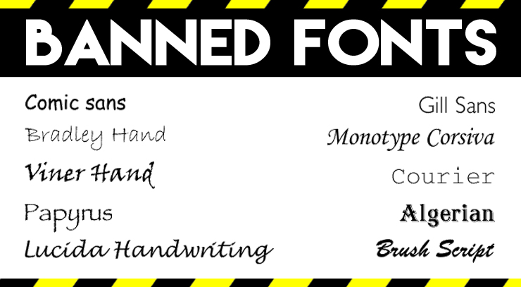
This point is self explanatory. Generally speaking, you should try to avoid irritating your future clients with a poorly chosen font.
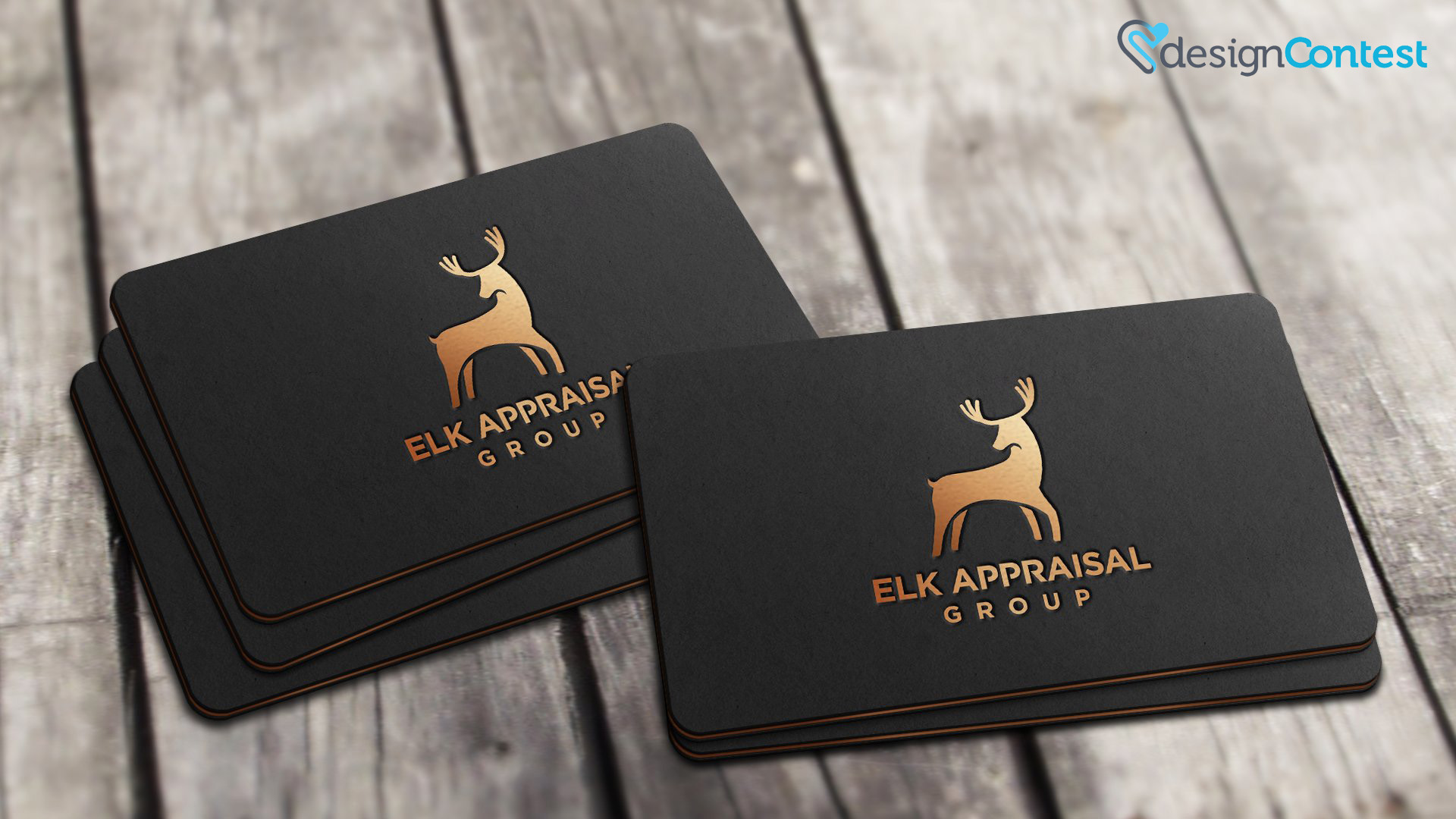
Don’t use UV or other glossy coating.
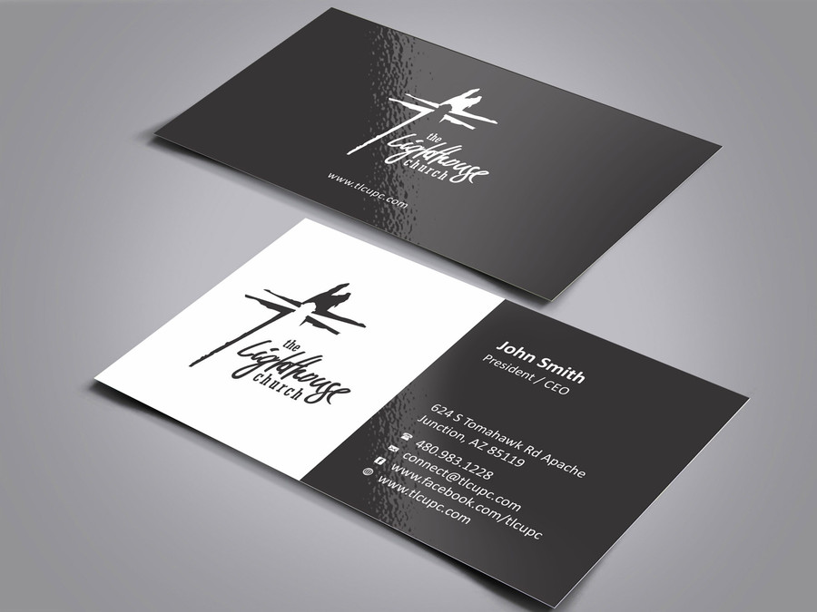
Glossy finishes may look nice, such as in this example, but glossy paper has several disadvantages. You probably haven’t considered this, but people write notes on them. They will also have to stand there and read your card avoiding direct sunlight as the light bounces off of the design.
Don’t cram information.
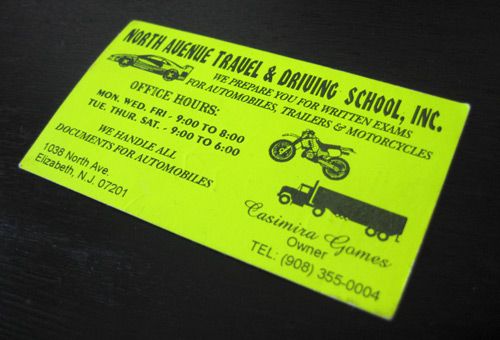
If your card ends up looking like this one, chances are you will scare your potential clients away or simply annoy them to the point of discarding it.
Don’t crowd the design and remove all white space.

Although a clear attempt to include white space can be celebrated in this design, note how unappealing crammed information can be.
Last word of advice: The most unfortunate thing that can go wrong with your business card is a typo. Do double check your content before sending it off for printing.
The key of business card design is to keep it simple and professional. This is your chance to make a first impression!


