You’ve never thought of this, have you? Or perhaps you have…
Yes, you can google ’email design’ and you will get amazing, eloquent and visually appealing articles on the topic. However, at DesignContest, we’ve taken the liberty  to do all the time consuming research for you and combine all of the top articles to bring to you a unique piece of informative writing. This piece of writing on the topic of email design is all you will ever need to know how to properly construct your email – perfect it to the very essence of the the word perfectionism.Â
This isn’t just “The Ultimate Guide to Email Design”. This article is your your inspiration, your support, your savior – YOUR BIBLE FOR EMAIL AND DESIGN.
Your Purpose, Your Objective
First and most importantly, figure out the basics. Who are you writing to? Who is your target audience? How should you address them? How many categories? Etc. There are different emails for different purposes. You should do your research here.
Type of EmailÂ
Newsletters.
Notifications.
Transactional emails.
Marketing emails.Â
If you cannot classify your email into one of these categories you’re already behind and you need to sit down and address this issue right away. Get with your team and do some brainstorming.Â
What’s hot and what’s not tip:
HOT: Email with a human touch
NOT: One message fits all
The last thing you want is your potential clients to think they don’t matter. Your emails should never is generic.
Style
Next, you need to settle on the visual style of your email. Is it simple? Is it sophisticated? Is it fun? Is it beautiful? Is it artistic? Is it all of those put together? That’s never a good option, think again. Your style must always be visually appealing to all, and reinforce branding.
And now, let’s go into more details…
How to Make Your Emails Visually Appealing
Visual appeal is your first and top priority.Â
If you stick by these 11 points, you’ll be surprised at how much you’ll have accomplished in a short time frame. Â
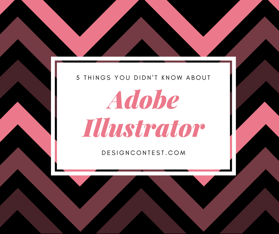
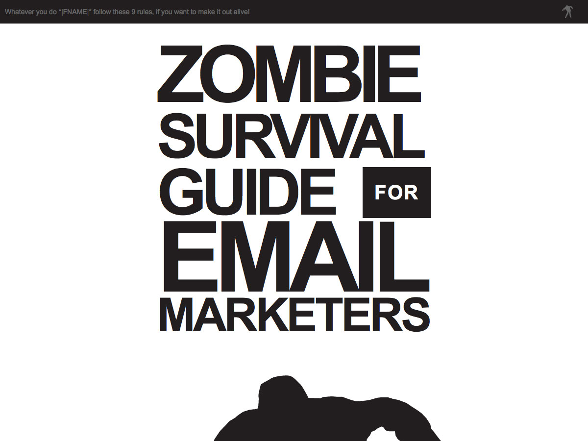
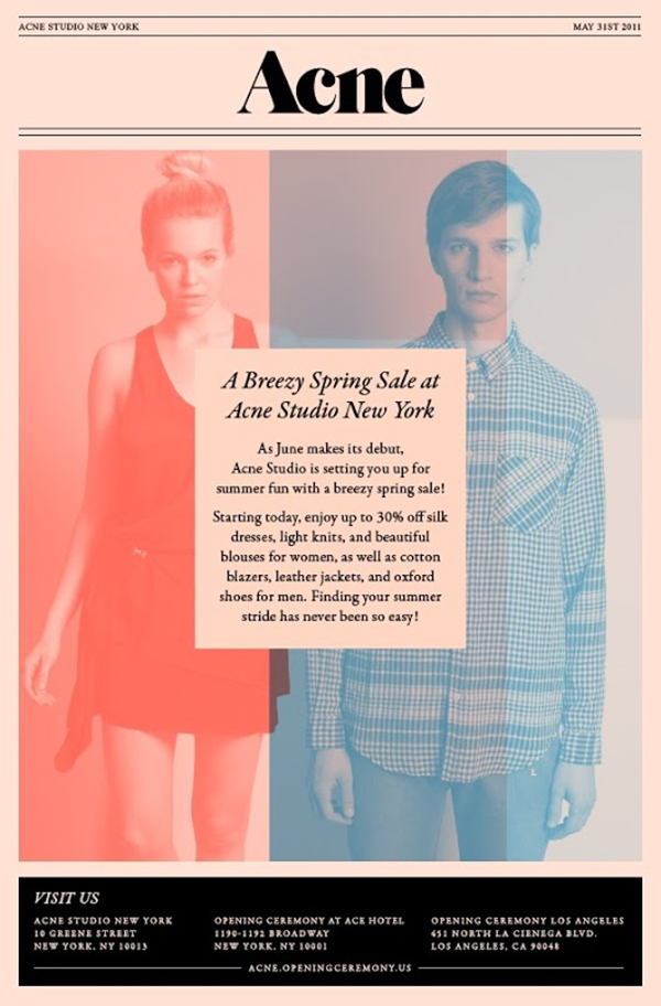
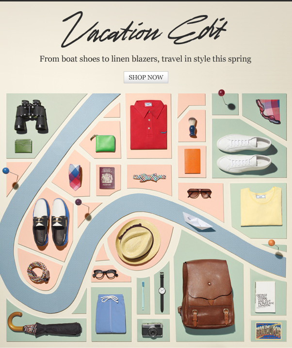
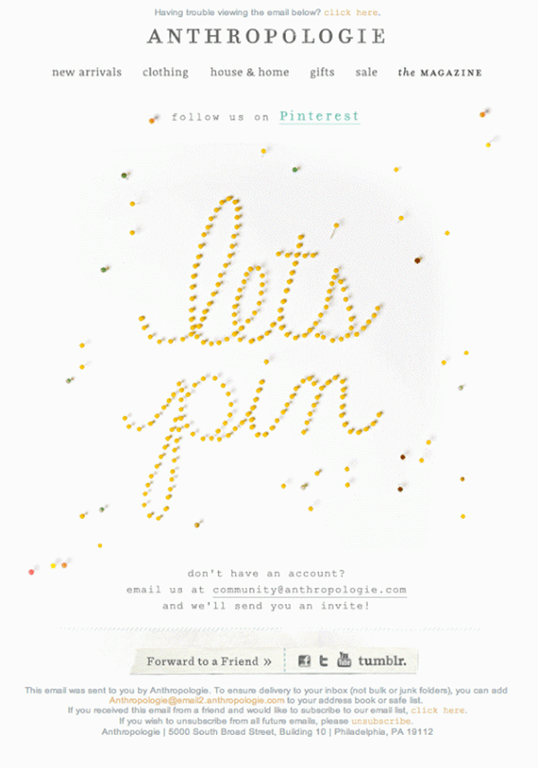
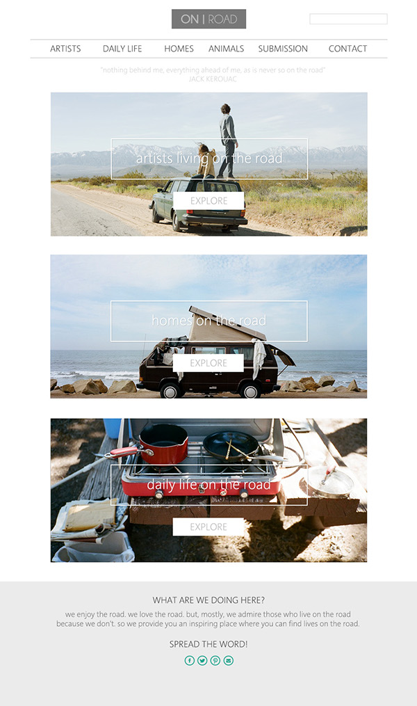
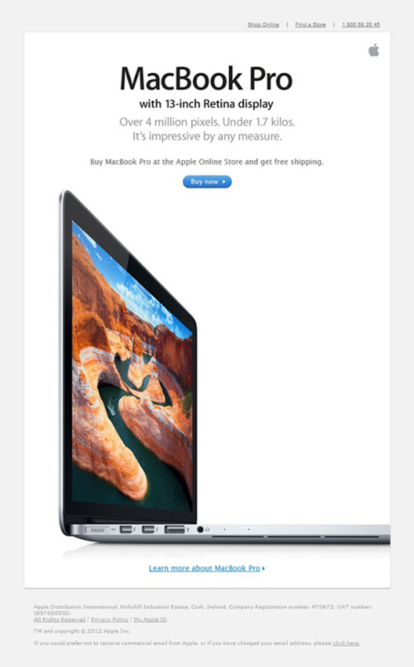
Please click on the following examples of excellent email design, sit back and flip through the gallery in a lightbox feature.Â
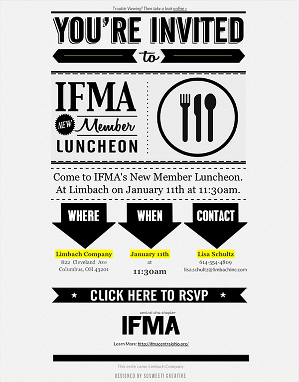
Get to the point:
Try color blocking:
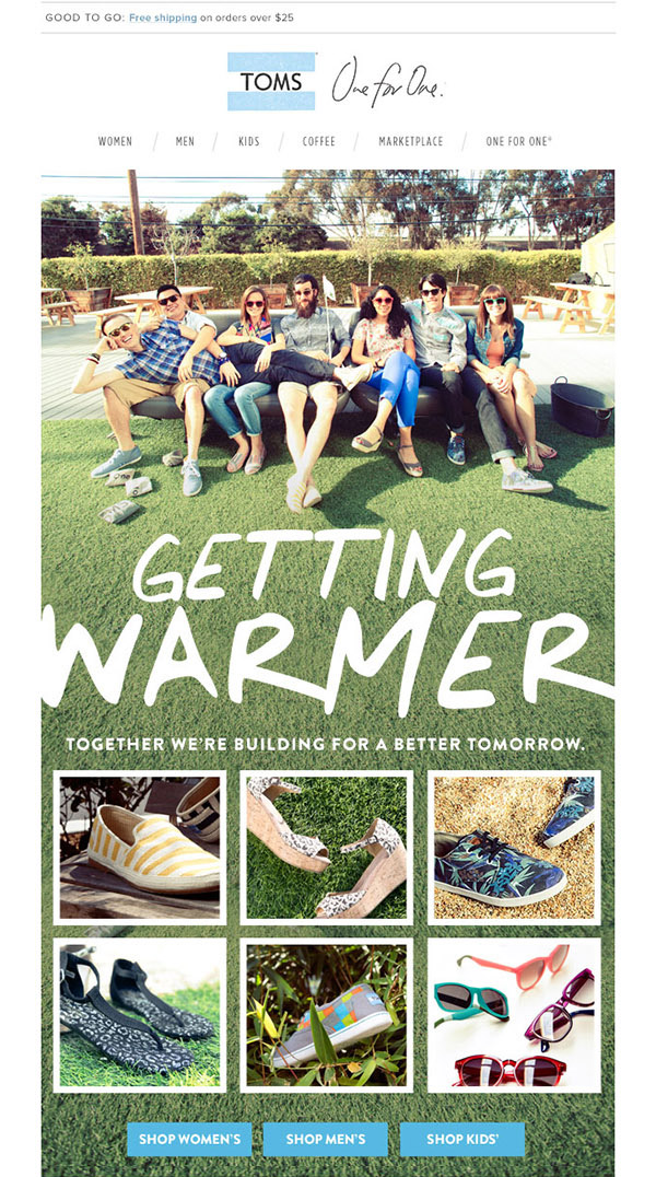
Be playful with your product:
Don’t be afraid of color:
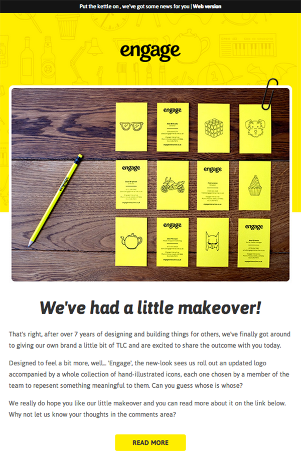
Make it recognizable:
1. Ditch the Multi-Column Approach
Why? Because it’s so last year. Sometimes it could be appropriate, but keep in mind that columns are tricky to navigate via mobile devices. Most brands have opted for infinite scroll options on their websites, and agree that emails need to strictly follow the ‘keep scrolling down’ philosophy.
With a single-column email, position the most important content on top with buttons and prominent features and links showing your customers the next logical steps.
2. Watch the Font and Subject Line
Rules of thumb: stick to standard fonts, use subheadings.
Obviously, the smaller the font the more illegible your content becomes, especially on mobile devices. It’s always better to make your font too big rather than too small. 16 pixels is the perfect size, although you really should experiment with sizes and perhaps go up to 20 pixels. This all depends on your content and objectives.
Your font style is equally important. You can nail it with the size and proportions of the font but completely miss the point by using a font style that just does not match your email format. Send a variety of emails with different fonts and figure out which one of them looks best.
Make sure that the subject line and pre-header text both work together and keep the subject line between 30 to 45 characters (this is beneficial when viewed on mobile devices).
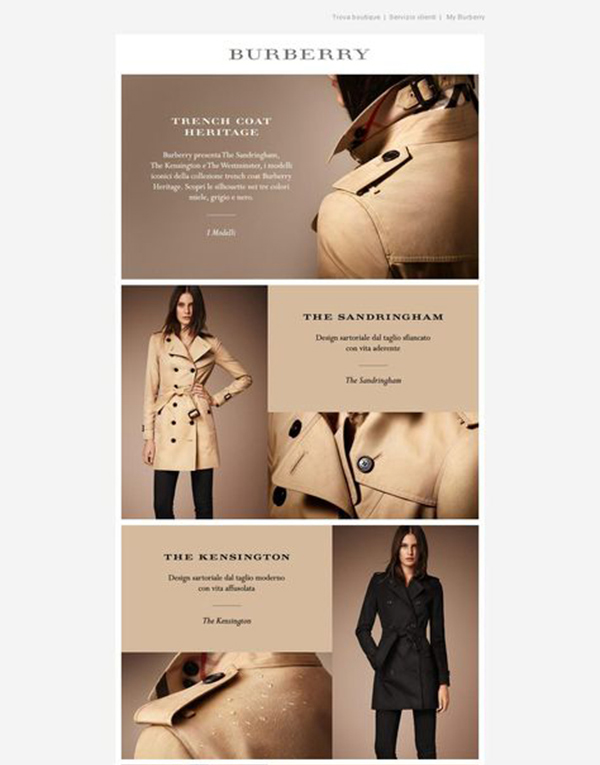
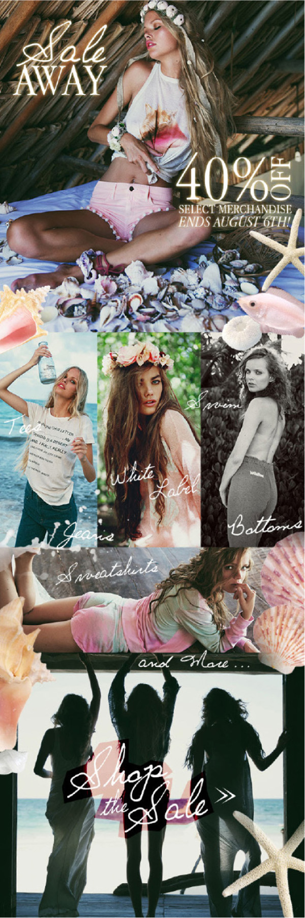
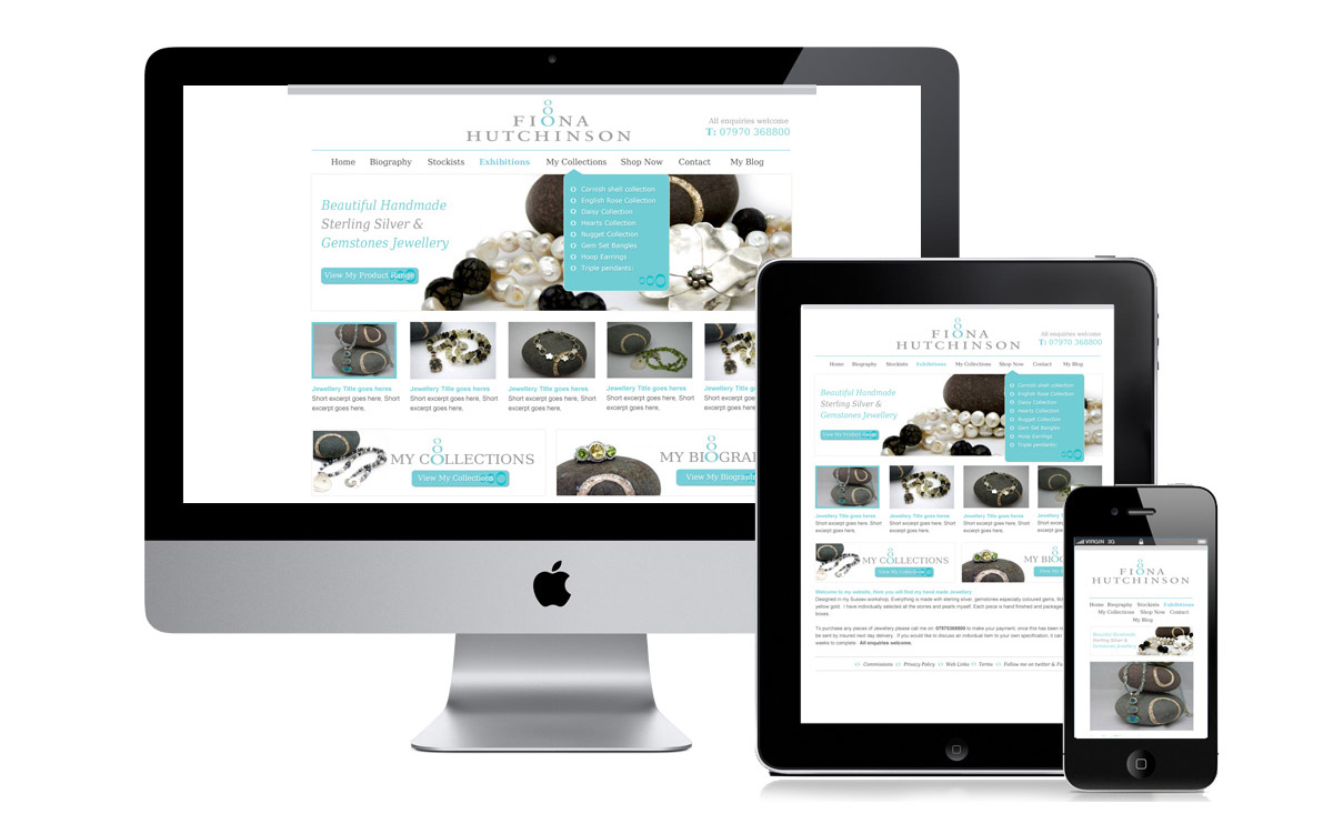
3. Create a True Hero Image
Use those pictures! In fact, if you don’t know where to start with these emails, start with the visuals. Find images that will scream to your audience, lure them and make them hungry for more. This is the first and most important point of consideration as users will take exactly 2 seconds to judge your email and decide whether to trash it or not.
Your hero image can become the superhero on a mobile screen. If your email needs to be viewed to the end for the ‘wow’ effect, there’s a big chance you’re trashed before you even introduce yourself. Sorry.
4. Color scheme.
Your email has to have a color scheme, unless you’re going with minimalism of course. Here is a tip for you: allow your logo to dictate your color scheme. It is as simple as that.
Our designers at DesignContest have nailed it in this example:
5. Thumbify Your Links
Not sure what this means? Everytime you include a link, you have to remember that it must be accessible with the thumbs. Yes, this means your landing pages and websites MUST be ready for mobile devices. Always assume your emails will be read both on computers and mobile devices.
A bigger font will be of great benefit here, but more importantly make sure the links are not packed too closely to each other. Too many links in a body paragraph can really throw off the reader.
6. Keep the Best Stuff Above the Fold
In responsive design, the ‘fold’ is the part of the email where users have to start scrolling to look for more content. This means TOP OF EMAIL = MOST IMPORTANT INFORMATION.
Carefully consider the graphics you will use here. It is the first thing your subscribers will see when they click on the email, if they don’t like your image (see Point 3 as to why), they will only see the stuff above the fold.
If you want your mobile users to convert, your best strategy is to make your call of action easily accessible. This can be done with a large, square-shaped button that will take the users directly to your product.
7. Offer Different Content for Many Devices
This will be your biggest challenge. Many brands have to resort to creating different graphics and different layouts for mobile and desktop emails. What they don’t take into consideration is how to build separate graphics or call-to-action for iPhone users vs. Android users. Usually, it is because they don’t have the technology to do it.
Don’t worry, there are contextual marketing platforms that will allow you to create email content that changes depending on the device that is being used. This means that a hero image to download your app can be placed at the top of the email, once accessed on a mobile device it could offer exclusive iPhone download option but something else on an Android device or a desktop.
Welcome to the 21st century. Keep scrolling to see how you can get started today using one of these platforms.
8. Build a Content Strategy
What will your customers see as soon as they open an email? What will make them want to convert or bin your email right away?
This is what every single one of you has to consider when developing a content strategy for your emails, regardless of the version (mobile or desktop). Customers don’t spend a lot of time checking their email, they’re literally flipping through those emails for anything that will remotely interest them. Everything that is not appealing – TRASH. This is a serious game we all play. Your content needs to drive action immediately or yes, I keep mentioning it, you’re binned.
9. Make Your Emails Local
Location, location, location. This could make all the difference in the world. If your customers get an offer and there’s a map showing where the closest store is, they’re far more likely to actually a. read your whole email and b. walk over and redeem that offer.
10. Create Big Beautiful Buttons
In the quest of thumbifying your emails (see Point 5 for a detailed explanation), marketers often create buttons. These buttons should be sized for optimal mobile rendering, which means 48 pixels by the way.
Social media button are there as background noise when brands are aiming for a responsive email design. If you want to encourage social sharing though, make sure that Facebook, Twitter and LinkedIn icons are clickable as well.
11. Test, Test, and Test Some More
We can’t stress this enough. Test your emails.
With responsive emails, you want to see how each email renders on different devices. This can be difficult to test so often email marketers test responsive emails on their own devices. There is no reassurance that the email will look as good on an Android device if all you’ve seen is how it looks on an iPhone.
What’s hot and what’s not tip:
HOT: HTML
NOT: Sending without testing for responsiveness
So by all means do it. Test those emails out until you get sick of it. And always, always keep it simple. Simple like…
Here are some resources that could save you a lot of time and effort…
Top templates and frameworks for email design.
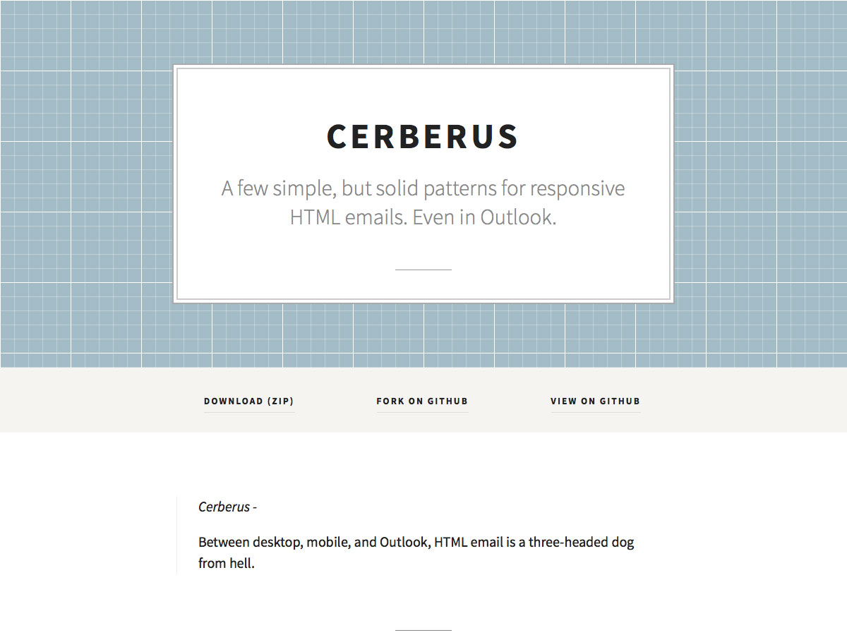
Cerberus
Cerberus is full of responsive email pattern templates that will work with Outlook and even mobile Gmail. There are two versions – one relies on media queries and the other one doesn’t. You may want to use code blocks together or separately.
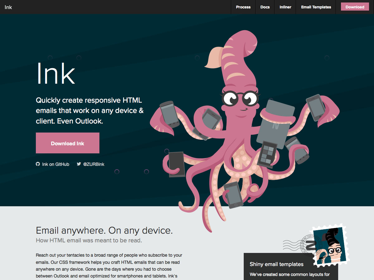
Ink
Ink is an awesome resource because the emails created with Ink work literally on any device, even Outlook. It’s so simple you can start right now!
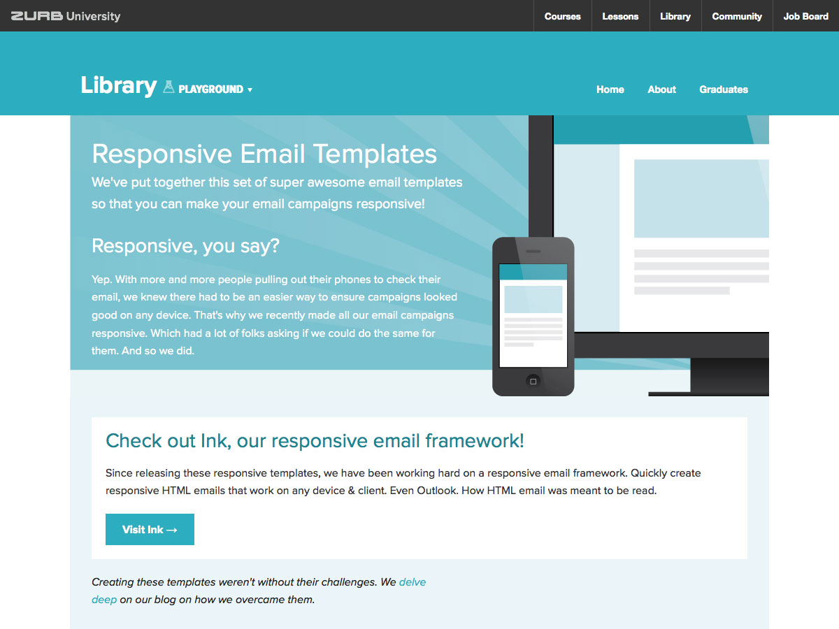
Responsive email templates
Zurb has some additional Responsive Email Templates, such as newsletter templates with a hero image. It also includes insightful info about using the templates.
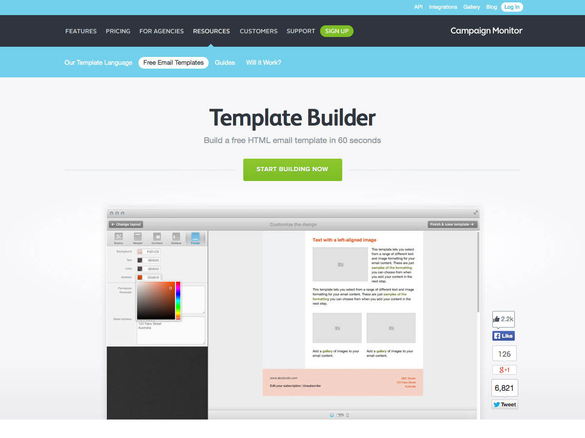
Template Builder
Template Builder allows you to build free HTML email templates in no time. The results are by far impressive. You get mobile-ready, fully tested, emails that can be used in CampaignMonitor or downloaded for use elsewhere.
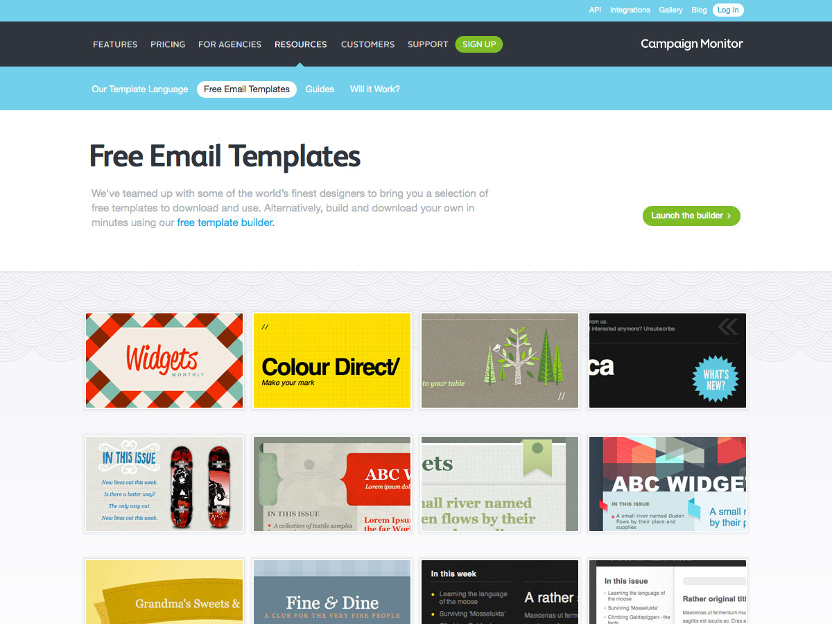
FREEÂ Email Templates
These Free Email Templates from CampaignMonitor are absolutely free and available for downloads regardless of whether you use CampaignMonitor or not. There are over 100 styles and designs available, so get to it.Â
 The final and very important points to consider:
Your users/readers/potential clients…
– may be using a computer or may be using a phone;
– may receive email in Outlook, Gmail, iOS, Android, Yahoo, BlackBerry or something else;
– may have image blocking turned on (and if so, may or may not choose to display the images);
– may convert all received email into plain text.
We hope we have provided a thorough enough guide and a powerful how-to article for you to nail that next email you send out. Impress your clients! And if needed, come to us for more help and support.