Fonts are an integral part of the web design industry that is changing rapidly. Hundreds of them appear daily in order to satisfy the demand that is constantly rising. The enthusiasm around fonts doesn’t seem to be possible to stop. The hardest evidence that proves the importance of fonts in the world of web design is their ability to manipulate people’s perception.
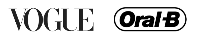
Different types of fonts call for different actions. If it wasn’t true, instead of Helvetica Oral-B would have chosen Savoy and Vogue would have done vice versa by choosing Savoy instead of Helvetica. However, it’s almost impossible to imagine Vogue using the font that belongs to the Serif font family, for those fonts might be heavy and pushy. Belonging to a fashion industry, Vogue needs to reflect its refined taste and delicate nature; Serif fonts, including Savoy, are excellent for this purpose.
Therefore, let’s find out what effect different types of fonts make on people and whether these effects can be incorporated into brands.
Serif fonts
Serif fonts are truly numerous and very popular in terms of web design, as far as they are embellished in a really airy way. A serif, which is a small line added to letters, makes the typography look fashionable and contemporary. No wonder it is so loved by luxurious brands, trustworthy publishing houses and international corporations. In order to prove that, take a look at The Guardian’s logo or the text printed in The New Yorker.
The Guardian uses the font called Guardian (which, I guess, cannot be a coincidence). As far as it is a competent newspaper that is one of the first to cover the latest news and reveal the truth, its font should definitely inspire people with trust and assurance. Strong and roundy letters would look boring if they didn’t contain any serif elements.

The New Yorker is known for being a magazine that is aimed at entertaining people by means of brilliant and biting satire. To make its text look catchy, they decided to use Adobe Caslon Pro, which also belongs to the Serif family. Its diverting letters set you to the right mood by making you happy and a bit light-headed. It accents the fact that the following content has to please and amuse. From the very first sight, before you even start reading the article, you are already in the proper mood, thriving for some new and captivating information.
Sans Serif Fonts
You can come across Sans Serif fonts everywhere. Known back in 18th century, they are dominating in both printed and digital worlds even now. The main perk observed in these fonts is hidden in their simplicity. With no extra embellishment, Sans Serif fonts managed to look dazzling and quite interesting. They are widely used in such spheres as fashion, business and sports, which points at their supernatural diversity.
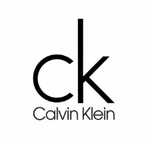
Calvin Klein, D&G, Louis Vuitton and other giants of fashion industry use Futura, which belongs to Sans Serif fonts. Futura is considered to be one of the most popular fonts in 2017 for emphasizing the brand’s corporate identity. Though these brands’ logos were created way before 2017, they still haven’t lost their “trendy†look, which proves once again that Futura is one of those everlasting booms in typography that will never be out of fashion.
To make an accent on their reliability and popularity, BMW and Toyota also use one of Sans Serif fonts, Helvetica. Though Helvetica doesn’t seem to be extremely popular in 2017, its ability to conquer the world of logos is worth admiring: except for car conglomerates, it’s also used by Nestle, Panasonic, Skype and, what’s important, Microsoft Corporation. This font, used for the brand endorsement, makes your company closer to the genious companies mentioned above. It creates the image that the brand is prosperous and is going to boost in the future, which inspires people with trust and amusement. Though it doesn’t look funny or extremely creative, it is still a perfect option for those who don’t want to be too risky: Helvetica always saves the day.
Handwriting Fonts
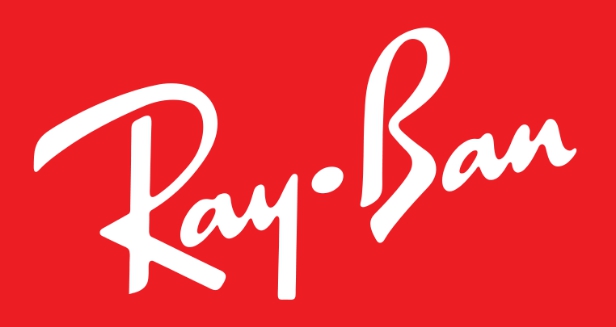
Handwriting fonts burst with creativity and scream for your attention. They always look unusual, fresh and can never be boring, not to mention the fact they are one of the latest trends in typography. However, they have one major drawback: not every company can allow itself to use such fonts: they might look really strange. Everything depends on the sphere you deal with and, of course, with the strategy your company provides. Being unable to stick to this strategy or to fit it may bring you to the collapse in your clients’ eyes. If you want to inspire your clients with youth and boldness, follow the example of Ray Ban: its corporate font used on the logo looks stunning and reflects the company’s corporate values and rises their spirit for sure.
Thus, it’s widely believed that typography is crucial and inevitable in influencing your clients’ perception: it makes your company the way you want to in your clients’ imagination. Do you support this idea? Share your thoughts with us in comments!