

You might not believe this, but the surveys don’t lie, they clearly show that WordPress powers more than a quarter of all the websites in the world. That’s millions of websites! Chances are, half of those websites you use every day are powered by WordPress. Naturally, there is an astonishing amount of themes, plugins, widgets etc. It gets a bit overwhelming when you need to choose.
With 2018 getting closer and closer we decided to take a look at the 5 WordPress web design trends that outshone all others in 2017. Knowing these trends will help you build a website that is modern and aesthetically appealing, plus you will have a better understanding of what your users are expecting usability-wise.
Responsiveness and mobile-first design
If you are not new to the webs design industry, you know that responsive web design is nothing new and it has been on the radar for a few years now. It is even considered a standard in web development. However, the rapid growth of mobile web traffic and overall usage of mobile devices have dictated new rules here as well. So what’s changed in 2017? Well, previously you would design a desktop website first, and then adopt the design for small screens. Now, though, it is usually the other way around. Web designers tend to start with mobile version and expand it for desktop. Why is this the way it is? Well, more and more businesses understand that mobile web browsing is taking the central place on the market, so naturally more clients want to know how their website will look on mobile before they see the desktop website. The biggest challenge the mobile-first approach has is having to decide on the core message and the most important content. The issue of limited space creates this challenge. Responsive design in its turn has become the go-to technique for creating websites for different screen sizes. There are obvious benefits to this approach, the main one of them being – you do not need separate designs for every screen size, you only create one that can cater to each device seamlessly. Google also played a role in the popularity of responsiveness in web design by punishing the websites that are not responsive. With all this being said, the obvious conclusion is – you need to choose responsive WordPress themes when you decide on the design for your website.
Custom visuals
Stock images used to be a go-to tool when it came to adding images to your web designs. But the sheer number of the same image seen over and over has finally created a turning point in web design. With it being standardised more and more, businesses struggle to find ways to stand out among the crowd and to maintain their originality and branding. And the crowd (and competition, obviously) grows faster and faster. So more and more web designers tend to go to custom design elements over the stock ones.
Custom photography
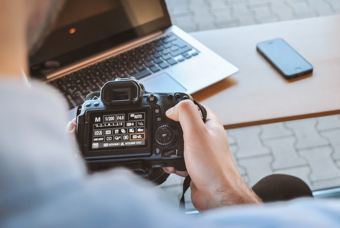
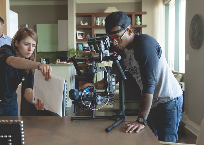
Photography is one of the most used ways to illustrate a message in web design. This is why stocks are still making so much money. But 2017 has shown a rise of custom photography, and stock photos chosen more carefully. By hiring a professional to do the photos for your business you create a real brand and tell its real story, not a generic one. And this what people want to see
Illustrations
Illustrations are another widely used tool. This is fun, versatile and playful way to deliver your message to the world. Custom illustrations allow businesses to create a feel of authenticity, character and personality behind what otherwise might have been a pretty dull online presence.
Large typography
With the minimalist style of modern aesthetics on the rise there is a sudden increase in available space. The easier to read, bold fonts are the best for occupying this space. This is functional way to create visual appeal while delivering your business message.
Video
Video marketing is all the rage now, what with the rise in popularity of the live streaming services and stories in Instagram and other social media. The popular concept of storytelling (we will discuss it a bit later) makes videos even more important, you won’t disagree that video can tell a story like no other media. Properly used videos in web design can more easily create an atmosphere and evoke stronger feelings than an unmoving picture will ever be able to. In 2017 we’ve seen a rise in popularity of full-screen video headers, video backgrounds WordPress themes and cinemagraphs. If the first two have been used for a while now, cinemagraphs are a new player here. What’s a cinemagraph? It’s a still picture with moving elements. Cinemagraphs offer quite a bit of exciting possibilities when it comes to creating an unforgettable visual experience on a website.
Storytelling and Scrolling Effect
Storytelling is a pretty awesome approach to marketing. When done right it converts much better than any CTAs, optimization and interactive elements combined. One way of creating compelling storytelling is using scrolling effect. Parallax is one example that comes to mind immediately. Though there are scrolling effects that can be as useful. Another thing worth mentioning when talking about scrolling is the rise of one page websites. This is happening primarily because of the rise of mobile technologies. It is far easier to navigate a one page website on mobile than it is to use a multi page one. Scrolling therefore becomes a means of navigation, which in its turn becomes a fascinating playground for web designers.


