

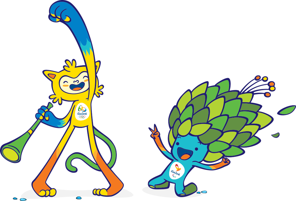
People are surrounded with fictional characters since childhood. They appear everywhere: in cartoons, movies, books and in advertisements. No wonder that many people become attached to them – and that’s why unique and charismatic characters can be a powerful marketing tools used for promotion.
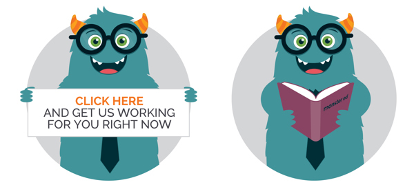
It’s always better for a certain company or brand to have its own personality. A mascot can represent this personality well and also is remembered easily (but, of course, only if its design is good).
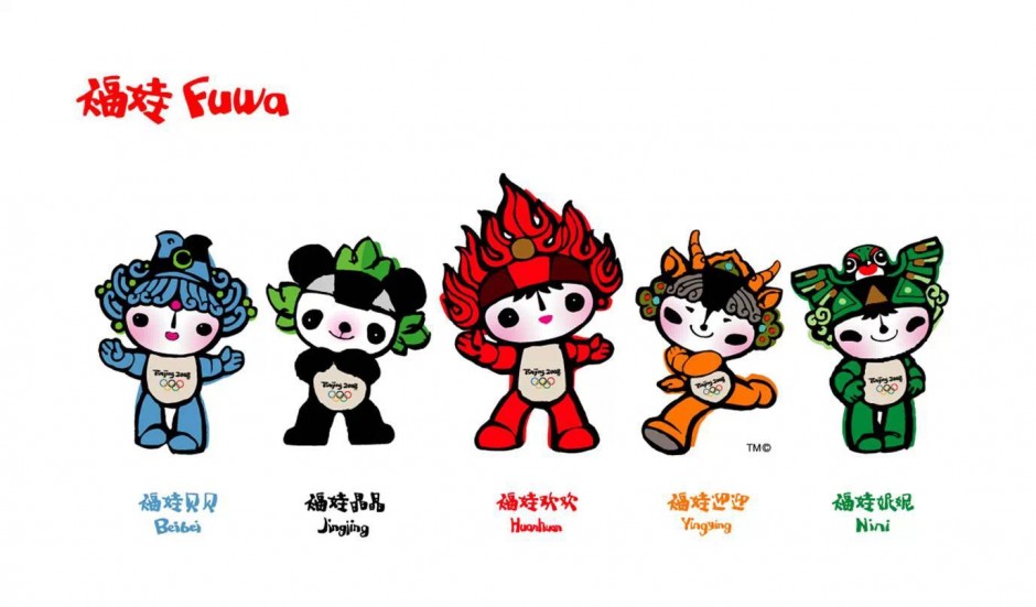
Many famous characters look simple (for example, Hello Kitty) and so sometimes people think that it is easy to design them. But character design is much more complicated than it seems. If you want to design a good-looking character that can become a popular mascot, we can give you certain tips that will help you to do so.
Think about character’s purpose
Brand’s or company’s mascot has to make a certain impression and to look a certain way. You won’t design scary-looking character for cute kids’ brand, after all. Keep your target audience in mind along with your brief and try to stick to simple shapes and solutions.
Your character can be used in different sizes and on different platforms (on mobile devices, on billboards, etc.). If you are designing a character that will be used in small sizes and on small screens mostly, avoid using too many details. But if you are designing a character that will be used on posters and billboards, you can add interesting details and features freely.
Develop character’s unique features
Speaking about the features: remember that your character has to stand out. Think about the ways to make it unique: maybe it’ll be its skin tone that will stand out? Or maybe its eyes will be big and expressive? Or maybe the shape of its mouth/ears/tail will be unusual?
It is good to play with shapes and proportions, to exaggerate character’s certain features (the ones that you want to distinguish). Things like big head, long nose or muscular arms can demonstrate character’s intelligence, curiosity or strength, so don’t be afraid to use them.
Choose colors wisely
Colors can help you to make a certain impression. Dark and gloomy colors will suit creepy and bad characters, but you should avoid them while designing positive characters (light colors suit them better). Pastel colors are good for magical creatures and bright ones are good for heroic characters.
Remember about personality
There are so many ways to demonstrate character’s personality: you can do this with the help of its face expression, posture and even shape. Character design is quite stereotypical: for example, round shapes are usually associated with softness, kindness and cuteness, while sharp lines and angled shapes can be associated with active, evil or creepy characters (though not necessary: everything depends on the context, after all). So don’t be afraid to play with traditional associations, but don’t forget about uniqueness at the same time. Your character has to be one of a kind to serve as a good mascot for your client’s company or brand.
If you follow these tips and practice a lot, you’ll be able to design truly unique and memorable characters able to serve a certain purpose and to represent a company or brand in a desired way.


