
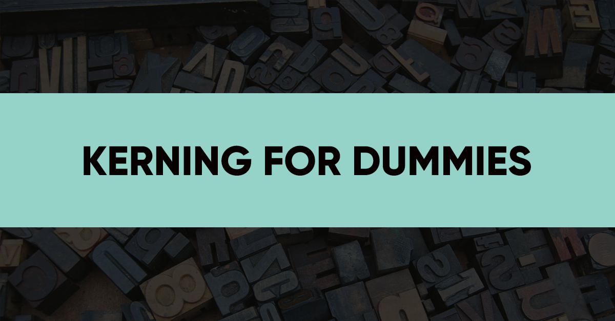
Have you ever thought of things that make your design informative? The colors you use (they can be correlated with certain feelings and emotions), the symbols you place (they can bring users to certain conclusions), and the content you introduce (it carries the initial information) – all these elements are responsible for the way the website’s information is reached. However, there is still one feature left. It is rarely discussed, though it has a major influence on the readability of the content and, therefore, the way users get the whole information. This notion is called KERNING and today, you’ll find out a lot more about it.
What kerning is
In simple words, kerning is the process of adjusting the space between letters judging by their shape. In most cases, kerning is applied automatically. However, while designing a logo or placing a tagline on a website, you may change the kerning settings and adapt them to your own requirements.
Kerning’s variations
Kerning makes your design look far more appealing and attractive. Due to this function, the typography you use becomes clearer. Between two main types of kerning, a metric and an optical one, you should choose the most beneficial for your text optimization.
Metric kerning uses kern pairs that have a specific spacing between separate parts of letters. These basic kerning pairs that belong to this metrics are To, Tr, Ty, Wa, WA, We etc.
As for optical kerning, it adjust the space between letters based on their shapes. It is much more suitable when you use different typefaces or combine different fonts. This way, you will get a cleaner text where fonts and typefaces get adjusted to each other.
Also, there is a manual kerning which is often forgotten about. In manual kerning, you adjust the space between letters on your own, mostly when you need to have more control or there are some additional special requirements to the text itself.
The fourth type of kerning is not widely used unless you deal with Japanese. It’s called Metrics-Roman Only kerning and is applied to hieroglyphic symbols.
Tips for using kerning
Choose a proper typeface
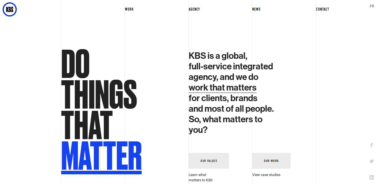
Kerning cannot save the day when a typeface you’re using leaves much to be desired. What’s more, each typeface needs a different attitude. Even if you’re using two or three fonts, they all have various requirements and should be adjusted to them. For example, take a look at the fonts chosen by The KBS Agency website. Here, kerning is differently adjusted to the website’s logo design, its title, and the rest of the content. If you take a close look, you’ll notice how different the letter spacing is on different points of the website.
Pay attention to different letter combinations
Remember that you cannot combine all the letters in the same way. Thus, JV will be a lot different from AV because of the way the lines complement each other. That’s why you cannot make all the letters stick to your general requirements. In this case, you need t go for a manual kerning to adjust everything properly.
Bottom-up
Sometimes, letters seem to be adjusted just fine, ready to be placed on a logo or a website and sent to a client. However, that’s only at the first sight. As soon as you take your letters upside down, you start noticing some minor faults. The reason is that, when turned upside down, you pay attention not to the meaning of those words but to the way they look.
Auto, tight, and loose kerning
There is a difference between auto, tight, and loose types of kerning you need to understand. Auto kerning is what you have by default in your typeface settings. As a rule, those who cannot work with typefaces leave those settings untouched. However, you can also go for a tight kerning (when letters are close to each other) and a loose one (when they are further than usual). In this case, you shouldn’t mix up the notion of kerning with tracking (when there is a limited space a word cannot cross).
Does kerning have any siblings?
Yes, it definitely does. They are called Leading and Tracking and they are always used all together. While leading is a space between the typeface baselines, tracking is the width of the text itself. In simple words, the size of your text depends on these two elements. What’s more important, you can influence and change them the way you want. That’s why Kerning, Leading, and Tracking can be described as siblings who are very close.
Bottom line
Now that kerning is no Greek to you, try using it for your next design (if you haven’t done it before). The result will amaze you because, along with a beautiful picture, you’ll get a beautiful typography. Creating beautiful things – isn’t that a point of any designer?

