Upgrading a logo is essential if you want it to be modern and stay up-to-date. You shouldn’t do it too often but doing it once in a while is a great idea on your way to improving your brand by refreshing it. Every successful branding needs rebranding, though it sounds quite funny. Nevertheless, our world is changing rapidly. The world of web design is doing it twice faster. Which means you should think in advance if you want your logo not only to fit in modern tendencies but also to correspond with future ones. However, pursuing fashion and trying to be in trend you may sometimes fail utterly and completely. We suggest you learning from mistakes of others by presenting a list of biggest failures in logo upgrading.
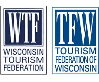
New Logo Design: The Winston Tourism Federation
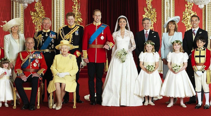
This is probably the best example of what not to do with your logo when your company’s abbreviation is WTF or similar. It reminds me of William and Kate’s wedding: there were coins coined to celebrate this special occasion and, as tradition goes, there were supposed to be the first letters of newlyweds’ names. However, they decided that the combination of William’s W and Catherine’s C (WC together) wouldn’t look great on royal coins. That’s why noble Catherine became simply Kate.
A similar thing happened to Winston Federation. They decided to change their name into Tourism Federation of Winston and, therefore, to upgrade their logo design. However, the result wasn’t completely satisfying: if at first, their logo reminded of a pack of light cigarettes, it then became… a pack of cigarettes once again but with a different shade of blue. Yes, nothing has changed, which is the biggest failure of such kinds of rebranding. The solution would be to exceed their limits a little bit and add more creativity to their logo design. No guts, no glory – this refers exactly to logo design process.
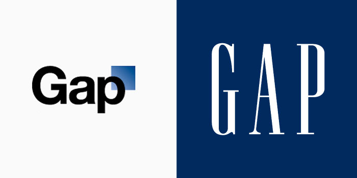
New Logo Design:Â GAP
It was a real gap in their designer’s choice of font, color, and size. Look at the logo they used to have: stylish letters on a sophisticated background. If you don’t know what GAP is, you could easily think the company has something to do with fashion, jewelry, luxury furniture etc. what comes to your mind when you see its new logo design? Soap, shoes or car tires? Hard choice, isn’t it? The thought that it’s a popular clothes outlet will be one of the last ones. What was GAP’s problem? They thought too much about getting modernized and didn’t think about their brand’s positioning at all. Changes are required but in this case, you shouldn’t forget about your customers as the main segment of your business and their reaction to these changes.
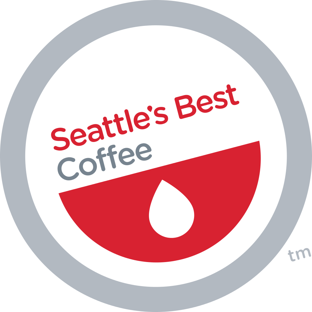
New Logo Design: Seattle’s Best Coffee
The company’s primordial concept consisted of using red as an appealing color to stimulate appetite along with a simple half-vintage style. The logo was quite similar to those in the same market niche and it was a high time it got changed. Nevertheless, if one only had known the logo would be changed so radically, it would have been better for the logo to stay the same. Instead of the half-vintage style, the company got something round and unclear. Red color stopped awaking appetite. Instead, combined with something that was supposed to be either a drop of coffee or a coffee bean, it started repelling it. This round “something†reminds more of a Pokemon ball which makes the logo upgrade even worse.
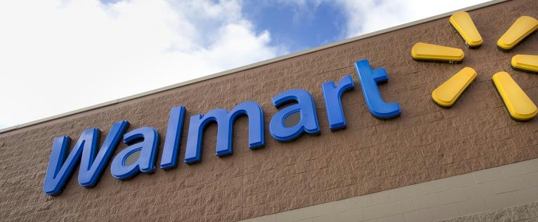
New Logo Design:Â Walmart
Beloved and chosen by millions of Americans, Walmart didn’t justify the expectations of its admirers this time. Its new logo is far from what everybody expected, at least because its famous blue star turned into not so famous yellow flower. Even deep blue turned into light blue which is not so appealing as well. As for its new font, it’s not so bad but could be much better. An old one inspired people with security and safety was appealing and intensifying. A new one is simply a font that is much more suitable for gas stations than for the world’s biggest supermarkets.
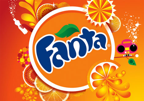
New Logo Design:Â Fanta
Let’s face the truth: Fanta has crossed the line in case of its redesigned logo. Yes, it’s supposed to be refreshing, bold and appeal to youth but a pink boombox on an orange background seems to be too much. Fanta decided to squeeze into this logo every single symbol they could. This is where they miscalculated forgetting the latest tendencies: what’s too much cannot be too good. That’s why such an outburst of colors distracts its clients from an actual visual perception. On its old logo, there was the feeling that the company’s name was going to be splashed out of it. It was fun and gripping. On the old one, there is a feeling that the company’s name is sinking in the whirl of its bright colors and symbols. It suddenly stopped being entertaining.
New Logo Design:Â Lenovo
Yes, I think this is one of the biggest failures in logo upgrading. Not because of its color but because of the font that was chosen. The previous logo got a strong brand awareness. The font became associated with its laptops, tablets, and phones. It looked harmonious on different screen sizes complementing responsive web design. The new logo has gone through too many changes: except for changing its color from blue to red (which is still possible to understand), it has got a new font which is really hard to get used to.
![]()
Bottom Line
The whole concept of upgrading and redesigning a logo should be carefully considered and the best solution must be found. Refer to designers you totally trust. If you’re not sure in their abilities and competence, don’t be in a hurry, otherwise, you won’t avoid the failures described above. You can also look for different design platforms. Some of them enable you to create a contest between designers (e.g. designcontest.com), at the end of which you’ll get several stunning logos you won’t even know which to choose.