

If you have somehow faced logo designs, you know they mostly cost a fortune. Everybody understands logo designs do need to be expensive: your brand’s awareness starts with them. However, sometimes companies get lucky and receive their logo design almost for free or really for free. You’ll be amazed to find out how much some famous companies paid for their logos that are nowadays famous through all over the world.
Google Logo Design
The company with the yearly revenue of about $ 89.46 billions (data for 2017) got its first logo absolutely for free. It was designed by Larry Page and Sergey Brin and is a direct prototype of a modern Google’s logo. Initially, they used Baskerville Bold and since that time have experimented with the shape of logo’s letters by making them more or less round, changing their colors and presence or absence of an exclamation mark. However, the logo design’s concept itself stayed mostly untouched which is even more astonishing: the logo that is recognized by everyone in the world didn’t cost a single cent.
![]()
The logo that we got used to seeing everyday hasn’t changed radically, only got improved. This is a great and inspiring example of what you can do if you really want to achieve something.
![]()
Coca Cola Logo Design
Here’s a design you’re probably not used to:
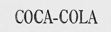
This logo was created in 1886  by John S. Pemberton. It’s been modernized ever since but it has never changed its concept: its name should endorse the brand itself. There’s no denying the fact they have changed a lot since Coca Cola first appeared on market, starting with its colors and ending with the fonts. However, two capital letters “C†are still reminding us of the logo that first appeared absolutely for free. The logo was first black because Coca Cola was advertised mostly in newspapers but with time passing by they added a red splash of color into the company’s name. The new strapline Taste the feeling reflects Coca Cola’s attitude to everything new and unknown, calling you to try it. In 2016 the brand raised $41.38 billions and doesn’t want to stop on what it has already achieved. The brand’s logo seems to be its lucky charm as well.
![]()
Microsoft Logo Design
Another IT conglomerate that received more than $85 billions in 2016 is Microsoft. There’s no doubt that its modernized logo design costs much more than we can imagine just because such company will be charged a lot in any way. Nevertheless, its first logo cost Microsoft… yes, you’re right, nothing. If you think that design studios were standing in a queue in order to create a logo for Microsoft absolutely for free, you’re mistaking. The company didn’t hire any graphic designers. Instead, they held a contest among their employees in order for them to come up with an outstanding logo. And they did create a logo that everyone adored. As you see, setting a competition to get something done is a great idea. Thus, an independent graphic design platform designcontest.com follows the same principle. If you want to get an outstanding logo for your company, you should simply create a competition for freelance designers through all over the world. You give them a brief on what you want to see in your future logo and set a prize the winner will get for the efforts. At the end, you’ll have lots of creative options to choose from and, therefore, will be able to pick the best logo. If it worked for Microsoft, it will definitely work for you.
Twitter Logo Design
A cute blue bird on the logo of one of the world’s most attended social networks was added to the company’s logo in a year after its first one with engaging navy-blue letters was designed. The bird cost Twitter $15. The sum was ridiculous, especially taking into account that it was designed not so long ago, in 2009. What’s more, its designer, Simon Oxley, sold this logo through one of the design websites. Even though Twitter paid for his logo $15, Oxley got only $2 (!) for his work. However, the bird wasn’t allowed to be used as a company’s logo, that’s why Twitter had to redesign it. The fact remains: Oxley got almost nothing for his idea which was really valuable. Indeed, this logo design was supposed to bring him much more than it really did.
![]()
Nike Logo Design
Nike is one of millenials’ favorite brand which means that almost every young person has something with a Swoosh logo in their wardrobe. Its Swoosh symbol depicted on the brand’s logo has conquered every place in the world, making Nike one of the most recognized brands in the world. It appeared in 1971, created by Carolyn Davidson, a graphic design student from Portland. The designer was paid $2 per hour for designing the logo and got $35 in total. Moreover, the Swoosh, which symbolized a flap of wings of Nike, Greek Goddess of triumph, wasn’t really appealing to Davidson’s customers who were completely unsatisfied with her work. Who knew this symbol would become so prosperous? The advertising campaign “Just do it†was launched in 1988. Using the slogan combined with the Swoosh on its logo, it became one of the most prosperous in the history of advertising. There is something else you probably should know about Nike’s logo: it used to be red; changing it into black and white promoted the sellings.
![]()
Bottom Line
As you see, not all the famous logo designs were a real ripping off for their customers. Sometimes they cost next to nothing and still served excellently for their owners. The main task of a logo design is to get memorable and these designs certainly succeeded in it. Someone said that a great design won’t save the world but it will definitely make it better. The same refers to logos: great ones will make your company much better and successful. World leading companies have already proved that. Now, it’s your turn!


