10 Best Insurance Logo Designs
Insurance companies are an epitome of trust. People rely on their services and have complete confidence that their matters will be taken care of professionally and efficiently. Potential clients look for any indication that the company is the right fit for them, especially in terms of claim handling, financial stability, and trustworthiness rating.
Some of these qualities can be reflected in an insurance firm’s logo design. An excellent way to pique a person’s interest in knowing a company better is through an impressive logo. An effective design will attract more leads that could become loyal clients.
Here are ten well-designed insurance company logo designs that have all the necessary elements fostering brand recognition and competitiveness in a saturated industry.
Robert Hermes Insurance
Robert Hermes Insurance is an independent insurance agency that focuses mainly on providing homeowners with security for their tenure. This logo design perfectly captures the essence of the firm, with the graphic element forming the outline of a house. It gives the audience an inkling of what services they can expect from the company.
The pop of red on the design emanates confidence, and it adds to the depiction of reliability using the four squares forming the window. Using an old serif typeface that is simple yet bold catches the readers’ attention and encourages name retention for this insurance business.
LA Advocates Insurance
With the trends coming back to simple and crisp layouts, this logo from LA Advocates Insurance is an excellent example of contemporary design. This health insurance agency expresses its goal of providing simple navigation of the country’s healthcare through a no-nonsense logo that uses a simple serif typeface. A subtle check replaces the line in A to add the statement of being an ideal choice.
Color plays a significant role in the effectiveness of this design. The LA in blue speaks trust and security, while the green in Advocates is the perfect indication of the firm’s services since this color symbolizes health, wellness and life.
Monterey Insurance Group, Inc.
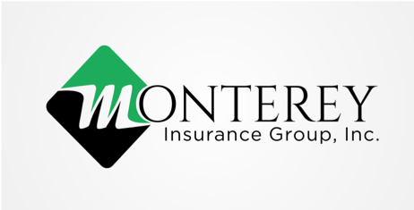
The Monterey Insurance Group offers personal and commercial insurance, and this duality is expressed in the color of the graphic element. The green and black combination works to represent growth and credibility. The duo forms a diamond-like shape that means balance and reliability. Enclosed in the shape is the script typeface M, which is unique and therefore carries the brand identity.
Also, notice how the designer used two font types, which gets a nod for finding the balance between monotony (only one font) and chaos (using more than three fonts).
ANR Insurance Group
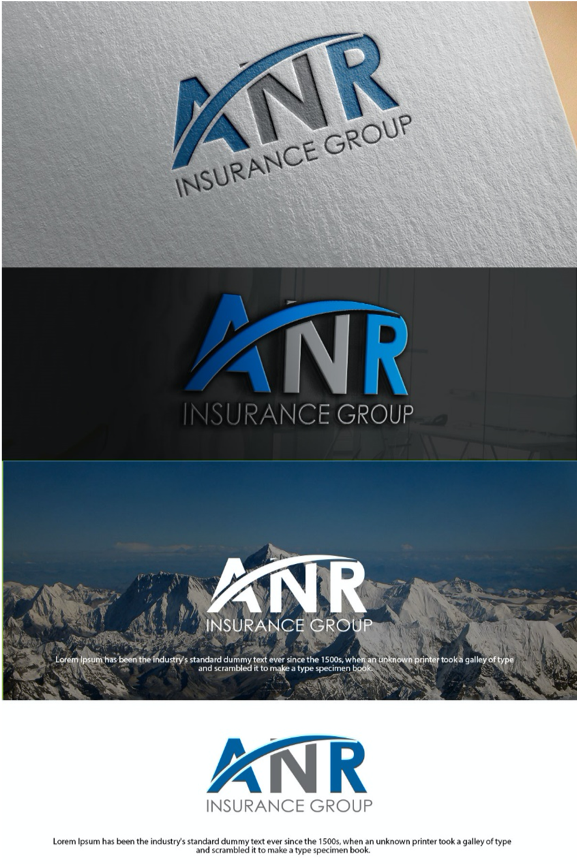
The logo design for the ANR Insurance Group is versatile and straightforward, which is the perfect rendering of the company’s broad range of services and providers. The blue color stands out, which is indeed an excellent choice for corporate firms that want to be known as trustworthy. With the gray N in the middle, the logo invokes authority and wisdom.
Another outstanding element in this logos is the curved line from the base of the A to the top of R, which conveys the umbrella coverage of the firm. Curved lines are the shape of protection, and inspires the feeling of trust for the brand.
Preferred Choice Insurance Agency
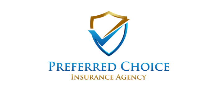
Preferred Choice Insurance Agency has its name going for it, and the logo design offers an excellent fit for the brand identity. The graphic element consists of a check within a shield, giving a sense of protection and reliability. The designer matched the blue hue of dependability with a classic gold in the emblem. The metallic effect of gold in the shield depicts exclusivity and tailored services for which the company aims to deliver to its customer base.
The typeface uses a traditional corporate serif that speaks professionalism and responsibility.
Cornerstone Insurance Agency LLC
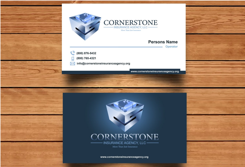
The Cornerstone Insurance Agency, LLC logo, is a fitting example of compelling typeface imagery. It uses a cube-shaped graphic with two sides consisting of the letters C and S, which prompts brand recognition and originality. The cube can be taken as a symbol of stability and balance, meaning that clients can depend on the company’s delivery of services.
Another notable element in this design is the cube-type depiction of earth within the CS box, which helps the logo stand out. The silver metallic scheme with a 3D effect gives it more oomph and conveys a client-centric approach to insurance.
Revive Healthcare
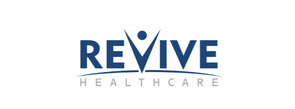
Like any health insurance, Revive Healthcare needs to have a logo that bears its commitment to fostering the well-being of its clients. This logo design is a proper rendering of that goal since it contains elements that speak a sense of protection, vitality and life. The typeface imagery element in the letter V shows a person that exudes health and wellness. The curved line in the middle covers Healthcare, which uses a faded block font that is well-balanced with the upper typeface.
Using a monochromatic all-blue hue enhances the company’s attributes of reliability and professionalism. This logo is crisp and sophisticated yet attractive to the audience.
Asset Security, Inc.
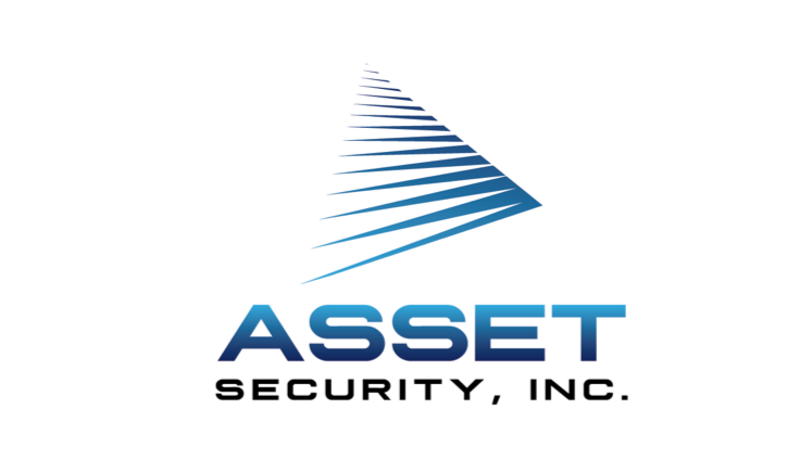
Asset Security Inc. uses a geometrical element made up of lines that seem to meet at a point, forming a pyramid shape. This movement conveys stability and security, which the company intends to provide to its customers. Lines can depict flexibility and freedom and it is evident in the number of choices the clients have over the services they can avail with the firm.
The classic black denotes integrity, while the blue is another traditional corporate color enhanced using an analogous gradient style that contributes to brand recognition.
Providence Benefits
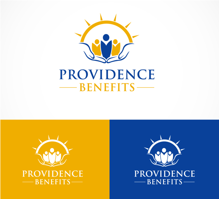
The logo design for Providence Benefits offers multiple classic elements that would typically be challenging to balance. However, the composition is adequately well-adjusted and harmonious. The graphic part consists of a sun outline, a group of people and hands joined together to carry the other elements. It is an overall symbol of protection with a subtle reference to faith.
The color scheme for this logo is yellow and blue, which speaks of positivity, warmth, and reliability. It invokes a feeling of security and hope, which are two great attributes for an insurance agency.
Campolo Assicurazioni
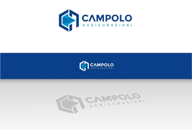
Campolo Assicurazioni is an insurance firm based in Italy and has been in service for more than 30 years. As an established name in the industry, Campolo needed a logo that calls for unique identity and timelessness. The graphic element is a blue-colored diamond enclosed in the brand’s acronym, which brings a sophisticated rendering of security and protection.
This logo design uses an analogous gradient that unifies the idea of insurance in a modern way. The typeface is designed so that Campolo stands out, solidifying the brand’s identity, and encourages recognition.
Wrap Up
There is more to a logo than meets the eye, so a graphic designer must always be aware of the elements applied to every detail of the image. Logos are created to convey the brand message and inspire the audience to get to know the company better. These logos from insurance companies are some of the best examples of designs that outshine in style and composition.