

Imagine that you have finished the contest for your new website design and see the list of TOP-10 designs you like most. And your colleagues have chosen another 5 designs. What will you do? How to choose the best one from that 15 versions and not to waste your time and money on just a nice picture? How to decide what is the powerful and efficient design and what is not? Let’s check it!
“Design is not a set of a pretty pictures, but the great tool to help you in reaching your goals”
In order to understand what kind of website design is good and what is not, you have to find out the website task first: what your clients have to do on the page.
The website task in our example is the following:
“Our travel website offers  unmatched travel deals, mainly to the caribbean region. Travelers will be able to book hotels and tours through our booking engine and there will be an API from another company to book the airfareâ€.    Â
Business analysis: the beginning
The main aim of a new website design for the client is the following: to prompt the user to find the tour. As a consequence, the main and the most important part of the website is the searching form for tours and hotels.
As a bonus: from the first seconds on the site the user needs to understand where he is and what kind of service he gets.
The development and improvement of that searching forms is the most responsible, time-consuming and at the same time exciting part of design work.
The main designer’s  task here is to look at the website and the process of searching tours as the most inexperienced user can do. That should be very easy to understand how to use that form, what exactly you’ll get as a searching result  and how to buy a needed tour after all. That form should be familiar to user, not the overcreative one.
Designs for exclusion
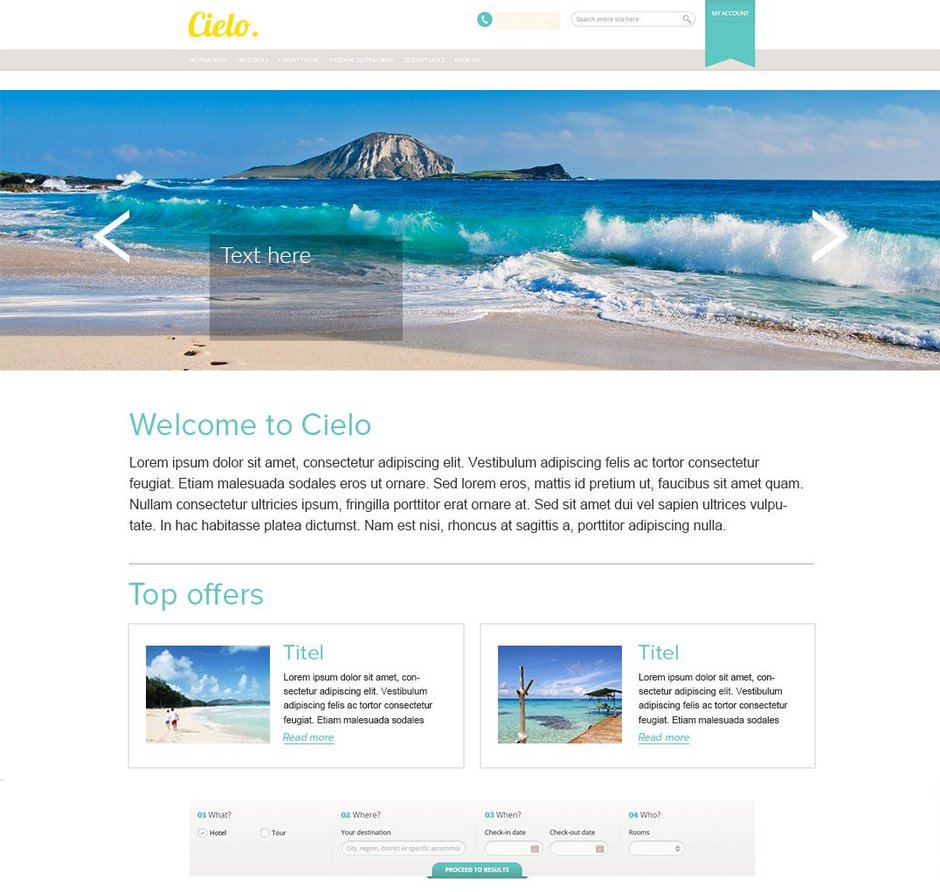
Reasons for exclusion: there is no searching form on the first screen, so the 50% of users won’t scroll down to the main part of the website. There is no clear structure of information and no contrast between searching form and top-offers
Reasons for exclusion: there is no contrast between yellow and white colors of navigation panel and  searching form, so it will be hard to use them; there is no modular grid; all functional elements are very close to each other. Moreover the searching form itself is not user-friendly, it’s hard to understand how you should fill that form and what exactly you’ll have as the result
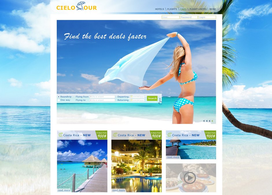
Reasons for exclusion: the main searching form is faintly visible among other elements. The most active place on that website is the bright central picture but not the target action
That designs aren’t good enough  for your goal:
Why not: designer sacrificed the logo of the company — it’s not a good strategy. Moreover that kind of transparent form is not the best solution, because it seems illusory, not real and reliable.  The text may be unreadable depending on the background pictures.
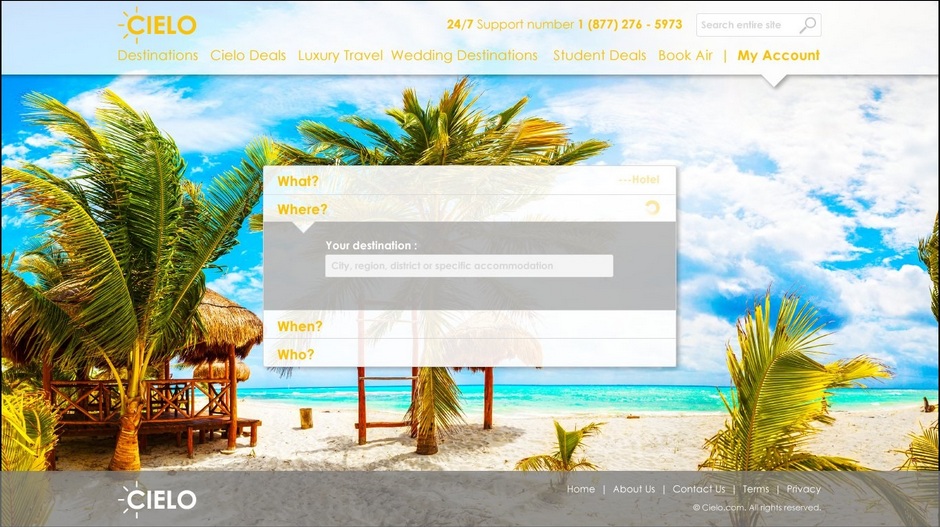
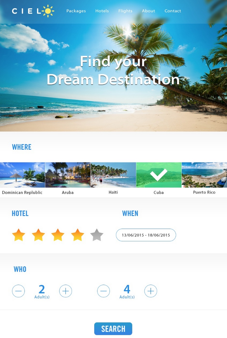
Why not: let’s be honest: is that easy to understand what the website is about? That kind of searching form is more suitable for aviasales website, but we sell hotels and tours.
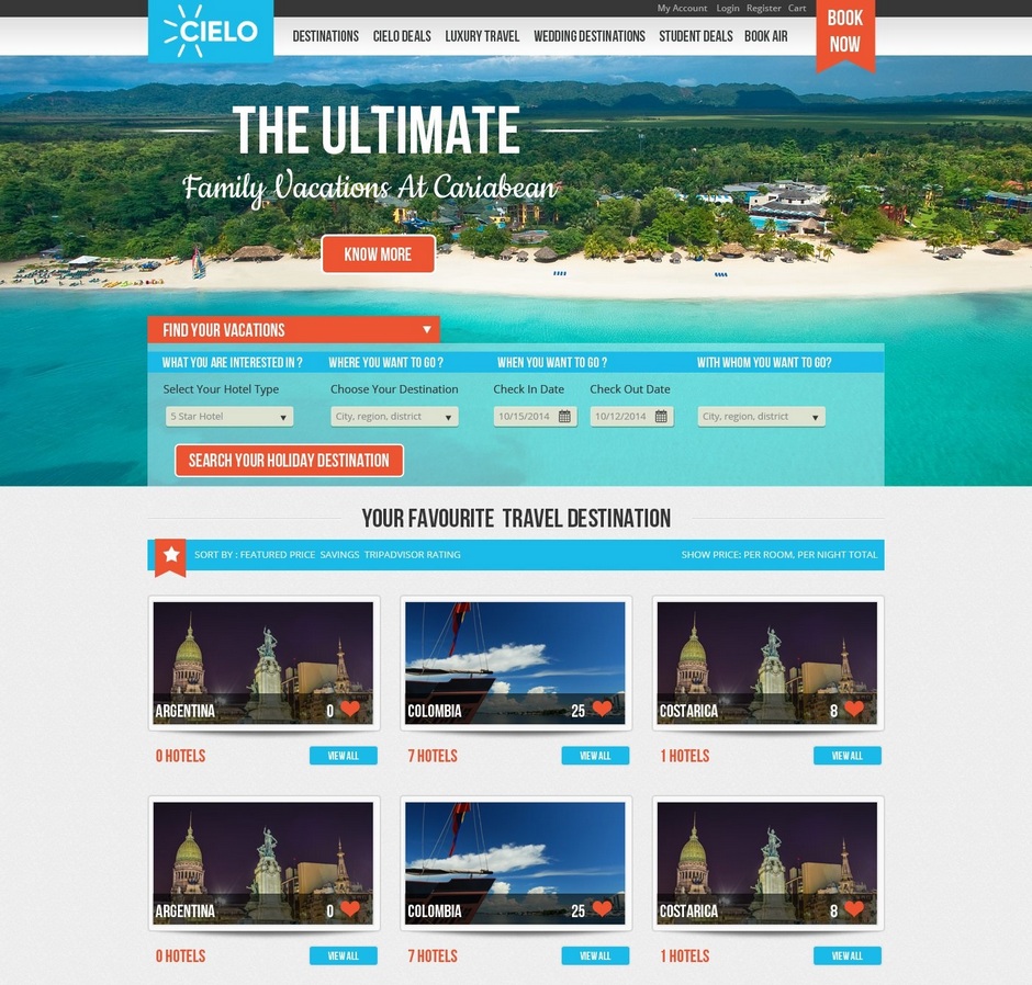
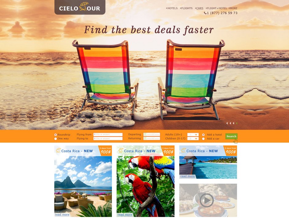
Why not: there are too many lines in the searching form, that’s why the form looks complicated. There is a mess of different fonts which is strengthening the complexity. The difference between 2 buttons “Find your vacations†and “Search your holiday destination†is not obvious.
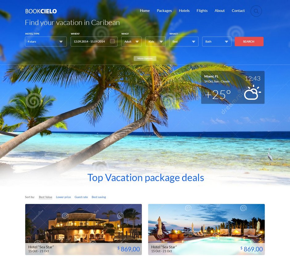
Why not: the main idea is good and easy to understand, but the form is too big and you can’t see it on the one first screen, so it’s not convenient to fill it. It’s not obvious how to choose another destination point except those 5 in the slider.
One common mistake is to ignore the form which is attached to the design brief. It’s not a good idea to come up with a new form’s fields when we try to design something familiar to our users.
The best ideas for the great website design
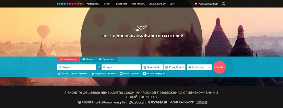
   1. Design a one-line searching form. According to researches, the chance of filling such kind of a form will be higher, because it looks easier than multi-line form (yes, even if they have the same numbers of fields).
   2. Make a clear and contrast searching form – that will guide the user through the logic of filling the form.
   3. Arrange a block with the most popular destination points using “tasty†related pictures, they’ll awake the desire to check the tour and make an order. Use the high-quality pictures, try to catch up trends like “pinterest-styled’ layout.
What else can be improved?
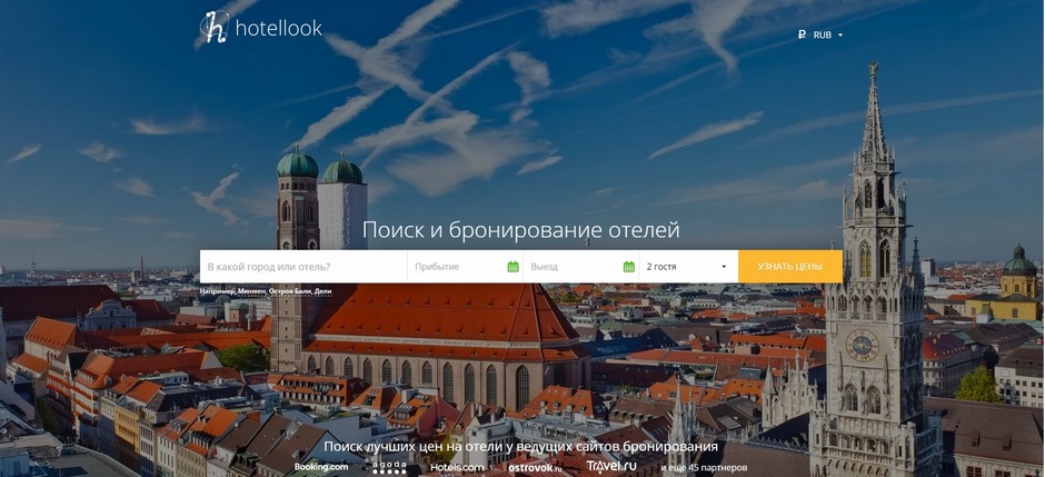
   1. Make the searching form easier, without the input’s background
   2. Fill out the form with some data as an example. Set up the nearest probable date of arrival and plus 7 days for a departure day.
   3. Make the fields of searching form larger and more spacious.
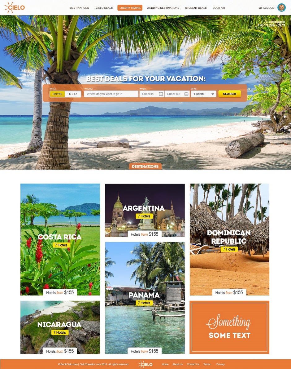
Some searching forms for you to inspire:
We hope that our express-analysis of one website design contest will help you to put everything in its place — what is really worth the efforts in design and what you should take into account and what is secondarily.
What other design categories are you interested in? Maybe you’d like our experts to analyse the logo design contest or the promo website design? Just tell us about that in comments! Â
If you like that article — share it 🙂
*Sources for illustrations:  Flickr (photo by Pascal)


