2018 is going to surprise us millions of times. The UX/UI design sphere is no exception. That is when DesignContest has prepared 5 controversial UX/UI design trends for 2018 for you that are going to raise some hype.
1. Full-screen videos
Full-screen videos aren’t something brand new or surprising in the UX/UI world. This trend has been popular for a long time and seems to receive a great user response.
Say Yes to this UI design trend because
This UI trend is safe and secure, which is why you can be totally confident about the future results. It is innovative, engaging, and intriguing. If you succeed in making this video content interesting, it could even become viral (which, to tell you the truth, is the secret purpose of EACH AND EVERY company). In general, videos are unobtrusive. At the same time, they can be stuck in the memory for a long time. Due to such powerful influence, UI design gets much more opportunities to get improved.
However
Video content has several disadvantages that make it a controversial trend for UI design in 2018. Imagine, that I am a client who wants to buy a used car (and your website is exactly the one that sells such cars, dah). I’ve found your site via search engines and now I am comparing several websites and the products they offer with their competitors to find the option that would be most beneficial for me. However, I do not spend more than 10 seconds on your website and move to another one. The reason is that your background video (with a very nice concept, btw.) was too loud, too bright, and too large.
This is the risk of using the video content. You never know whether your client is ready to it.
2. Negative Space
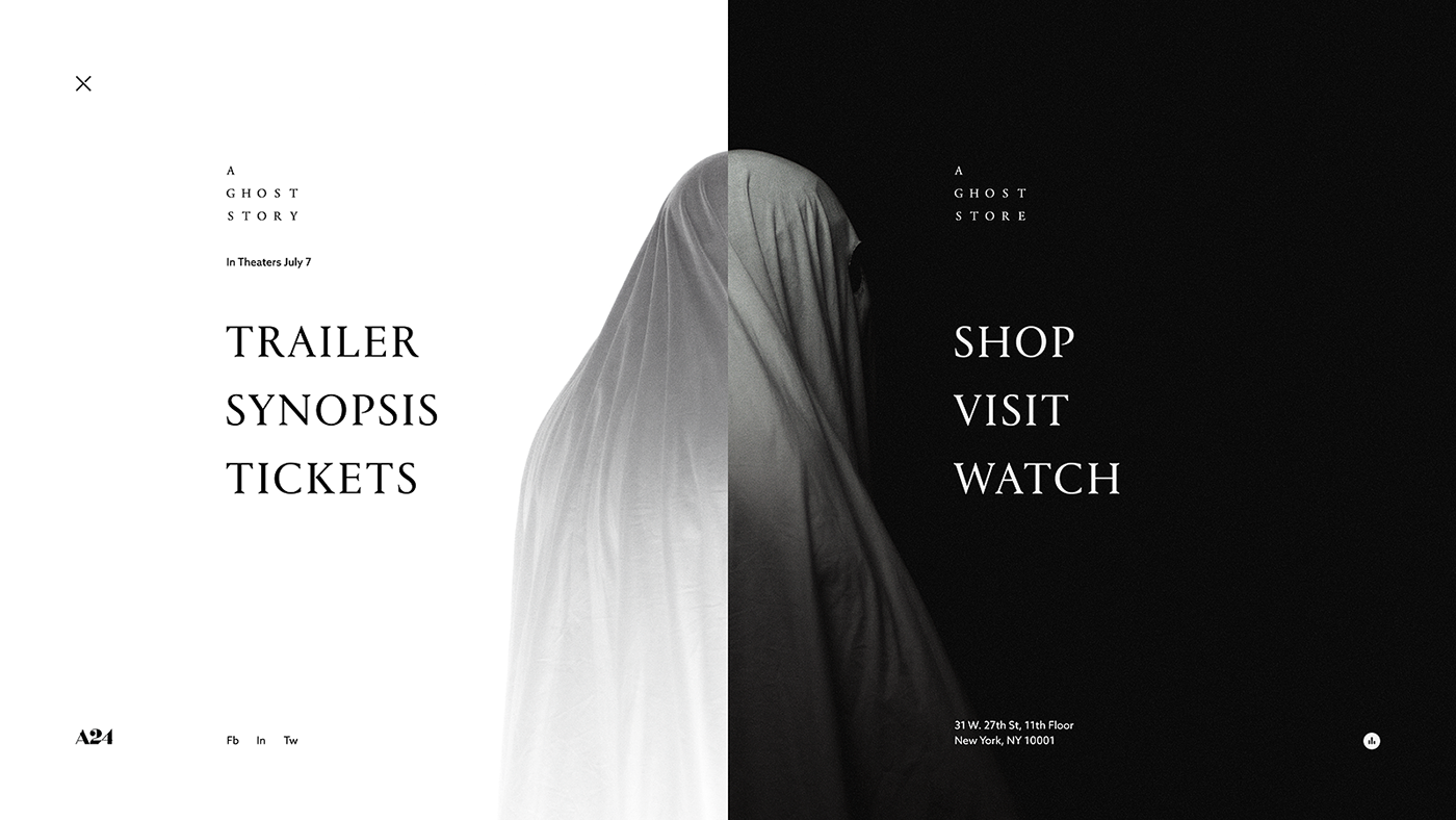
Negative space is the area in design that is free from any design element. It is often called a “whitespace” and is expected to conquer the UX/UI design world in 2018 completely and entirely.
Say Yes to this UX/UI design trend because
This trend is clean, easy, and allows you to play with different elements, their implementation, and your client’s expectations. The white color purifies both web and mobile app design. It allows you to emphasize the most important things and to provide a simple but efficient call to action. UX/UI design trends in 2018 want to be bigger. In this case, they get really large: the white color creates an impression as if there is much more space than in practice. Negative space lets you use contrast as one more tool to highlight important stuff.
However
There is always a fly in the ointment. When it comes to the negative space within UX/UI design trends for 2018, this fly has a face of the misunderstanding. Sometimes, clients refuse to let their designers even try to use the negative space because they think it is more like “there is no design at all there, just plenty of white”. And yet, the truth remains simple: nowadays, this very “no-design” is the hardest one to achieve. It is connected with the UX/UI major principles on the absence of design that is the best design. The best thing for your business is when your client doesn’t seem to notice your design. In this case, the whole attention is aimed at the product or services you provide.
3. Chatbots
2018 is expected to be The Chatbots Year. Though it has just started, a lot of outsource software development companies confirm that most clients need their websites and mobile apps developed with chatbots.
Say Yes to this UX/UI design trend in 2018 because
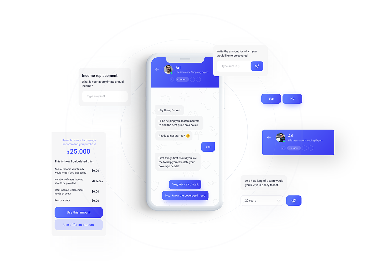
Chatbots are fresh and resourceful. Along with AR/VR tools, they own the future of design and development. At first, chatbots were just fun to use. Later on, it turned out that the companies that go with chatbots increase their sales up to 11%. No 24/7 support can bring you such amazing results. You may wonder why chatbots are mentioned among UX/UI design trends for 2018 if they deal more with the development process. However, the design of chatbots is as much important as the code they are operating on. By creating a chatbot, you need to make sure that it looks as a real conversation with a real person, including the design of the bot’s messages.
However
Remember the episode in Black Mirror when the girl texted the chatbot app that was replying her on behalf of her late husband? Well, with nowadays’ chatbots, everything is not so scary. In fact, our main problem now is that it is not so easy to develop a chatbot that would be texting as a real person, with pauses, special remarks, our favorite “lols” etc. That is why, if you are not sure in the chatbot you have developed, better check it once again. Otherwise, your clients may lose their trust in your company.
4. Card-Based Design
Don’t know what that really means? Here is a simple explanation. When you launch a logo design contest (or any other one, if that matters) on our platform, a card-based design is exactly what you see when designers submit their entries. Which means that DesignContest has become trendy way before other websites!:)
Say Yes to this UX/UI design trend in because
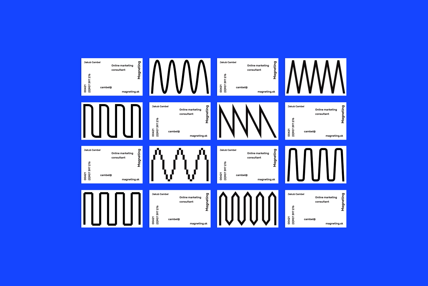
This is a highly convenient UX/UI design solution, especially when you need to use a lot of visual elements! What is even better, card-based design allows you to arrange all your design elements so that the webpage or the mobile screen don’t look crammed.
However
Even the minor mistakes in your UX/UI design process can spoil the future project. Within the card-based design, every fault will be highlighted. That is why you need to pay a special attention to the technical issues, the size of your vizuals, and even their shades. Also, you may consider to take up a lazy loading that, along with the card-based design, can improve your traffic.
5. Free form of the content
Sounds weird, right? Yet, this is the prediction given by Vytautas Alech to Forbes, and it is too good in order to be skipped. Free forms, assymetry, and brutalism are getting the upper hand.
In 2018, say Yes to this UX/UI trend because
This looks fresh, fun, and it is going to win lots of attention. Sketchy designs get opposed to the well-organized card-based pages. People like them because they don’t look artificial or far-fetched.
However
In some cases, for some business types, this kind of design might seem not appropriate. Which is why you need to conduct a careful analysis before getting down to business.

