

There are so many coffeeshops and coffee companies that you probably mistake one for another often. Actually, it isn’t surprising at all as all coffee companies usually have similar logos. I’m not talking about numerous Starbucks clones right now: no, the logos themselves can differ quite a lot, but their most common features remain the same. If you read this article, you’ll understand what I mean.
Why knowing about these features is important? Because if you are a designer, you’ll probably have some client from a coffee company someday, and if you are a client, you have to know what to expect from a designer. Using the most common features in logo designs isn’t bad, actually, but only if you do it wisely and strive for uniqueness. So let’s find out more about types of coffee logos.
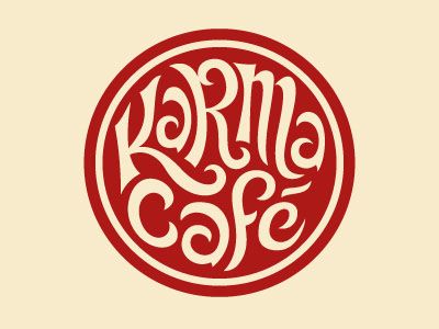
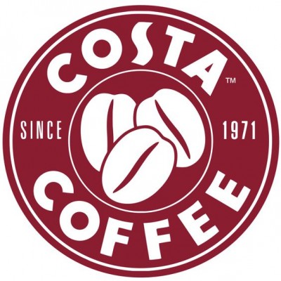
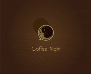
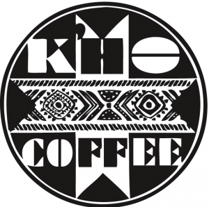
1. Circle logos
![]()
![]()
These are rounded logos that sometimes can remind seals. They look good, but only when used with appropriate fonts and are unique. Designing one of these logos is actually really hard as a designer’s main goal in this case is to avoid any similarities with not only Starbucks, but also other look-alike logos. But if a designer succeeds, the result can be amazing.
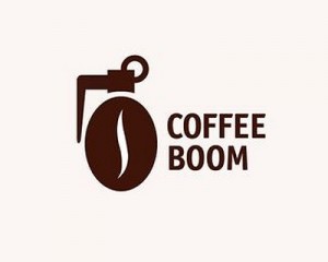
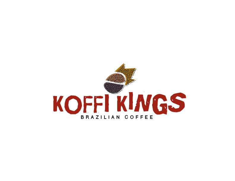
2. Coffee bean logos
![]()
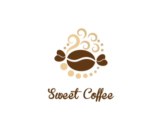
Probably one of the most common types: so many coffee companies use coffee bean in their designs. It seems a logical thing to do, but at the same time it has already become cliché. However, it’s possible to create interesting logo, using coffee beans: for example, design a tree with coffee beans instead of leaves.
3. Coffee cup logos
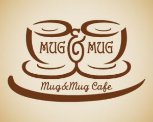
![]()
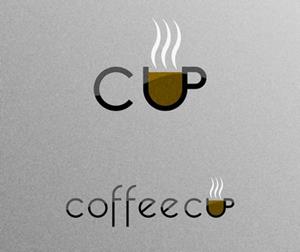
Of course, this concept is one of the most common ones too: after all, coffee lovers adore cups of hot and delicious coffee. But to design a good logo with a coffee cup on it, a designer has to try really hard. It’s important to give this cup an unique look and, maybe, to do something original with the steam curls.
4. Ethno logos
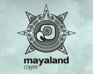
![]()
I bet you’ve seen one of them: with ethnic motives, some details related to regions from where coffee is imported, etc. This concept is one of the widespread ones but at the same time more diverse. There are actually many options for a designer creating this type of logo: one can use a certain element, a pattern, etc. Though this type of coffee logos is probably the most interesting one, all the used references have to be easily understood by the target audience – otherwise, it just makes no sense.
I hope this new knowledge can help you either to improve your design skills or to evaluate designs better.


