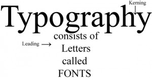
 In our previous post we talked a bit about common typography terms used when choosing a typeset for your designs. However, the buck doesn’t stop there: In fact, there’s a lot more to typography than just serif versus sans serif, or kerning and leading. No, just like a fine craft, there are distinct elements used to construct each individual letter. Understanding these small parts not only makes your design choices more expert, but helps solidify your on sight ability to recognize fonts—a handy skill, no matter what field of design you’re in.
When we talk about the anatomy of a typeset, what we’re talking about are the individual portions of each letter. For example, you’ll often here designers talk about the x-height of a font. This measurement determines the height letters achieve when in their lowercase forms. It also controls a few other parameters, including the height of the lower portion of an F, or the upper part of an ampersand.
Just as the x-height determines the lowercasing of a letter, so do the cap height and baseline contain the letter on the top and bottom respectively. An easy way to think about these is to image a single line at the top and bottom of your typeset. The cap height keeps the letter from going any higher, while the baseline keeps it from sinking any further.
Designers also like to talk bout the ascender, terminal, and spur of letters. An ascender is any portion of a letter that shoots upward without a final resolution, like a crossbar at the top of a T. For example, the stem on the left side of a lowercase h is an ascender. However, this is not to be confused with the actual stem of an uppercase T. A terminal is the end point of a top element, like the curve at the top of a lowercase f. A spur, on the other hand, is a twist at the bottom of a letter, like this one in the lowercase a. A similar idea to a spur is an ear, which doesn’t appear at the bottom of a letter, but rather at the top, jutting outward. The lowercase g in Times New Roman sports an excellent example of an ear.
Finally, the aperture, when used in typography, denotes the space between any two top elements of a letter. For example, the opening in the letter a between the top terminal and the lower counter is an aperture.


