Nowadays the product’s packaging is no less important than the product itself. The product has to stand out among thousands of others and so each manufacturer has to find the best way to present it to the end customer.
Fonts
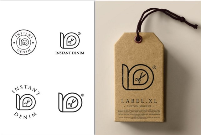
The usage of wrong fonts is the most common mistake. Try to avoid using more than two or three different fonts on packaging. The main task of a right font is to deliver information about the product and to be readable. If you cannot decide between beautiful and readable fonts, always pick the last one.
Description
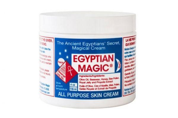
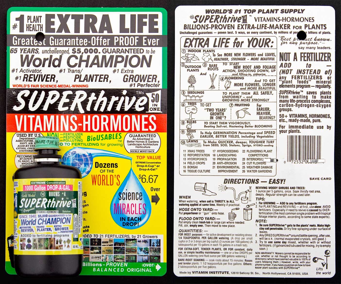
Another very common mistake is to put too much or too little information on packaging. It is important for consumer to understand what product he sees by briefly looking at its packaging or label. You have to choose a middle ground here: don’t put the complete composition of a product on its packaging, but also don’t settle with its name only.
Color of packaging
The eco-movement becomes more and more popular these days and it’s important to notice this and to apply in packaging too. The consumers will associate simple packaging made from recycling paper with something natural.
But you have to remember that eco-packaging is often associated with handmade products. That’s why you shouldn’t use it for innovational cosmetics that is based on newest scientific developments, for example – it won’t deliver the right message.
You have to choose the images wisely too: don’t confuse the customer by putting something not related to the product on its packaging.
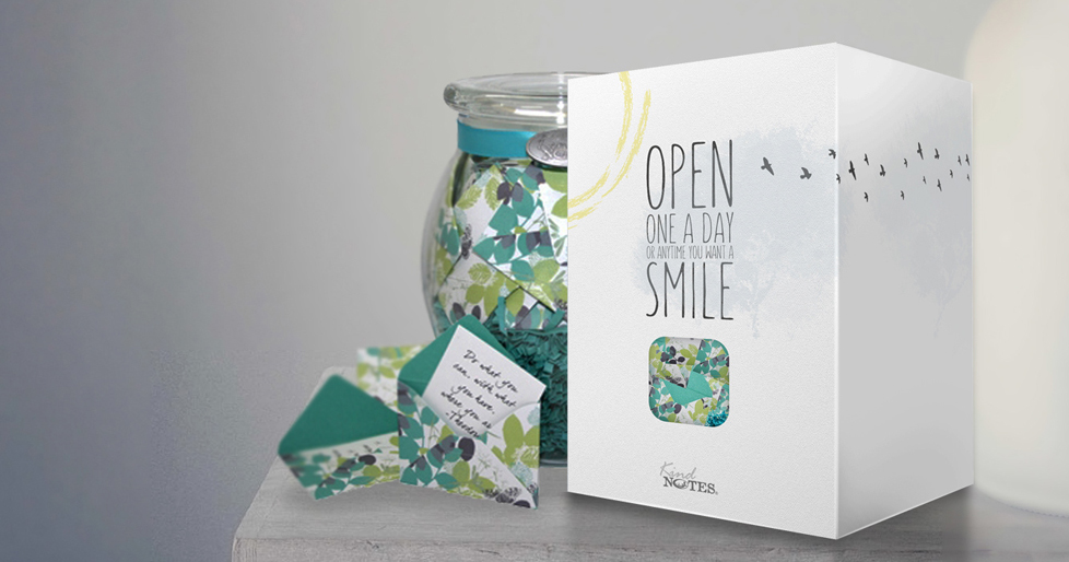
Packaging’s form
The main goals of packaging design are to surprise and to make the products noticeable among others. But no matter how unusual your packaging is, don’t forget that it also has to be functional: convenient and safe to use.
The examples of good packaging

The examples of bad packaging