
One of the basic skills an adept graphic designer should have in their arsenal is icon creation. Sure, there are many free icons online or you could start a contest for icon design. However, knowing how to do it properly yourself will give you the ability to fully customize your icon. The end goal is to be able to create a distinguishable set of icons that shows your talent as an artist.
Like any other design skill, creating icons in Photoshop (“PSâ€) starts from knowing how to tweak settings and properties within the software. Once you are familiar with the tools, you can now begin making icons and icon sets that can be used virtually anywhere, from phone apps to website logos and more.
These necessary steps can be applied to other graphic design tools, but for this guide, we’ll use Adobe Photoshop as an example. If you need a plugin to transform the file format into an ICO extension you can use this reference for details on how to install it.
Step 1: Set the Canvas
Preparing the canvas is the first step to working on any image in PS. Start by selecting File > New to open the dialog box. Set the width and height to 16 x 16 for small icons (48 x 48 for medium and 96 x 96 for large), and choose a color for your canvas by selecting your desired shade in the Background Contents box. Remember: icons are always square!
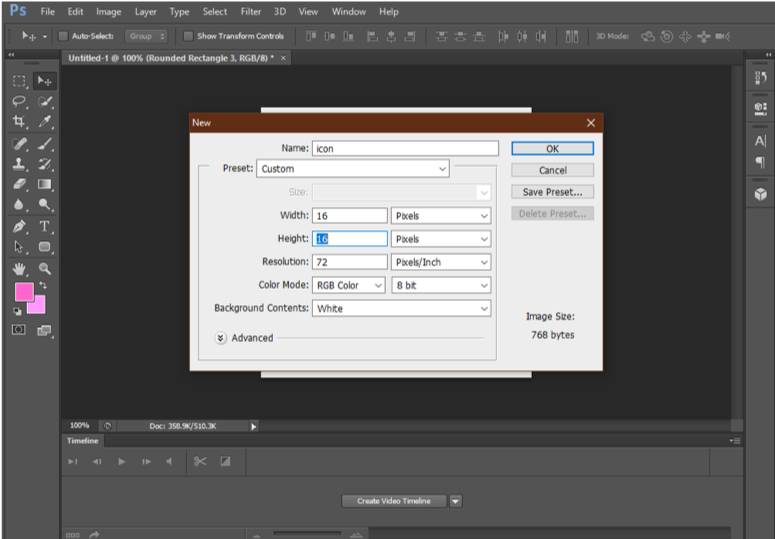
If you want to change the size later, you can press CTRL + ALT + C on your keyboard, which opens the Canvas window in which you can set the desired size for your icon. Select OK to finalize the canvas size.
Step 2: Make the icon
Imagination makes art practically limitless, and this extends to images! In this step, you can let your creativity flow by choosing the design you want, whether for a single icon or an icon set. Just don’t forget that the figure is tiny, so refrain from putting words, patterns or texture with fine details. Icons are typically simple yet recognizable—think Facebook or Instagram.
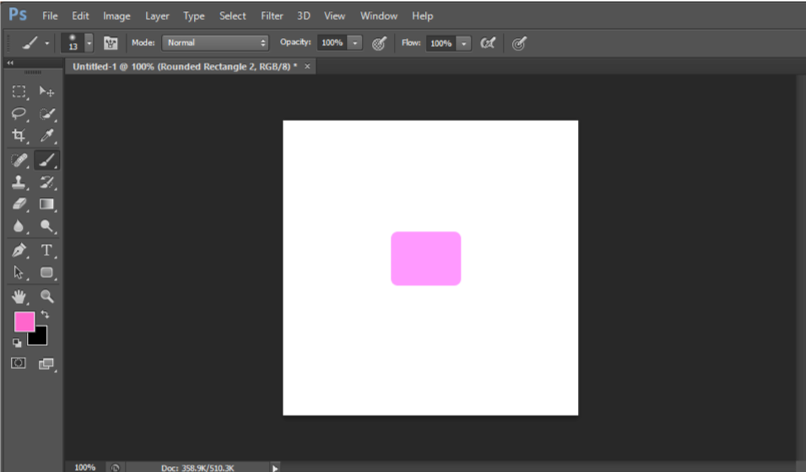
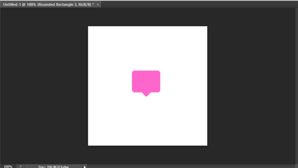
For this guide, let’s try making a simple chat box. It’s geometric and can be used as an icon base wherein you can layer other illustrations on top of it, such as emoticons or logos.
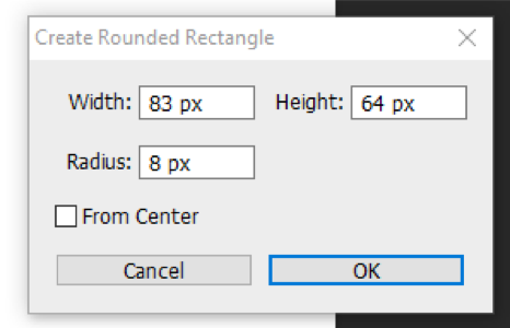
Firstly, draw an 83 X 64 rectangle with an 8 px radius using the Rounded Rectangle Tool.
Then, hold SHIFT and draw a smaller rounded rectangle and set it to 36 x 36 with a 3 px radius.
Press CTRL + T to open transformation points on the smaller shape. Click and drag on the outside of the bounding box and set images to a 45-degree angle. Make sure to place it on the lower center of the larger rectangle.
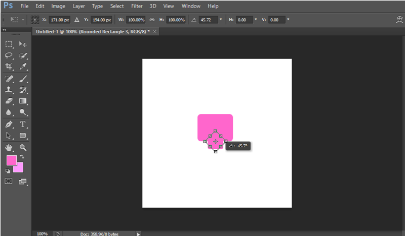
Press ENTER to complete the shape transformation.
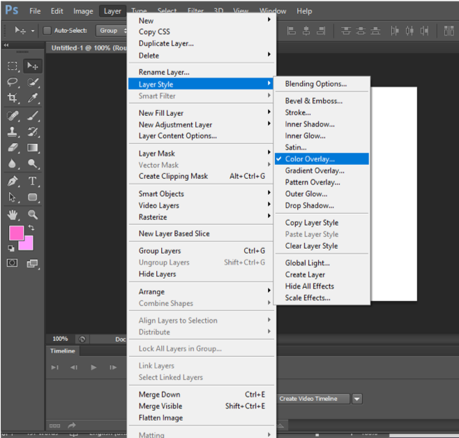
You can change the depth, shadow, stroke, and more by selecting Layer > Layer Style on the menu bar.
When you are satisfied with all the adjustments you made, you can now add an icon sign by adding another layer, or use it on its own!
You can use these tools that are made available in PS so you can create more designs:
- Pen Tool. This tool allows you to make scalable vectors. Draw any shape by placing nodes and dragging them to create and adjust curves.
- Layer Style. There are many free to use styles to enhance your icons. Tip: try using a 1-px gray stroke and set it to 40-50% opacity, and select a 110-degree shadow overlay for your final touch-up. It works!
Step 3: Test and Tweak
This step is a make-or-break process for your icon. Many graphic designers skip this step, but if you want the figure to be vivid and visually appealing despite its size then you need to test the image.
Size your design down to the smallest icon setting (16px x 16px) and check if the image is recognizable and clear. It means that the icon you created remains visible and maintains its integrity despite its size.
If the icon looks good (clear lines and curves, no distortions, etc.), you can go ahead to the next step. Otherwise, tweak or recreate the icon using Step 2 until you are satisfied with the quality.
Step 4: Save the icon
Once everything is finalized and ready, saving the figure as a .ico file is crucial when using it as a Windows icon. Use the PS plug-in to convert the image you created into the right file type. The .ico file format is also applicable for favicon or favorite icon associated with a web page or website.
Conclusion
Creating icons is easy once you have the software, the knowledge, and a clear idea of what you want the end result to be. It would be best to follow a theme, especially when creating an icon set, so that everything looks uniform and harmonious. Don’t be afraid to mix and match, but make sure that the set captures the essence what the icon represents.


