

Do you believe in love at the first sight? If yes, what makes you fall in love with a person the moment you see him or her? Scientists think it’s all about pheromones. If that’s true, love at the first sight exists in business and sales, too. Only in this case, the role of love pheromones is played by the packaging design.
Design is directly connected with people’s emotions. It’s sort of a lacmus paper that serves as an indicator, giving you a clear message to buy the product before you find out anything about it. It captivates your attention and influences your mood. Lots of designers, businessmen, marketing specialists, and sales representatives, agree with the thought that one cannot achieve great results in sales without operating a good design.
I’m a big believer in the emotion of design, and the message that’s sent before somebody begins to read, before they get the rest of the information; what is the emotional response they get to the product, to the story, to the painting – whatever it is.David Carson, an American graphic designer best known for using experimental typography.
Now, take a look at 6 packaging design trends for 2018 that will make people fall in love with your brand again and again.
1. Clear messages
Packaging design for 2018 promises to be clear and vivid. If you want to create a stylish package design that will remain trendy in the future, choose simple forms and you will never lose. The information you provide your buyers with is crucial in this case. Your packaging should explain why and what for, remaining stylish and interesting.
Cheekies – face paints

Designed by aymansolomon_fx, these face paints allow kids to turn into superheroes, magical creatures, and unusual animals. This is what a colorful packaging design demonstrates. You can buy a box called “Magicalâ€, “Scaryâ€, “Superhero†etc. These packaging designs show how happy your kids will be when you present them with these beautiful paints, not to mention the fact that the boxes captivate people’s attention by bright and smooth color solutions. This is what clear message is all about: people know why they buy your product and they are eager to get it.
Air party cannons

One more example of a trendy packaging design created on DesignContest that beat the clock is Air party cannons contest. Won by 3bdesigns, this project delivers a clear message about the reasons the products are worth your attention and what they are aimed at. The differentiation works like an engine that makes people buy this very product at this very moment. So, when it comes to Halloween, you will want to buy Halloween party cannons to celebrate just because you realize that they were made for this very occasion.
2. Bold typography
Haven’t you heard? To be more precise, haven’t you seen the way expressive typography conquers the design world? We bet you have, for eloquent fonts of bright colors are on every modern packaging design that requires attention. If you think that alcoholic drinks are the only market niche that will be using bold typography in 2018, you’ll be very surprised.
Plan b

This packaging design concept for a coffee energy drink is a gorgeous way to prove that sometimes, a proper typography solution is the only thing that matters. Your product’s name might be everything you need to create a great packaging design and to start trends. Black and white VS yellow and black colors combined with a soft but at the same time bold font bring amazing results. Nothing distracts people from the can on the shelf.
Hawkins & Brimble
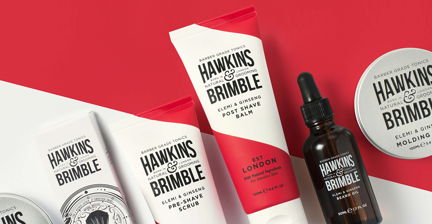
This is why an emphasis on a packaging design matters so much. The first thing you see about the following packaging design would be two words that stand for the brand’s name. These two words are easier to notice and to memorize. Which is why the usage of expressive letters becomes logical.
3. Energetic colors
Energetic, passionate colors used for a packaging design in 2018 will make your product noticeable. You may see lots of products in the supermarket but recognize only those that capture your attention with an unusual look. It is the law of jungles “The strongest survives†but implemented in the marketing campaign. In 2018, the brightest survives.
Jam & Cream bakery
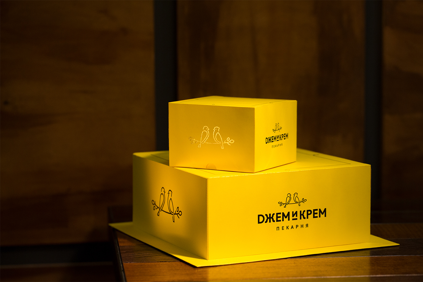
Tuscan sun yellow packaging design created for a Russian brand Jam & Cream bakery strikes with its warmth, luxury, and something else. This “something else†is hidden from a naked eye, it’s strange but at the same time breathtaking. It’s the feeling those bright shades give people who are looking at them. Just as if those birds depicted on that packaging design were going to fly somewhere any minute now. With such colors, the package becomes alive.
Tea packaging redesign

If you aren’t sure which color to choose, try combining them. Not just two colors. Try a lot. Mixing a rainbow is no longer a kitsch. It’s a loud packaging design trend for 2018.
4. Pattern designs
Polka dots, stripes, triangles. 2018 allows you to mix those patterns up and come up with something more than just floral labels. Pattern designs leave lots of space for creativity. At the same time, it makes the design clear and harmonious.


5. Imaginative die cuts
The next packaging design trend 2018 is aimed at your imagination. Despite the fact they reveal what is really inside, they also make you see some hidden (or not quite hidden) messages.
6. Eco-friendly packagings
Less plastic, eco-friendly materials, re-usable packagings: these three features will be very popular among business owners who want to launch their own products. Thinking of our nature has become not trendy but necessary.


![Why Clean Typography Matters [Part 2]](https://dc-prod-blog.sfo2.digitaloceanspaces.com/uploads/2013/06/typefaces.png)