cbbWhen you’re asking for some graphic design, logos, websites and even T-shirts are not somethid new. But there are some other things that affect your brand identity and require an awesome design. The Powerpoint design is one of those small but important things.
The Powerpoint is everywhere: great commercial proposal helps you to sell, successful presentation of your startup helps you to get investment, corporate presentation shows the best results of your work and creative presentations raise the brand awareness and add a wow-effect.
But what does “the good presentation design†mean? That is not only the perfect design, but the achievements of your business goals: the sale completion, convertion increase etc. We have compiled for you 7 design trends that will make your presentation better
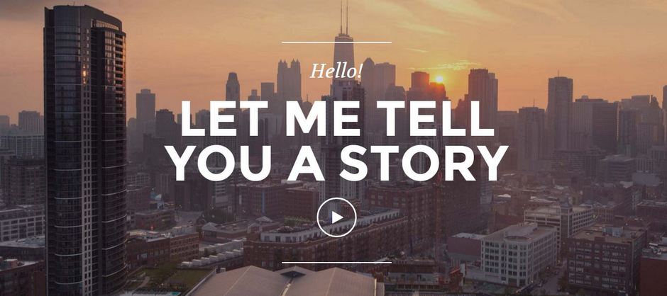
1. Scrolling can make it wow
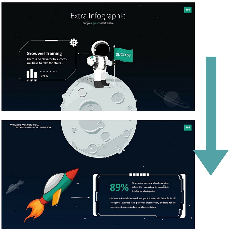
Create a continuous stream from all your slides, which flow one into another, forming an outstanding visual wow-effect of infinity. Your customers will definitely remember this creative presentation.
2. Flat design for presentations is a good idea
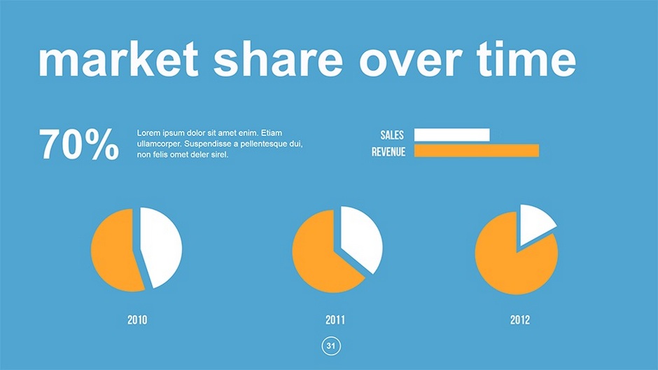
Flat is a trend but there is no signs for it to be less popular. Why is it so cute? Using flat design you greatly simplify the visual message, leaving only the essense of it. This can be applied for backgrounds, illustrations, infographics. The great features of flat design are the following: no shadows, plane icons and buttons. The days of complex palettes are gone – you should use simple, bold and bright colors for contrast and all the details of your presentation, brevity and minimalism are in everything, including the information you convey.
3. The right font is the right choice
The process of choosing exactly the right fonts for your presentation can take extra time and that is normal, because they can make or break your presentation.
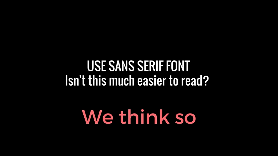
– no fancy fonts that affect readability, and don’t be afraid of fonts that look like “too boring and standard” at first sight – sometimes they are not boring but safe and clean. If you use a dark background for your presentation – you can set a bold font for better readability. Note that sant serif font is much better for a good presentation than serif, because serif can bleed all together
– fancy font is not a taboo, but use it wisely: use it in a headline for example
– don’t use more than 3 fonts in a layout. If you need more than one – choose complimentary fonts. Check Typegenius for better combinations
– handwritten fonts are trendy. All that made by hand have an outstanding elegance and attractiveness, moreover it looks very personal and catchy. You can find one of that amazing hand-written fonts at Fontsquirrel
4. The stock photo is dead
We all know that using pictures is a very powerful presentation techinque, because pictures tell stories and stories give us the feelings. But, please, people are fed up with all that grey man, lightbulbs and happy faces of office workers – thay are really overused. Use some handwritten pictures and icons, which can compliment your presentation, use high-resolution photos (1000px or more), use real images that evoke emotions and emphasize the content of your presentation. Please, don’t use ugly and embarrassing photos just to fill the free place, don’t oversize them too much. You have to be more than carefull with stock photos. Sometimes the lack of any photo is better than the presence of inappropriate one. Don’t put more than one picture on a slide – it’s not a photo album, it’s a presentation
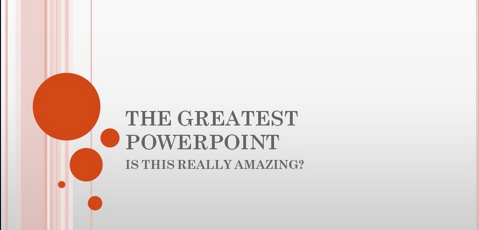
5. Don’t Use a stock theme for your presentation – customize!
When you use some default PowerPoint theme it’s a sign that you haven’t spend too much time to make your presentation unique. Let’s be honest, 99% of that stocks are really awful, boring and are not letting you stand out. You can say that these patterns are getting better from time to time, even Keynote has some good examples, but custom theme or image make a stronger impression. Make a template that will be in harmony with the logo, the color schemes and other attributes of your corporate identity as well as its mood, spirit and values
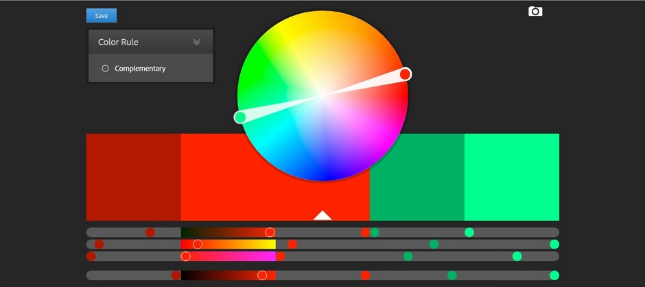
6. Colors rock
Use the right colors, they help to identify main ideas and create the needed emotional response. There is no need of complex gradients and textures – you can achieve all that by simple colors. If you are looking for some great colour combinations – check them at Adobe’s Kuler or  COLOURLovers. Do you need some basics? All colors and tints can be warm (orange, red) or cold (green, blue). Cold ones are better for a background, warmcolors are good  for objects and text. Use the contrast between the color and the background to highlight the main idea on your slides. If you have a complex background picture with a lot of small objects – add a stylish bar of color behind the image for the contrast. If you want to underline a certain word in a text – distinguish it by some contrast color.
7. Less is more
Simplicity is a new black. Don’t put too much on your slides, you have only 1 or 2 sec of your readers attention.
– use visual objects instead of text where it’s possible
– one idea – one slide. Don’t use more than 3 bullets on a slide or better don’t use them at all
– not more than 6 lines of text per one slide
– cut the text to the minimum. Here is one powerful technique: look at the presentation and cut 20% of the excess text. Did you succseed? Now look once again and remove another 20%. All your slides should have a blank space with no elements. Less on your slides will make your presentation more efficient.
As a conclusion
Presentation  is exactly that “small†part that can form a complete image of your company for potential clients and partners. A good presentation is not just a nice slide design, but also a result you have in the end – the increased number of questions, shares, conversions, calls or something else. And it’s very important to keep your presentation up-to-date as well as your logo, website or landing. I hope that 7 tips will help you to become better.
Do you agree with the points that we have listed, or would like to add something else? If you have friends who would be interested to read this material – share the link with them!
*Sources for illustrations: graphicriver.net and magnum.themes