

One of the ways to recruit customers on the Web is banner advertising. Good banner advertisements, that is.Â
Although a common path for many, bad banner ads have spread like wildfire. Sometimes it feels as if they get too involved in the aesthetics, and forget about the ad as a whole. The goal of a banner ad is to get that extra click. Not selling a product, that is for the landing page to do. Your job with this task is to get the attention of your visitors, spike their interest and earn a click.
I would like to give you an equation. Memorise it by heart if you want to get anywhere with those banner ads.
EA = 2AT + I + AS
This equation is copywrited by someone, but this article is written towards a better cause so don’t mind me. Get a tattoo of the euqaiton if you really have to.Â
EA = Effectiveness of the Ad
AT = Attract Attention
I = Generate Interest
AS = Ask for the Click
These three very straightforward objectives result in some of the most common, most silly mistakes with banner ads.
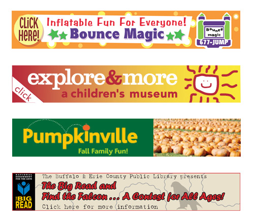
Here are examples of excellent banner advertisements before we move on to the unfortunate ones.
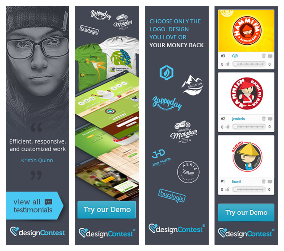
Do you see why we all take the same message away from these banner ads?
These follow all of the afroementioned rules. They look professional and they’re sucessful because they follow rules. And now for the common mistakes with banner ads…
1. IGNORING YOUR BRAND
Are you making banner ads and forgetting to brand them? Rookie mistake. The subtle visual elements in your banner ad make all the difference. They let the audience know what you do, and translate your brand message for all to see. Do remember to include colors, icons, logos and fun fonts.
For the sake of effectiveness, try using less space and limit the thematic, color and icon representations. You’d be surprised at the power of minimalism. You can continue to woo your audience once you’ve secured their click with your banner ad. Although the following banner is well designed, it is missing a very important feature.Â

2. CLUTTERED COLORS
I don’t need to tell you about the correlation of colors and psychology. If you’re a respectable company, you should know. Too many colors can send the wrong message and result in an ad that looks unprofessional and amateur. Is that what you’re going for? No. Your color scheme should consist of 1-3 colors, and the colors should be chosen from your brand color palette and perhaps expanded on or emphasis.
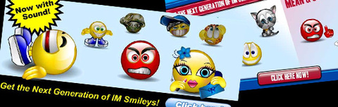
Think red for Coke, blue for Facebook. Not these questionable color banners where all 7 common mistakes are implemented.Â
3. CRAMMING
Don’t overwhelm your audience with information. This tactic may work if you’re trying to recruit clients in person, I’m referring to our tendancy to ramble. It just does not work with banner ads, I’m sorry.Â
Cramming information and images in your ad means you’ve mastered the art of spaming. That is the message you’re sending your clients. Aim for something a little more focused, sophisticated and with a clear purpose.Â

4. IGNORING/FORGETTING YOUR TARGET AUDIENCE
This is by far the most embarassing one. One of the biggest mistakes marketers and business owners make is lose sight of their target audience that they are trying to reach with the ads. It may have been specified, but lost in translation or just too vague and unclear for all to see.Â
Ask yourself these questions. Who do you want to gain clicks from? Do the visual aspects of the ad speak directly to this target group? Are you too excited, and are only interested in creating a pretty design? Think again.Â
One more word of advice. When you’re designing for a specific audience, do avoid generalising.
 Â
Â
5. POOR GRAPHICS
I was debating on including this as the first and most common mistake. However, we see less of this now because looking at your competition, it’s just impossible to go with poor graphics if you want to get any attention that is.
This point makes all the difference between PROFESSIONAL and UNPROFESSIONAL. Graphics must must must be clear and never pixelated. Unreadable font falls under this category. Don’t even think about comic sans or any of the fonts in this ad.Â
6. UNCLEAR/MISSING CALL TO ACTION
You MUST include a Call to Action, and this ‘call’ MUST be clear from the first glance to let the viewer know what to do and why. Consider the things that generate high click rates and what you are offering the users in return.
They need not be complex. For instance “watch instantly – free trial”, and the Call to Action would be “Sign Up Now”, clearnly indicated in the banner ad. Oh, and don’t fill your viewers with false hopes, make sure you actually deliver your Call of Action purpose.
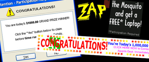
Like this atrocity here. I’m dying to know what happens when I click “Yes”.
7. WRONG BANNER CHOICES
A typical banner is static. However, if you encorporate tasteful animations or effects into your design, you’ll increase your click rates significantly. Don’t try it if you’re still unsure and/or have noticed any of the aforementioned mistakes in your ads. This may be a little too advanced for some because if you fail, your add will look like spam and no one likes spam.
For the love of God, stop making bad banner ads. Not only do they make your company/business look bad, these common mistakes let your clients know you really don’t care much for them and their needs.
While we are on this topic, I feel obliged to mention banner blindness.Â
Banner blindness is a phenomenon in web usability where visitors to a website consciously or subconsciously ignore banner-like information, which can also be called ad blindness or banner noise.
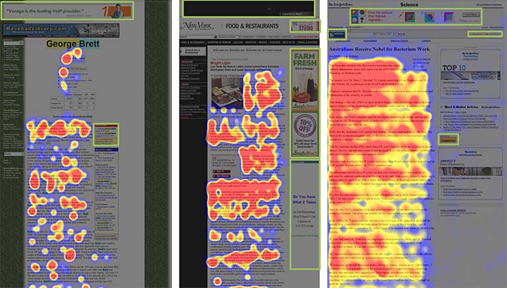
I hope you find the following image of interest to you, study it and make your own conclusions.
The following heatmap is extracted from various eyetracking studies. Areas that users fixate on is colored red; the yellow indicate fewer views, and blue represents the least-viewed areas of the web pages. Grey areas appear to have no fixations, and the green areas show where the banner ads are placed.Â
We sincerely hope you have taken away something very useful from this article. If you do not recall any of these common mistakes and how to avoid them, at least keep the equation in mind.
EA = 2AT + I + AS


![Brand Evolution [INFOGRAPHICS]](https://www.designcontest.com/blog/wp-content/themes/dcblog/img/fallback.png)