

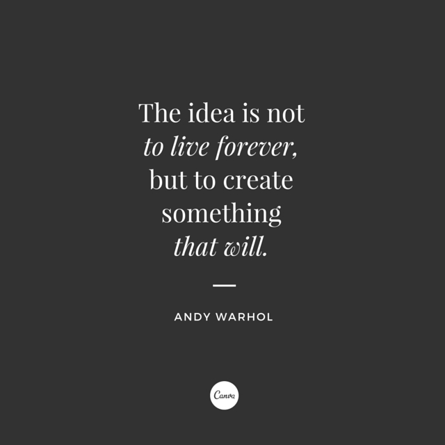
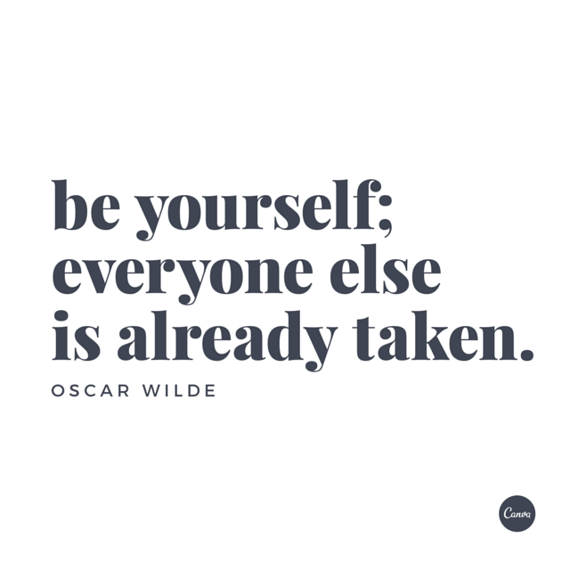
“Creativity is intelligence having fun.”
– Albert EinsteinÂ
Have you always wanted to attend a design school but never got the chance to pursue your dreams? Enter Canva – the website that brings us inspiration all day every day.
Today, with the help of Canva, you can undertake a quick crash course on graphic design! Applaud yourself, you’re now a better designer having skimmed through it. If this seems like an exaggeration, then read through and take something away from this (if not as a lesson, then your source of inspiration for future designs).Â
As a graphic designer, you have an equal responsibility to be a. an amazing designer and b. an effective communicator. You tell your stories through memorable design using type, color and images. Like all other artists, you have a set of tips and techniques to help you in your responsibilities as as designer/communicator. It’s always in the little things. The size of the font, the hue of the colors, the darkening of the background images etc. Sometimes it’s the slightest changes that will make all the difference to your designs. Canva (and DesignContest) present you with the following tips to ensure the tone of your messages are always spot on.
Often, it’s just a matter of adjusting the size of your text, or darkening the background image image so that your message is more legible. Other times, it’s a small but significant alteration; like breaking up the lines of the text into a rhythmic pattern which can dramatically improve how your design visually communicates with your audience.
Professional Tips for Designers from Canva
Tips on Images
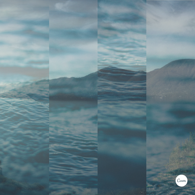
1. Overlay photos in strips and try to match them with the forms in your background image.
Always be willing to try something new! Crop your images to make them into interesting compositions. As you can see, they don’t always have to match to look great as a whole.
2. Help textures speak through design elements with transparency.
Don’t play it safe. Plain white text or shapes are so boring sometimes. Use subtlety in your designs – apply transparency to white elements to soften the graphics. Add a detailed background (such as the one below), and let the texture speak to the audience instead of the words.
3. Crop images to let them act as background textures.
Sometimes your perfect image is actually hidden in disguise. It can be a part of a bigger image, which makes searching for the ideal image for your project so much easier! Just pay close attention to details.
4. Crop your images to complement your composition.
Are you a bird? You’re not fly if you’re not implementing these tips! Use your images to guide you in cropping for better compositions.

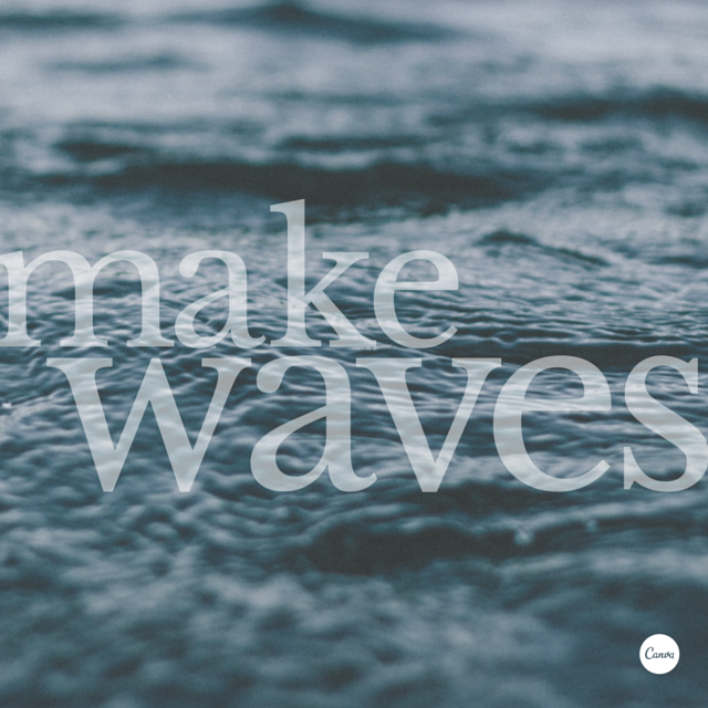
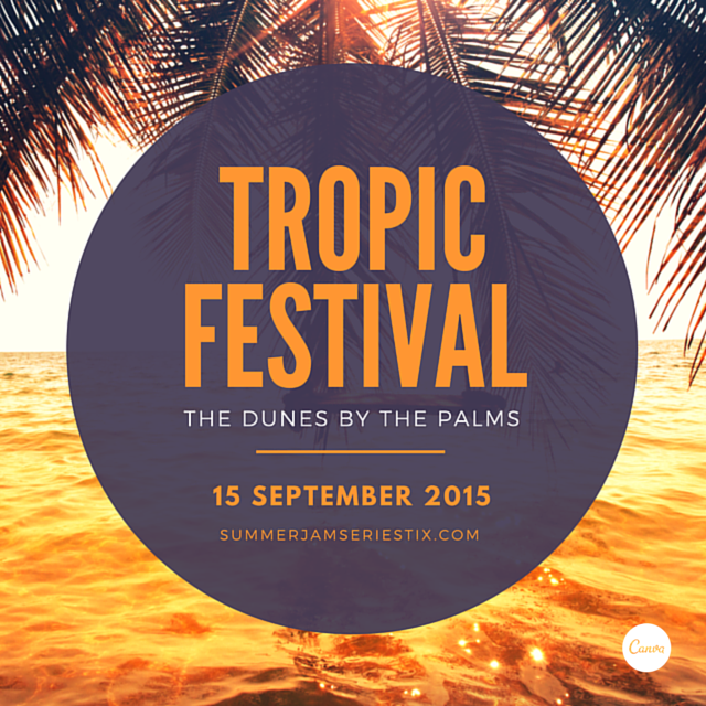
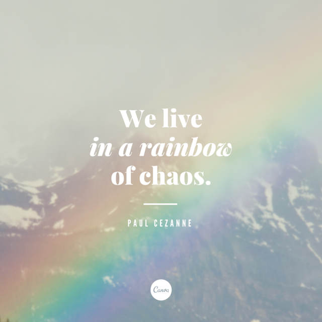
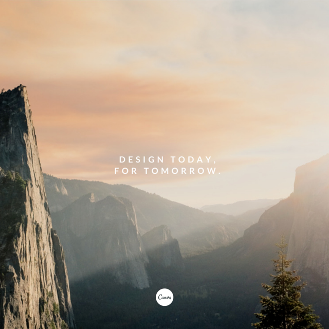
5. Use relevant imagery to help visually communicate your message.
If your image does not correspond the text, you’ve pretty much failed this course.
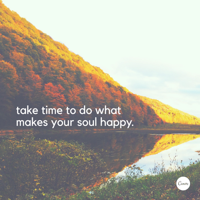
Make sure you place your text where it’s legible for all. Imagine if the text for this image were to be placed in the sky. The lack of contrast would cause the message to lose it’s impact.
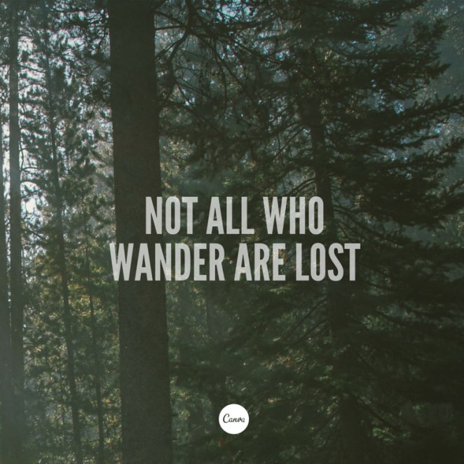
6. Use colors from your background image to apply to your text.
Just keep it simple. That’s all. No need to go crazy with introducing new colors for ‘contrast’, use some of the subtle color hues from your background images.
Tips on Composition
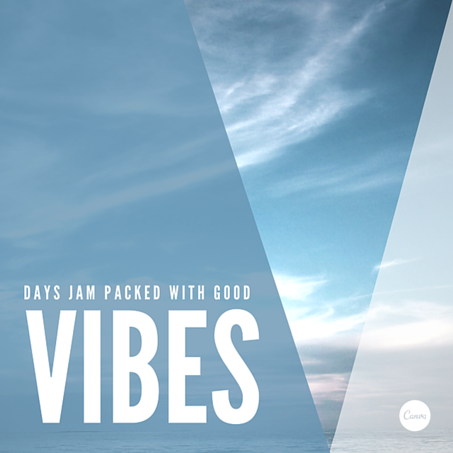
1. Use shapes to create symbolism that reinforces a message in your graphic.
Create a clever composition by combining elements that visually represent your idea. See the many doors that open with the repetition of the V shape in the image below.
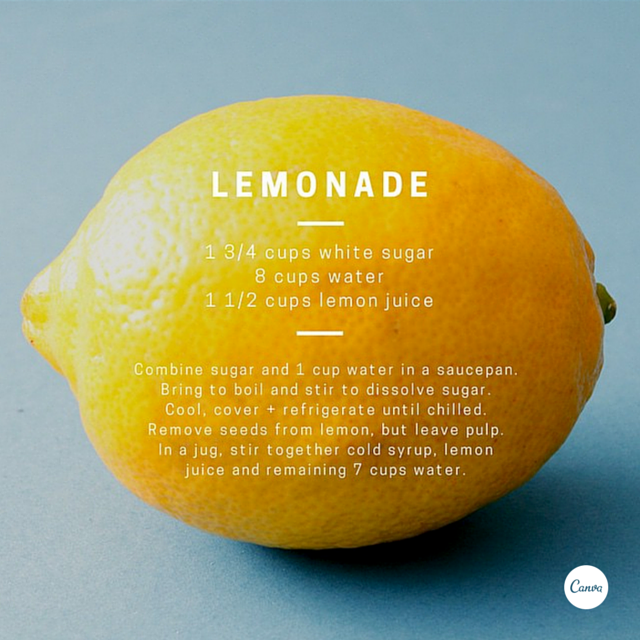
2. Create clever compositions by letting the features within images guide where to place your type.
It need not be a lemon! Another tactic for a unique composition is using an interesting and fitting shape (relevant to your subject matter) to help guide where you place your lettering.
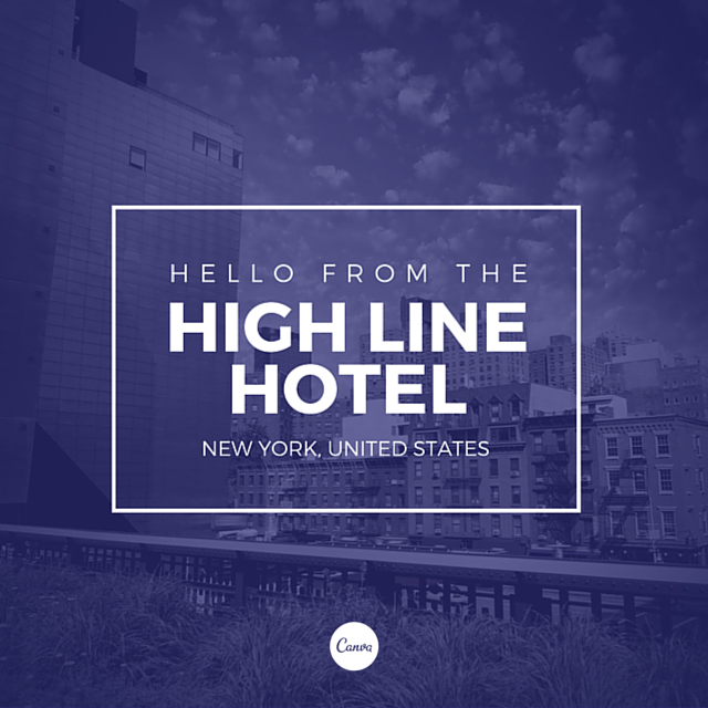
3. Aesthetics! Composition! Adjust all the elements in your graphic so they are on corresponding angles.
Compose yourself, then look at the composition of your background image and compose the text accordingly. Are you following?
Always keep in mind – COMPOSITION. Like the type in this image that’s slightly slanted to correspond to the slant of the horizon line. Creating visual harmony is a a skill!
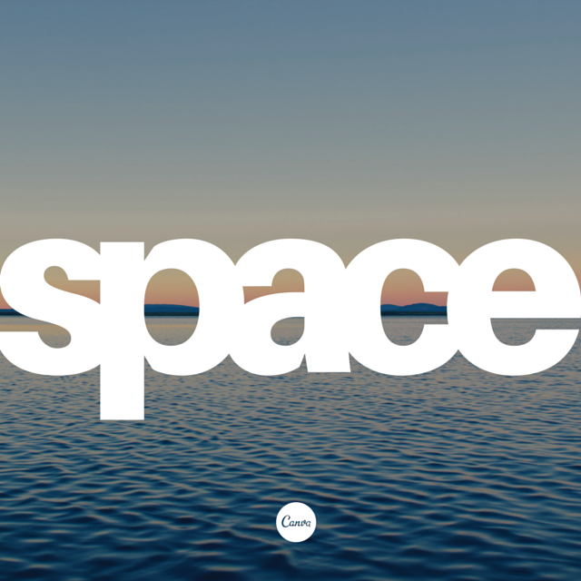
4. Use areas with clear space in your images for creative ways to include text.
This tip does not need to be elaborated on. We all know that taking advantage of negative space is always a win-win situation.
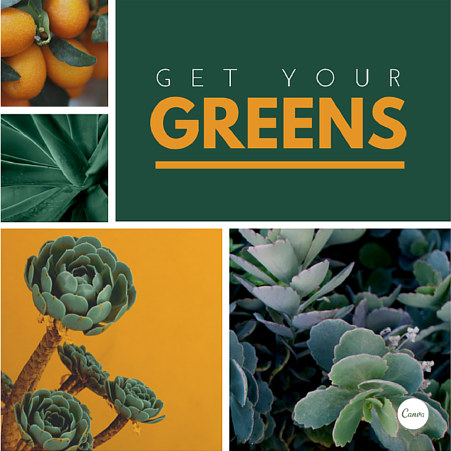
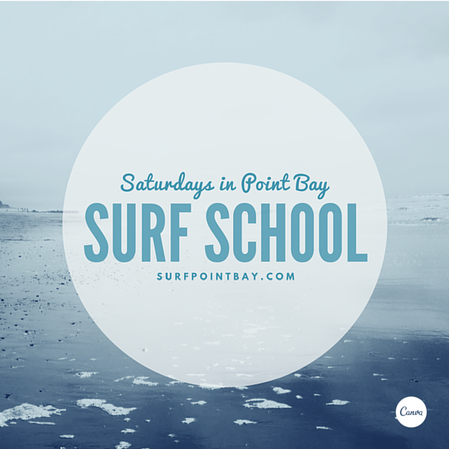
5. Apply a grid to create a clean composition, using one of the photo holders as a text box.
One of the most visually appealing compositions are a clean grid. To further contribute to the aesthetics, include images within the same color palette. If you want to take it a step further, use a solid color from the same color scheme to fill one of your sections.
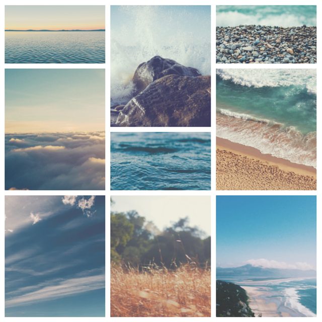
6. Make beautiful collages with your favourite photos using grids, ensure to apply the same filter to each image for consistency.
The grid is a sure way to get you that ‘clean’ look you’re going for. Another tip is lining your images within the composition together for even more harmony. In the series of images below, you can follow the lines from the horizon as they match up with the floor line on the right. Also, make sure your filters are consistent if you’re applying them to your images!
Tips on Contrast
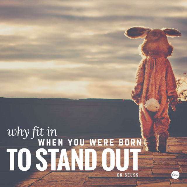
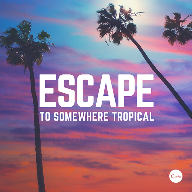
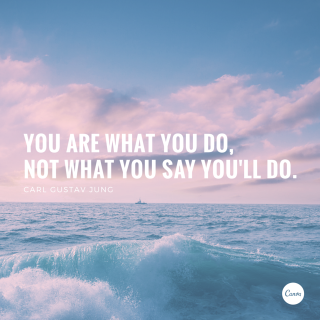
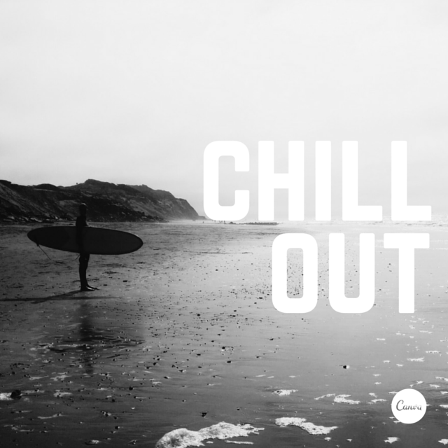
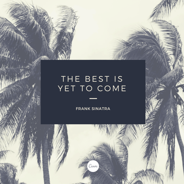
1. Use strong, geometric typefaces to amplify your message.
The tone of your message is partially translated through the typeface you use. In this case, the bold and strong Sans Serif font delivers the message in a strong voice. Note how the white lettering is also contrasted by the dark filter used in the background image.

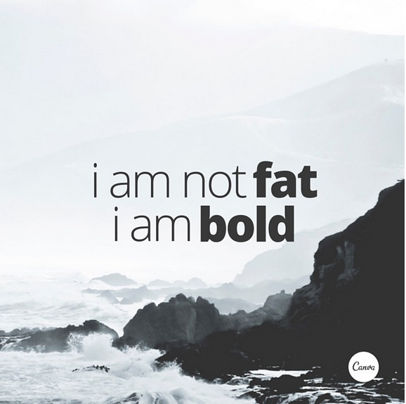
2. Create strong graphics with the application of saturation and a bold typeface.
This is a case of striking white working with you to contrast the background image. The contrast in this composition is high-impact because of the high saturation of the background image. This brings out the heavy, block-like typeface. It’s right in your face.
3. Use the combination of a tint and x-process to create two-tone filter effects.
When you reduce the x-process, your image takes on a cooler, more soothing shade.
4. Create soft effects by placing a pale shape over your image and adjusting the transparency.
Like with the previous tip, overlaying colors enhances the tones in your image and creates a softer effect. A transparency filter also reduces the noise levels in the details.
5. Level out the tonal separation in your images by decreasing the contrast in your filters.
Really, we’re all familiar with the temptations of increasing the contrast in images. Do consider that a low contrast filter can also create beautiful effects. It gives your images a somewhat ‘vintage photography’ feel.

6. Desaturate your graphics by applying a pastel toned shape over your page, creating a whimsical effect.
Are you singing the song right now? Stop it. Focus on the image! Note how a pastel filter tones creates a whimsical effect.
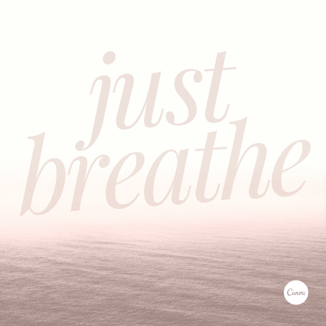
7. Create calming, cool design using soft tones and transparent imagery.
For this particular effect, apply a pale tone to your background. As beautiful as your image may be, sometimes making it barely visible can be quite intriguing and help your font stand out. Adding a white frame around a pale images contributes to the ‘sophisticated’ look.
Tips on Font Type
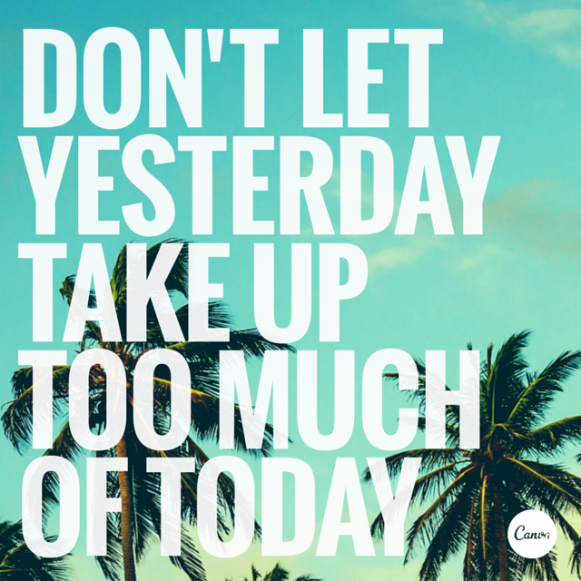
1. The placement of text is a crucial element. Make sure to break your lines up the way it should be read.
You can go so wrong just by pressing that space bar an extra time. Keep rhythm in mind as you break up your text. Also, italics are a powerful tool for emphasis.
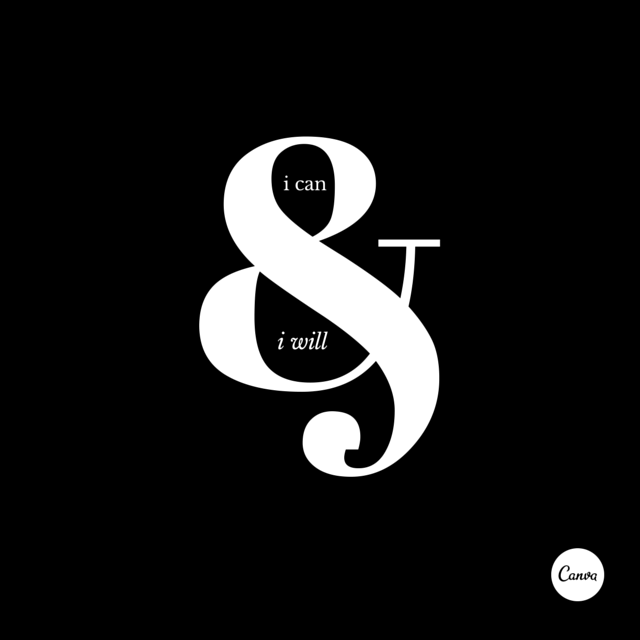
2. Â Monochromatic style graphics never get old. Use black and white filters combined with white text for an epic contrast effect.
You can never go wrong with black and white. Black and white is cool and you can’t disagree.
Take advantage of forms and shapes for tonal balance.
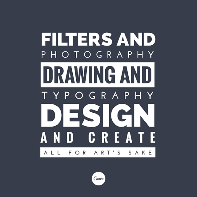
3. Use light and bold font variants for emphasis and impact.
Open Sans is a great option for staying consistent with your style.
4. Use a bold and stylistic typeface teamed with a fine sans serif for optimum contrast.
Some words of wisdom here for you.
5. Treat content with a strong rhythm with an equally strong design style.
Do you see how the word “design” is stacked on top of each other where it repeats? This is visually very powerful. Try to keep up this rhythm if you have repetition in your text. But don’t overdo it!
6. Choose a geometric typeface teamed with an elegant serif for a happy pairing.
Canva says contrast is your best friend. Take note of this as well.
7. Typefaces have personalities too. Make sure you represent your message with the right fonts.
Aside from the obvious, notice how the two different typefaces are used on different parts of the image. Emphasis!
8. Use font styles to create nuance in your text, to place emphasis on specific words.
Lora is a beautiful and elegant typeface to go with when you need emphasis. The subtle difference in the regular and bold style contributes to its effectiveness.

Tips on Placement of Text
1. Use an interesting text placement to play on the idea of your message.
Break up your words into separate text boxes. Remember that it’s still just as important that your text reads in the correct order, regardless of how carried away you got with all the adjusting.
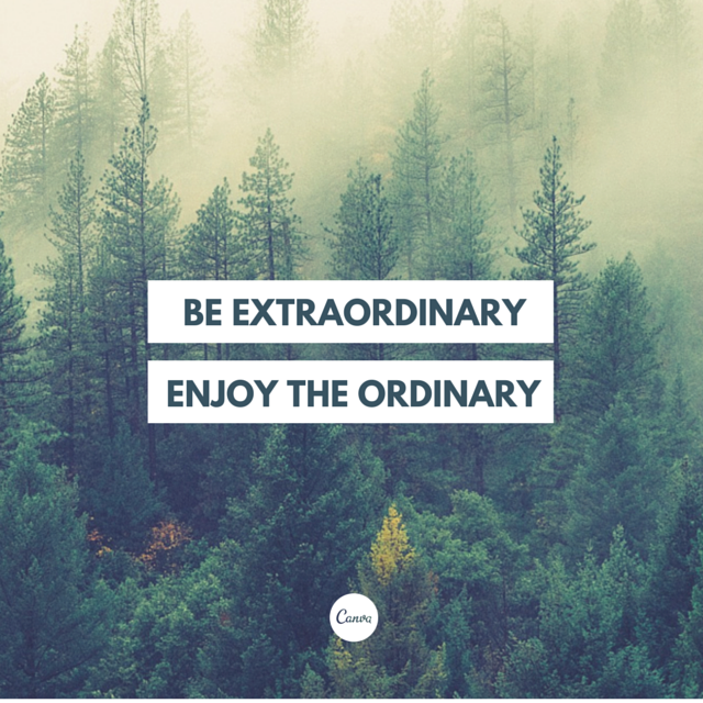
2. Never underestimate the power of a nice image and clean text.
Keep it simple. Always.
3. When using a shape to contain your text, apply a color from your background to your type for a cut-out effect.
This can be both playful AND sophisticated.
4. Contain your content by using a frame around your text.
Create some drama with those frames!
5. Let your background determine how you align your text. Find space with less noise for placement.
Remember the key principles and elements of design? Balance being one of the most important ones? Take advantage of asymmetrical images by balancing it with your text.

6. Push your creative skills by stacking different weight typefaces for a stylized effect.
This could be so much fun! Sans Serif is the best font to go with for this particular trick.Â
Tips on Letter Spacing
1. Use letter spacing and line height to make your text fit your page.
2. Use shapes to create contrast and offset your text from your background image.
3. Be creative with letters + symbols by applying scale to form interesting compositions.
4. Create beautiful typographic forms by increasing or decreasing letter spacing.
Tips on Color
1. Instead of using solid colors, try increasing the transparency of your elements a little for a more subtle effect.
Give your letters some breathing space. In this example, the graphic evokes the feeling of aspiration and inspiration. Take a minute to figure out why.Â
2. Apply a tint to your image the same as any block color in your design for consistency.
Pick a color from your image and use it to fill in a block in your design.Â

3. Use one color consistently across your all the elements in your graphic.
Consistency, consistency, consistency. Regardless of your design, a complimentary aesthetic is to be always kept at check.
Make your image black and white before applying your tint for optimum effect.Â
So there you have it. Great tips as well as examples of beautiful and effortless design.
DC is happy to present you with your very own certificate (an imaginary one) upon completing this crash course/article.
One more quote before you go:
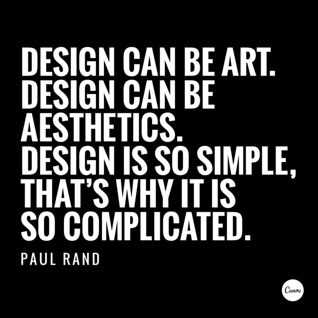
“Design is the method of putting form and content together. Design, just as art, has multiple definitions; there is no single definition. Design can be art. Design can be aesthetics. Design is so simple, that’s why it’s so complicated.”
-Paul Rand


