Approximately 8-10% of men and 0.5% of women suffer from the inability to see color or difference in color, which means that every 10th person visiting your website may have color-blindness. Is there a way to make sure that your interface is equally suitable for the needs of every possible user? There is a lot of controversial information on how design should look to be legible for people with color vision deficiency.
We have made a list of what you should consider in order to reach that level of color view-ability of your interface.
What is Color Blindness?
Color blindness is the inability to tell apart between shades and colors. Men happen to be more prone to color blindness than women.
There are three main types of Color Blindness:
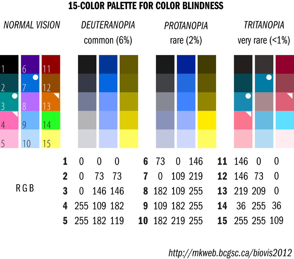
– Deuteranopia, in this case a person can only see two to three hues, whereas someone with normal vision sees 7 hues. They are more likely to confuse mid-reds with mid-greens, bright greens with yellows, pale pinks with light grey, light blues with liliac;
– People affected by Protanopia are less likely to distinguish shades of red color. They may confuse deep red with black, dark brown with dark green, some blues with some reds and mid-green with orange.
– Tritanopia is a condition where a person cannot tell between blue and yellow colors; however they safely distinguish their reds and blues.
How to make your design suitable for color blind people?
At first you think: “There are 7 billion people out there, why should I optimize my design if the chances of them visiting my website are so low?â€
But if you take into account color-blind people when working on the design, there are high chances it will improve the overall interface and usability.
Making your website universal does not mean making it less aesthetically pleasing to the eye. Instead, you are making it more easy to comprehend and more pleasing to use.
These tips will help you make your layout meet the needs of color-blind people.
1. Use BOTH color and graphic symbols
Try not to rely solely on color to indicate a state of some process. For instance, some forms of color blindness will not allow users to see the red mistake message when filling in a registration form. One of the solutions would be to use both: a color indicator and graphic symbols with explanations.
Take a look at DesignContest registration form:
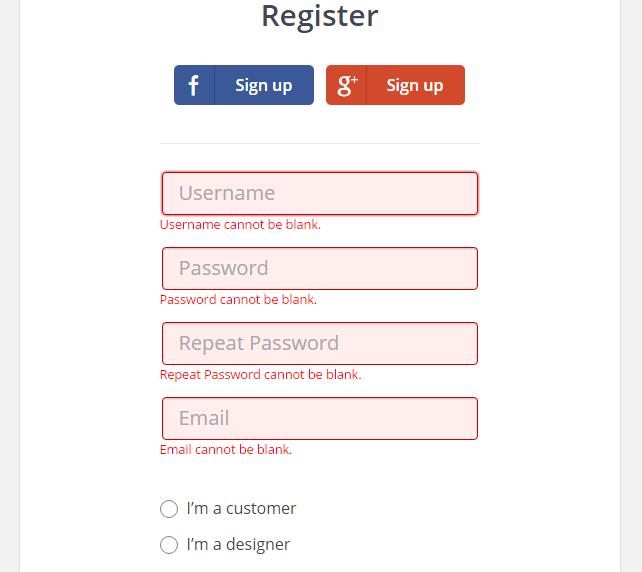
We added an explanation for each section if there is a mistake.
Fact: Mark Zuckerberg has a hard time telling a difference between greens and reds due to Deuteranopia. That is why the color scheme for Facebook is blue. As he said in one of the interviews “Blue is the richest color for me. I can see all of blue”.
2. Go with less
Limit the color palette of your website to a few main colors. Remember that less colors means better interface, and not only for color-blind people. People generally react better to less colorful pages that do not irritate their vision.
3. Patterns and Textures as a tool for contrast
Users may find it difficult to differentiate graphics and diagrams if you solely rely on contrast colors. Try emphasizing elements with textures and patterns – it will help them understand information better.
4. Avoid misleading color combinations
Know your color palette! Since color blindness takes different forms, it’s difficult to say what is a “safe†choice for your design. Here are some color-combinations which are challenging for color-blind people:
– Green + Red;
– Green + Brown;
– Blue + Violet;
– Green + Blue;
-Â Light green + Yellow;
– Grey + Blue;
– Green + Grey;
– Green + Black.
How to tell if you are color-blind?
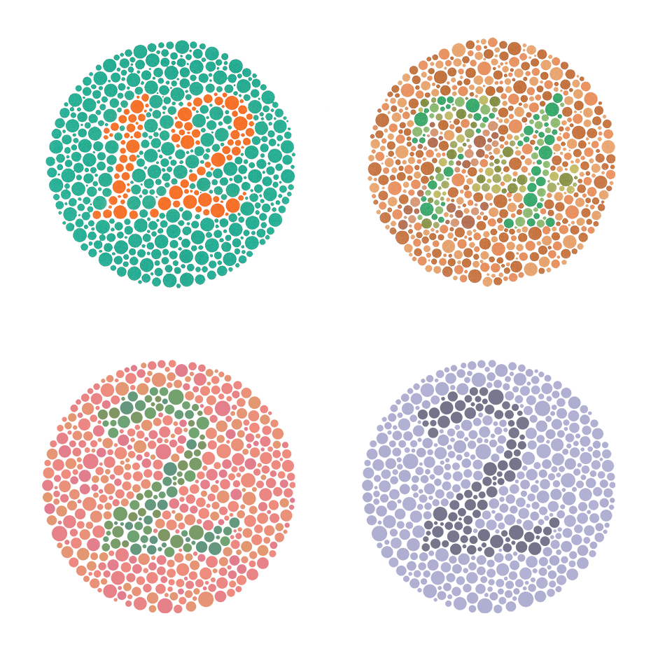
Well, some people might not even notice it unless someone points it out to them. The most common way would be taking the Ishihara test.
You will look at images like the one below and write down what you see.
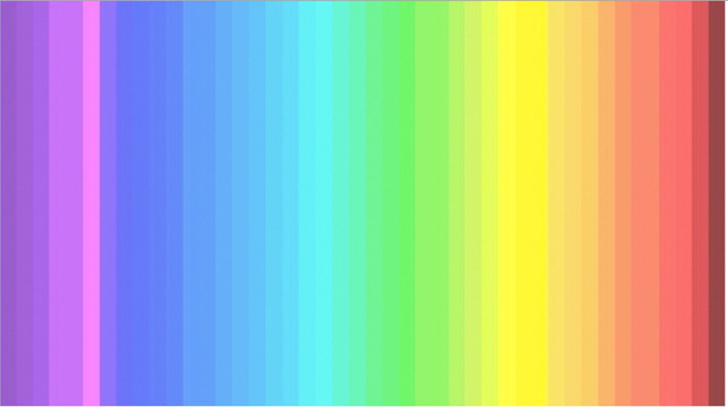
Another test was created by an expert in neuromarketing, Diana Derval. She created a post on LinkedIn explaining the basics of vision and sharing a color spectrum similar to the one below. Apparently, the amount of colors you see tell whether you have a  problem telling colors apart.
However, it is always best to consult an eye specialist.
Unfortunately, there is no universal solution to this problem. But for a start you can rely on the listed guidelines. Good luck in creating great designs!