
![Why Clean Typography Matters [Part 2]](https://dc-prod-blog.sfo2.digitaloceanspaces.com/uploads/2013/06/typefaces.png)
The most important consideration when it comes to type is readability. From small, tightly packed lettering in body text to big, dynamic lettering in logos and banners, clean typography can make or break a project.
Here are five more things you need to know to help create clean typography – proper punctuation, relative size, smart quotes, color and contrast, and readability. (Don’t miss Part 1, which explained hyphens, alignment, spacing, headlines and hierarchy.)
1. Use proper punctuation
Somewhere in grade school, students were taught that you end a sentence with a period and then add two spaces before moving on to the next space.
Not true! (Unless maybe you are using a very old typewriter.)
One space between words and one space after sentences is all you need. Period.
Placement of other punctuation is important as well. Punctuation goes inside quote marks.
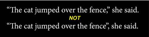
This applies to all punctuation. In addition, when using parenthesis, punctuation goes inside of parenthesis if the whole sentence is parenthetical, outside the parenthesis if part of the sentence is not.
Why it matters: Following rules adds a level of professionalism and visual consistency. Your text looks like all of the other text out there and reads in the same way, making it easier for people to digest.
2. Size relative to document
The size of body type is especially important when it comes to clean typography.
Lettering should be relative to the document or screen size for optimum readability.
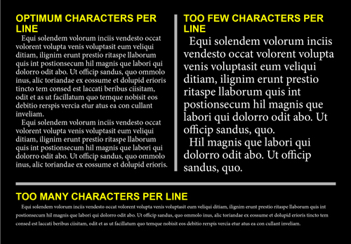
When it comes to screens, the optimum number of characters per line is between 45 to 75, depending on font. To play it safe, stick somewhere in the middle – 55 to 60 characters.
Mobile typography is somewhat larger in proportion to screen size, at 35 to 50 characters per line for the most readable type.
When it comes to printed type, the rules are similar but you can get away with somewhat smaller lettering by working closer to 75 characters per line. But there are better ways to measure printed type than characters per line. For those familiar with picas (a unit used by print designers), the simple rule for choosing the size of body copy is to take the width of the column (say 20 picas) and divide by two to determine an optimal point size for type (here that would be 10 points). In print design, you often have columns to worry about and all measures are based on the width of each column, not the overall width of the page.
Why it matters: Type that is not size properly can result in lots of odd breaks, making it difficult to read. Type that is too small can strain the eye by having to read to far from left to right and back again. Type that is too large creates odd copy breaks and when using hyphenation, will result in an abundance of hyphenated words, which can cause a reader to stumble.
3. Use smart quotes
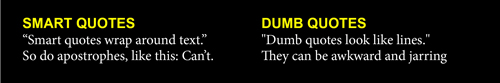
Smart quotes turn in relationship to nearby text. Making it so that quote marks turn in toward the text instead of away from it. Smart quotes mirror the way people write and even the all-famous air quote that people use when speaking.
When you use “dumb†quotes they can turn away from text or are merely represented by a small flat line, leaving text with a look that seems unfinished.
Why it matters: Good typography is comfortable when it comes to the structure of characters. Smart quotes fit text text appropriately.
4. Pay attention to color and contrast

The color of type can be just as important as what it says.
When working with color, make sure to go for hues that make reading easy stand in contrast to the color of the background. (The highest contrast combinations are black and white, the most popular background-type pair.)
Be careful of using large blocks of type in colors that are exceptionally bright or too closely match the background color. You can create type and background color combinations that are sharp and easy to read without sticking to black and white. Start with a neutral beige background and gray type and experiment from there.
Why it matters: Low-contrast typography is extremely difficult to read. It should be reserved for “artistic†elements only and never used in large blocks of type. The goal of type is to read it, high contrast color makes that possible and easy.
5. Make it readable

If you can’t read it, the words mean absolutely nothing.
Finally be careful about using too many effects, colors or additional elements in and around type. Be aware of type wrapping and the proximity of other elements to type.
Allow type room to breathe and stand on its own. Elements such as photos and icons should not touch type and there should be as much (or more) space between type and other elements as the amount of spacing between lines of type.
By allowing type room to stand on its own, you are making it easier on the reader. By combining all of the tips in this post and from Part I, you will begin to create typography that is appealing and easy to read.
Why it matters: The reason for typography is readability. Make it easy for your audience to see and understand your message.


