

The language of icons
How many languages do you know? Which of them is the most useful? Which is Lingua Franca? I guess you all think of English. And you will be wrong. Lingua Franca (in other words, the language everybody knows and uses) in today’s digital world is the language of icons. Icons speak in a loud and clear voice, they help you to navigate everywhere: in airports, unknown cities, and a new software.
Cave paintings of the 21st century
Icons seem to be simple and not worth our attention. Well, they exist, that’s great. We don’t think of them much; their primary functions don’t awake our interest. However, they should, for icons are like small beacons on any website or mobile app; they help us to make quick decisions and lead us to what we are looking for. In the era of worthless information, a few seconds you need to get the message from the icon you are looking at saves lots of your time and efforts.
Creating one great icon is hard. Designing several superb icons is much harder. Creating several superb icons that will be connected to each other in terms of style, colors, size and purpose is the hardest thing to do. Still, the hardest doesn’t mean “impossibleâ€.
Types of icons
There are two basic types of icons used nowadays: pictograms and ideograms. Despite the fact they are often joined together for a better influence they have on people, you still need to differentiate them.
Pictograms
Pictograms are the most popular icons. They are some certain symbols that redirect us to the object they convey. For example, a bus means a bus stop; a receiver means a phone box; a plane means an airport. As a rule, these icons are common for all the countries, which is why they facilitate their perception.
Ideograms
Ideograms belong to a higher level of understanding because they depict the whole idea aimed at one object. For example, a crossed cigarette means it’s forbidden to smoke there. So, one icon carries a whole concept inside.
Icons’ proportions
In general, digital icons demand a set size. You may create your icons sticking to any of the following sizes: 16×16, 24×24, 32×32, 48×48, 64×64, 96×96, 128×128, 256×256, 512×512. However, it doesn’t mean you should be restricted by these sizes only. The best option for choosing the icons’ proportions is to take into account what these future icons are aimed at. If we are speaking about an Android app, for example, you need to take a look at Android icon design guidelines and provide the design that correlates with their demands.
Icons for free
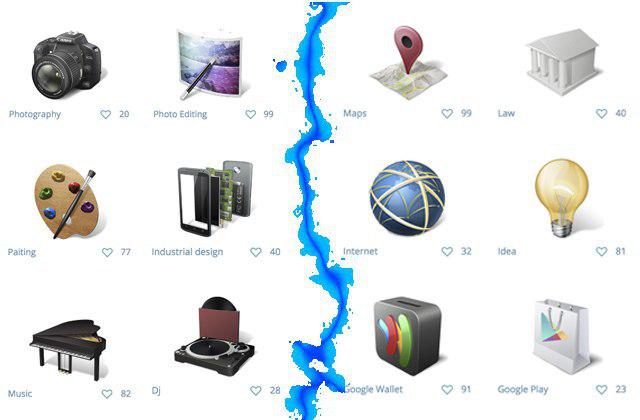
So, a wide variety of icons along with their importance stays out of question. And here comes the question of where to get these icons, especially if you need them as quick as possible. One solid option is starting a contest on DesignContest – the results will be better than you expect. To prove this fact, DesignContest offers you to use a set of our incredibly creative icon designs free of charge. These icons were chosen by our Facebook community as the best ones. Therefore, enjoy them and remember: if they look so great, the icons from DC’s contests look twice more stunning!
Terms of use
This graphics is licensed under a Creative Commons Attribution 4.0 License. This means you can freely use these icons for any purpose, private and commercial, including online services, templates, themes, and software. However, you should include a link to this page in your credits. The icons may not be resold, sub-licensed, rented, transferred or otherwise made available for use. Please link to this page on DesignContest.com if you would like to spread the word.


