All that glitters isn’t gold. This well-known English proverb comes from the times of Shakespeare and has’n lost its relevance ever since. It’s been proven hundreds of times that the most expensive things aren’t always the most prosperous ones.
Expensive failures
We used to know this company as Hewlett Packard, one of the biggest information technology conglomerates in the world. When the company started losing billions yearly, it was decided to turn it into HP Inc., which hopefully was supposed to increase sales. However, the result was quite opposite: the company is still losing money despite being merged.
MGM Resorts International is one of the largest hospitality companies in the USA that is yet influenced by major revenue problems. Even its collaboration with Sydell Group doesn’t seem to help: money troubles are still pursuing the conglomerate.
There are lots of other examples that demonstrate giant successful companies suffering from financial troubles that decided to take up merging or selling the company as the only possible way out. However, none of these companies have tried out the most obvious solutions to fix the situation and endorse sales: rebranding.
Making your brand rewarding again
Rebranding is always a significant risk that should be completely justified. You cannot go for it simply because you wanted to. You should have sound and compelling reasons that reflect your clients’ expectations. If your sales got affected by any major shifts from outside, you need to react immediately: any hold-ups can make the situation worse. Altering the expectations you set for your public may help you overcome these difficulties.
Rebranding means presenting your company from a different, brand new point of view. It consists of transforming your company’s corporate identity in the way it would appeal to your regular clients and can attract attention of potential ones. Rebranding includes upgrading your logo along with business cards, development of your product and website design and other upholding elements that stimulate your sales. It costs a lot, especially if you decide to change a couple of elements despite one. If your budget is limited, the situation can still be improved: even at less than $299 spent properly, one developed component of your corporate identity can rescue your sales.
Upgrading a logo
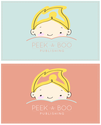
Changing a logo is a tricky business because you never know how it will affect your target audience. It is always a lottery. You may pay through the nose by buying extremely expensive tickets but get truly disappointing results. You may well buy only one ticket at a reasonable price and become a winner. One of such winning examples is a logo designed on designcontest.com for  Peek-a-Boo Publishing Group. Â
This logo is soft, tender and sweet. It reflects every single quality you want to see in the agency that deals with publishing children’s literature. It carries some special glowing within that inspires you with warmth and serenity. The most magical thing about this logo was not even  the impression it leaves behind but its price: at less than $299, the company got a perfect design that is capable of boosting its sales: people get engaged the creative ideas.
Designing new business cards
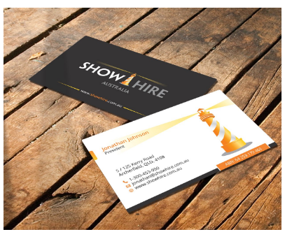
Business cards are the tool that reminds your clients about you, as far as they always have them in their wallets. They also enable your prospective clients to understand what your company really is and how they can benefit from cooperating with you. Thus, a leading event production company Show Hire in Australia has got a perfect business card design that correlates with its basic concept of providing the assistance and guidance to the events in terms of lighting, sound and equipment. Having paid less than $299 due to DesignContest, the company has been enabled to introduce and promote itself in a very different light (both literally and in a figurative way).
Changing a package
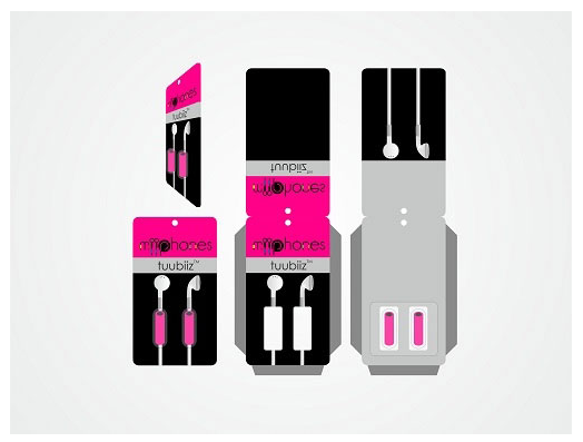
Your corporate identity is nothing without the product your company manufactures, for it’s aimed at standing for its promotion. That’s why, if your sales face some troubles, changing your product’s packaging may be one of the best decisions you can go for. The way your product looks is essential for your clients’ choice: we cannot resist the temptation of buying something beautiful and creative the same way butterflies that fly towards fire. For instance, MiiPhonesTM, the company that deals with producing earphones, has changed its products’ design significantly by fitting it into a completely new packaging thanks to DesignContest. Loud, neon and daring: it’s aimed at youth and those who aren’t afraid of experimenting and doing crazy things. Those, who correspond with this description, will most likely choose this product if spot it on the shelves: the packaging lures and seduces. It’s hard to believe that the company paid less than $299 for this creative packaging design: it looks much more expensive.
Therefore, even with a limited budget your rebranding campaign can be extremely successful: all you need is to pick one element that needs to be upgraded and turn it into something breathtaking and memorable. These components are different in various cases. To your mind, which element of a corporate identity is the most significant one? Which one should people change first and foremost to get the best results imaginable?


