When ‘less is more’ in web design, it is easy to slip and slide into being dubbed as ‘boring’. That’s not what you want to be known for.  Minimalist website design has made some noise in the past years, and it looks like it’s here to stay. Without further ado, this article will provide you with the 4 ultimate tips and hacks to help you make the most of minimalist design and keep your webpages entertaining for all.
A little bit of history
The design movement begain in Switzerland decades ago  and has been applied to a variety of fields: graphic design, architecture, music, literature, painting and of course web design.
Minimalist design is about going back to the basics, stripping content of unecessary elements, and clutter to make the content the stand out and  bring the mind to concentrate on the most important information.
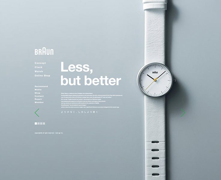
Here is an example of minimalism in webdesign:
As a followup example (and if you’re still lost as to what minimalism is), here is an image for you:
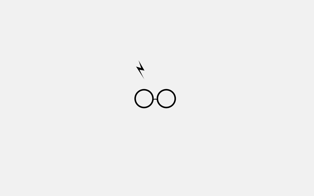
Because who doesn’t love Harry Potter!
Let’s get back to business. If you decide to go with minimalist aesthetics, it’s easy to go down the ‘boring’ route. Although simple does not always mean boring, we feel it essential to give you a few  insights as to how you can keep your minimalist webdesign fun and exciting.
Tips and Tricks with Minimalism in Webdesign
1. Movements and animations
Keep it simple, but add movements and animations to your webpage. Visit this website, to see it in action.
Adding movements makes your page more versatile. If you want elements on your website to move or to have an animation you would use Macromedia or Adobe flash. However, today we have better alternatives such as JavaScript, Ajax, jQuery and the like. They will help you take your website from boring to fun and exciting.
In fact, adding any movement is guaranteed to catch the attention of your audience. It could be as simple as a slider or as complex as illustrations coming to life, but any movement makes a webpage more interesting. This is the stuff that will get people to come back to your site and share it with others.
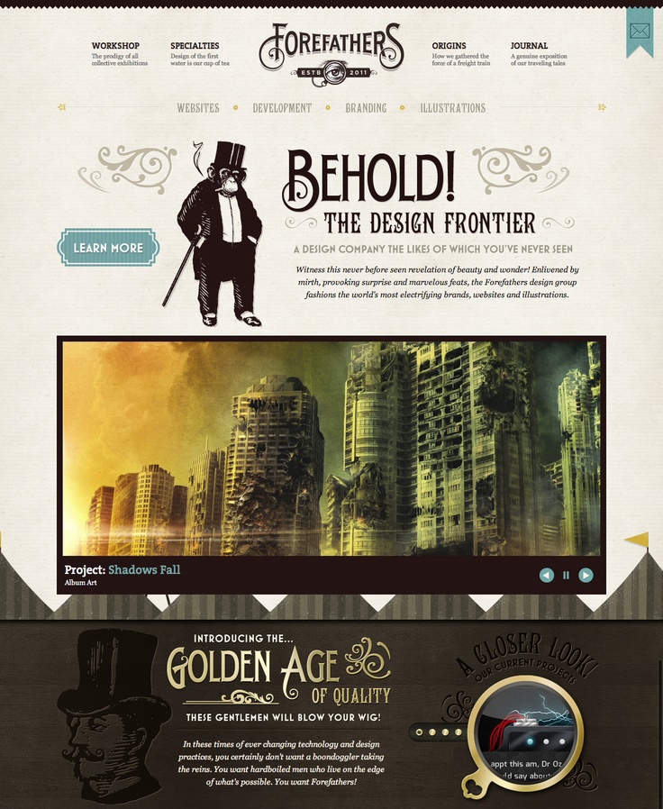
2. Pay Attention to Detail
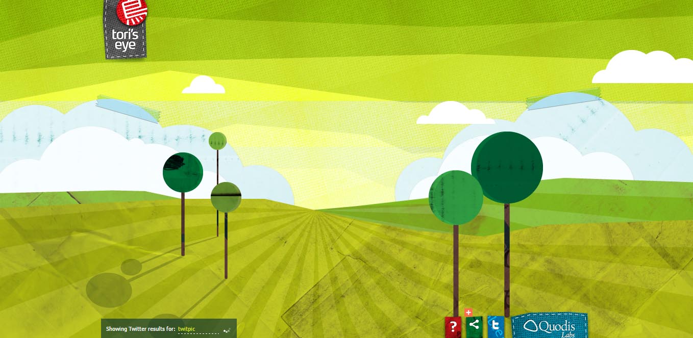
Although arguably, minimalist webdesign has minimal details, it is important to keep these things in mind. Composition being one of them. It can take your design from plain to amazing. Here is an example:
Playing with symmetry and asymetry, white and black space can make all the difference in making that webpage of yours more aesthetically pleasing. You may create a design that you feel needs that extra edginess, but in reality the answer might just be hidden in the details. Make subtle textures and patterns. Use borders and/or white space to different elements. Also, paying attention to typography is key.
Paying attention to detail also means youre paying attention to the bigger picture. Details result in better user experience because you’re concentrated on what and where the user is looking.
Have a keen eye on your graphics, coding and overal design decission making. Your website must fulfill it’s ultimate purpose, so unecessary textures and details that serve as decoration are out of the question. Be thorough.
3. Add videos to your minimalist page
Engaging your viewers with videos is the alternative to animations. It is a better way of getting your audience’s attention as it is much more revealing than sliding images. A video has a direct purpose and adresses a particular topic that could complement your website.
People like to watch videos. Period. We all like stories and something we can relate to. YouTube is the #1 place to go to, and will also help your search engline optimization. If you create a video for your website and upload it on YouTube, your company gets more exposure.
Including a video can help you deliver your message, or contribute to the basic information. You may choose to embed videos in your conentwhich will help you focus on the content.
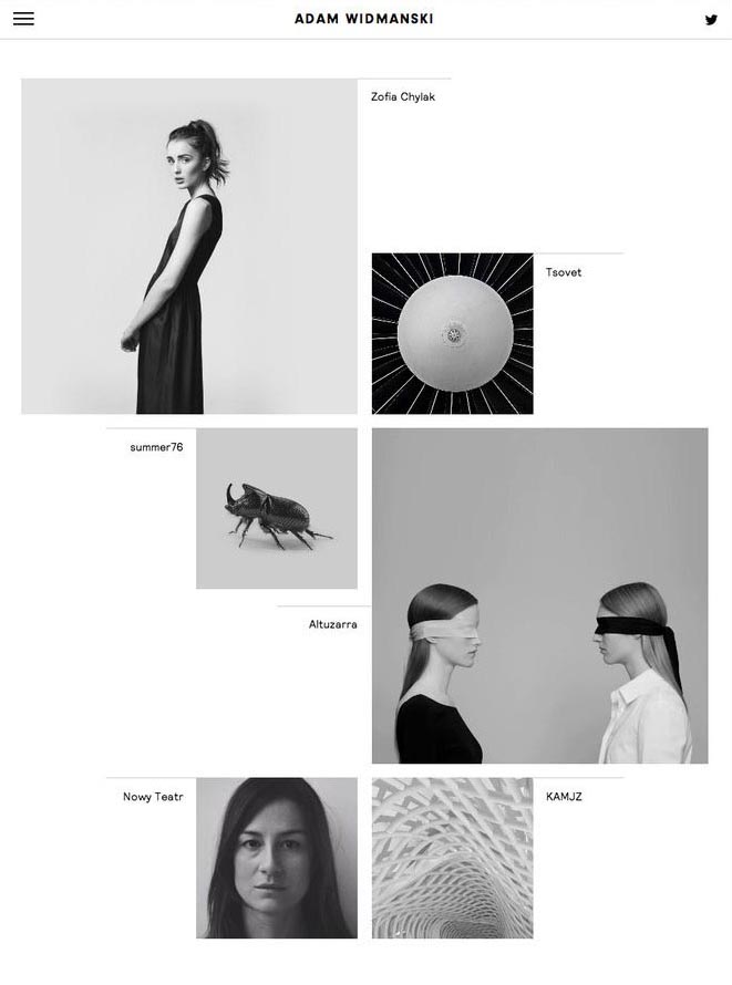
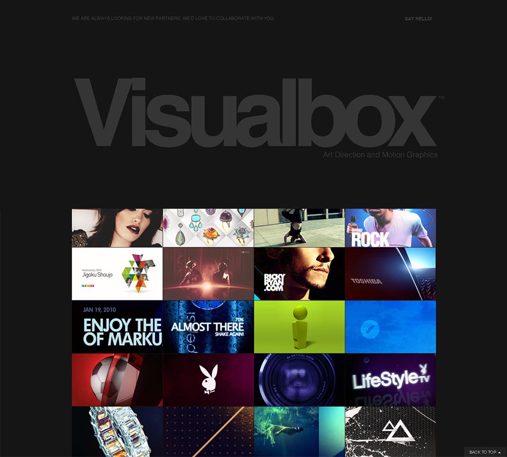
4. Go Bold
With both your typography and your images. See example below.
The trend used to be smaller fonts, Verdana or Arial. Today it is not the case, as often times we are greeted by huge headlines and subtitles on websites. Your website must have a purpose, and if one cannot understand by giving it a single glance, than your minimalist website design was created in vain. If your fonts are overly decorative and small to the point where users can’t read it, youve also failed.
It is much more difficult to forget a webpage that is made up of large, bright and bold images with large text to accompany it. Visit some minimalist webpages for inspiration, and you will see that the ones that resonate with you will be the ones that implement this tip.
Using images will also help you direct the eyes of your audience. Visual contest tells us where to look, and contrasting and bright colors do the same. If you can surprise your audience with a single image that they will rememember time and time again, then you have exceeded all expectations and outdone yourself.
We sincerely hope these 4 easy tips and hacks will aid you in your future creations. Minimalism in webdesign is a powerful tool, but certainly not one to be lazy with. There is a very, very thin line between being minimalistic and just plain boring. Keep our advice in mind, and we’ll guarantee results.