
![RGB vs CMYK [Infographics]](https://dc-prod-blog.sfo2.digitaloceanspaces.com/uploads/2015/10/featuredimage.jpg)
When it comes to design, you can’t mess with your color modes.
Often times designers and clients alike, get confused about color modes for print and web specifications of their images. There are many color modes available, but the most commonly used ones are RGB and CMYK. Yes, we all wince looking at these letters because most of us don’t know the difference. Just admit it 🙂
Do you know what’s more upsetting than not knowing what the difference is? Reprinting your designs 60 times to get those colors just right. You can alternate between the RGB and CMYK color modes and adjust the colors of your designs (in utter frustration), or you can sit down and settle this issue once and for all.
To eliminate all the confusion, misunderstandings and miscommunication, we have created the following infographics to really set things straight. Don’t let color modes interfere with your amazing designs!
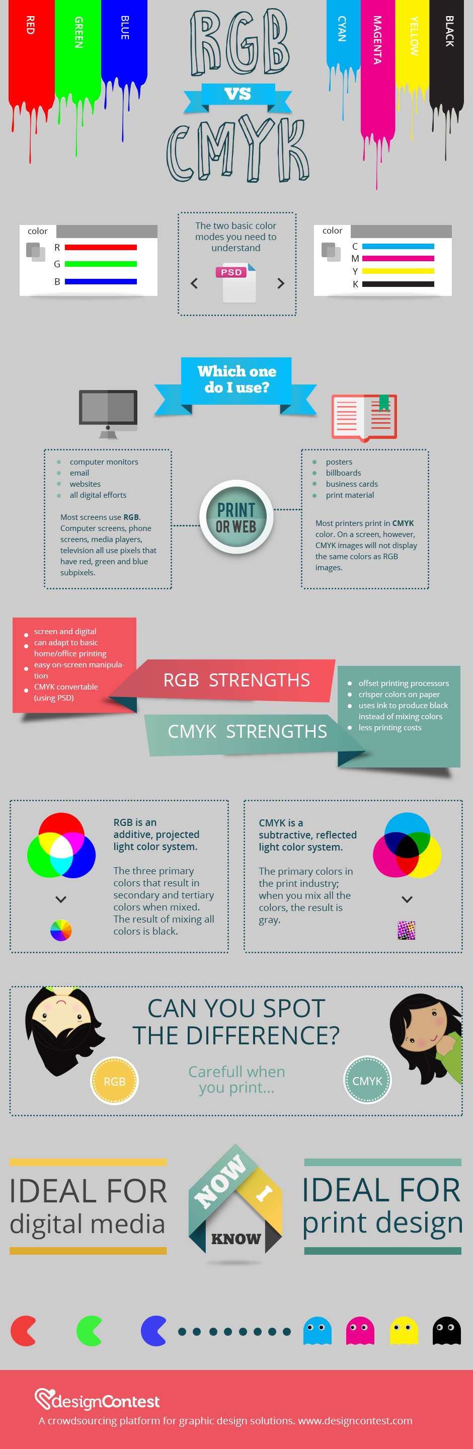
As you can see, the difference is rather simple (but also complex). RGB color mode uses light to mix colors on screen whereas CMYK uses ink to mix colors on paper. RGB color mode, undoubtedly has more color output options
You can always convert your RGB files into CMYK color mode for printed documents. If you are using Photoshop, it is as simple asMenu> Image> Mode> CMYK (don’t forget to select 300 dpi resolution). Additionally, printers WILL accept RGB files, but they will do the conversion themselves and this will result in some very, very disappointing results of inaccurate colors.Â
What is the verdict?
Choosing between RGB and CMYK depends on your output. CMYK conversion reduces the data contained in your original RGB image. The data that is not saved will be forever lost; in order to retain as much data as possible, do your color conversions in the final resterization process before you print. Â Always keep in mind that these two color modes will not display the same way on screen.


