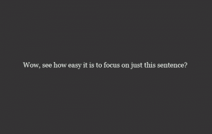
 We know we’re sticklers about it, but one of the things we like to emphasize most is the use of white space in design. I mean, it’s not just the white stuff we like: We’re pretty much suckers for anything minimalistic. Thankfully, one leads to the other, making our job (and this discussion) easier.
No matter who you are, what kind of project you’re working on, or who the client is, it’s important you understand the value of white space. It’s an incredibly effective way to spice up a design, and might just be the solution to your layout headaches. With that in mind, here’s reason number one to love white space:
- With Ample White Space, Classiness Is A Guarantee: If you’re using white space effectively, there’s absolutely no way your design will be anything but sleek and professional. Why is this? Well, there’s a number of reasons, but (believe it or not) they all tie into minimalism—you’re shocked, we know. Essentially, if your white space is beneficial to the design, the important elements will naturally be emphasized, while the negative space will be appropriately backgrounded. This isn’t a complicated thought. In fact, it’s completely organic. so when dealing with white space, don’t worry about making the blank zones look classy, but rather just congruent with the overall design.
- While We’re Talking About It . . . : On the subject of emphasizing designs, white space is a bloody fantastic way to single out an element in the visual hierarchy. For example, if you have a large Twitter icon that you want distinguished from everything around it, throw in some ample white space in every direction south, west, east, and north of the icon. Instantly, that section will be higher in the visual hierarchy because it forms an oasis in the overall design. It guides the eye, and keeps the viewer locked in.
- Blow-Up Your Designs: Seriously, white space is just about the best thing you can do for you layout, especially if you’re in a rut. Play around with your elements and adjust them to change the pools of negatives space available. You’d be surprised what readjusting to compensate for overcrowding can do. If you’re having a lot of trouble finishing a layout, consider removing items to increase overall emphasis. Or move every design bit to the perimeter, freeing up the middle for further exploration. There’s literally no end to the possibilities, so get out there and create, Pilgrim! The web layout is your (white space) oyster.


