What is it that makes a brand choose the color purple to portray its identity? It is a popular choice, no doubt, but like every shade in the rainbow, it has to mean something to someone, somewhere.
Spiritually, the color purple signifies a higher, more evolved state. However, physically back down here on terra firma, it signifies qualities such as royalty, intrigue, and sensuality. Purple and gold are well-known royal colors and other color combos can also be very striking. Combining purple with its complementary color yellow is a great way to catch the eye. Yellow-adjacent colors also give branding a visual pop such as orange or green.
In addition to playing well with other colors, purple balances the yin and yang. It’s neither too feminine nor too masculine. Thinking about the color wheel, the hues red and blue mixed together create purple. Like-wise, if we combine the symbolism of the two colors, red is vibrant and racy, while blue is cool and calm (see 40 beautiful blue logos). The result exudes class and power.
This is one of the many reasons we see new tech and engineering companies skipping blue tones and taking on purples to convey their softer sides. Consumer brands and services logos that also turned to purple for their branding. Think of: FedEx, Hallmark, Cadbury, and Yahoo. You name it, they’ve used it!
The main takeaway is that purple is versatile and easy to love which is why some of the most interesting brands in the world have adopted the color and made it their own.
Let’s see how they’ve gone about it by exploring a mix of both fresh and established brands.
1. .xyz
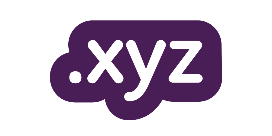
.xyz and its powerful purple logo stands for the new order of global domains post the dot com, dot net, and dot org eras. It literally has the last say in the alphabet and is synonymous with simplicity: “as easy as X-Y-Z!” This logo encapsulates both the technical aspect of the internet as well as an all-inclusive world-view with its friendly font selection. Traditionally, blues and grays have represented tech brands but by using purple, the .xyz brand emphasizes a new age feel with universal appeal.
2. Freaky Clean Bins
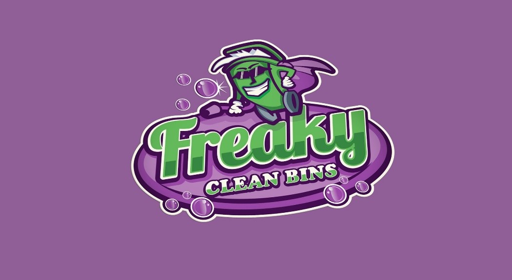
Purple and green reign supreme! We see this complementary color duo here in this fun trash can caricature. The bright green bubbles and frills is a fresh take on the classic recycling color. Had this hue been matched with any other color aside from purple, the impact would have fallen flat. Here we see purple acting as a solid background supporter that displays the name, mascot and other green and white elements really well. It’s eye-catching and delicious and puts a fun spin on the subject matter.
3. Zebulon Solutions
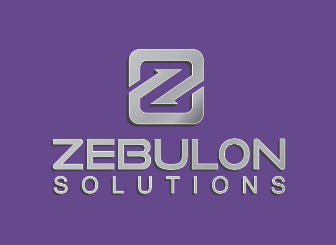
In Zebulon, we see an engineering company refreshing its image with a new logo. Not only have they used the color purple but they have claimed this shade as “Zebulon purple”! The company wished to hold on to its industrial roots with metallic lettering but the true essence of the makeover lies in ‘Zebulon purple” and all it brings to this brand. They say the new logo looks bold and clean. Well, the clean may be from the metallic lines but the boldness is all thanks to the purple.
4. Yahoo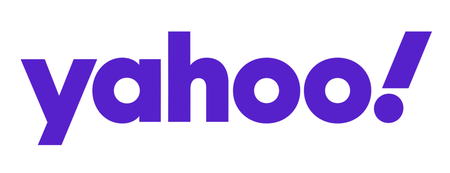
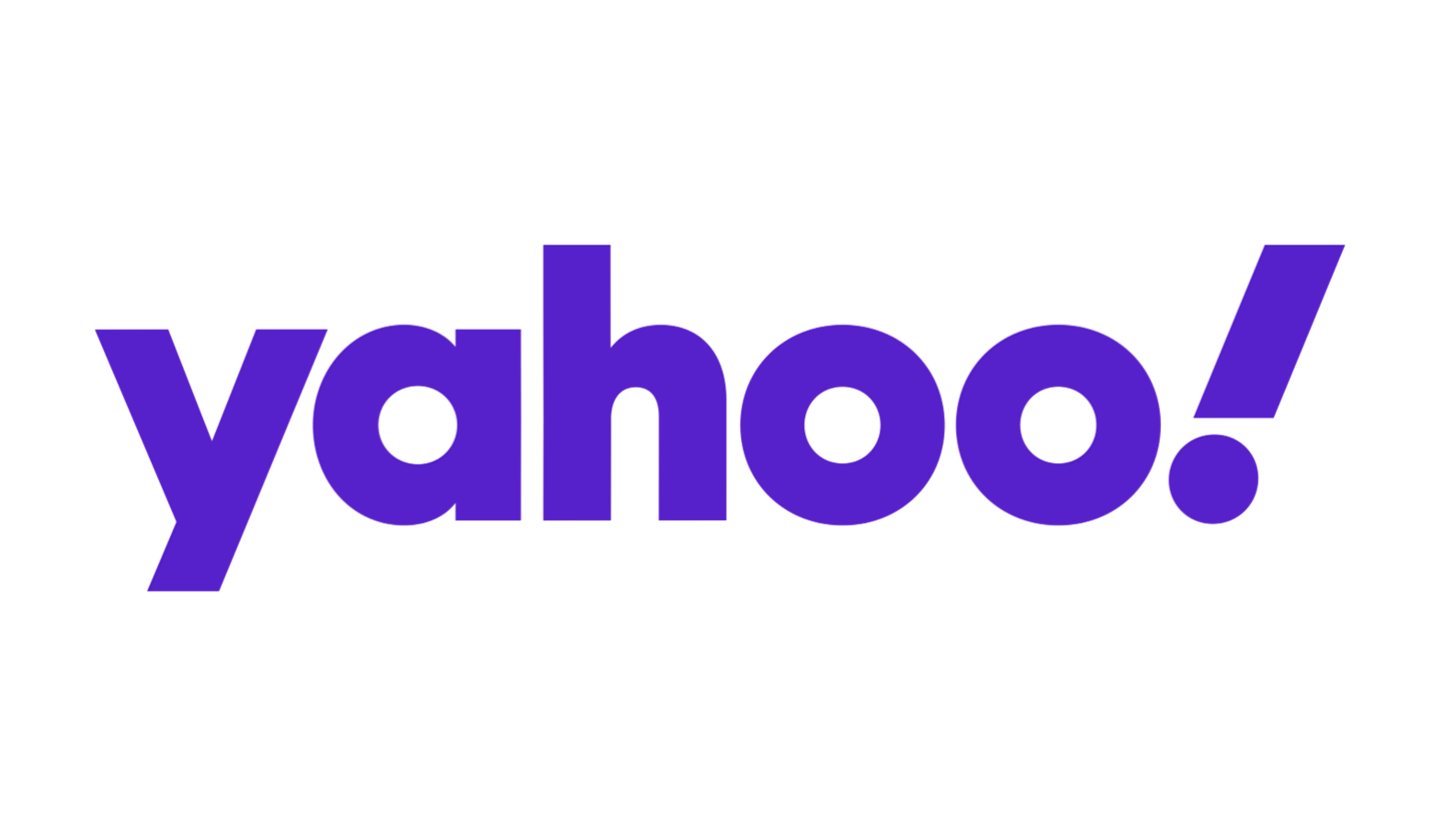
Yahoo has always been known for their purple color palette. Through all of their logo iterations it has been the purple that stood the test of time. If it works, why change it? But why does the quintessential Yahoo.com purple logo continue to live on and on? Here’s why! The purple in Y! spells fun and innovation. It is enjoyable to learn new things! Yahoo! Like a Eureka moment each time you find what you’re looking for. Purple also gives the brand an authoritative standing amongst its rivals. Again, we see its royal implications. But best of all, the Yahoo logo works in purple because it’s bright and playful while maintaining the seriousness of a leading search engine.
5. Allure
No ode to purple would be complete without giving it some credit for its attractive qualities. Hence, the logo for Allure Beauty & Aesthetics that specializes in beauty treatment for men AND women. This is a clear example of a visual metaphor for the balancing properties of purple. In this interpretation, the purple soothes and comforts while the font is artistic. It’s an ideal color not only for the logo but their entire brand. We like to think that while clients are enjoying their treatments, a nice therapeutic shade of purple makes it all a little bit better.
6. Titans Sports Academy
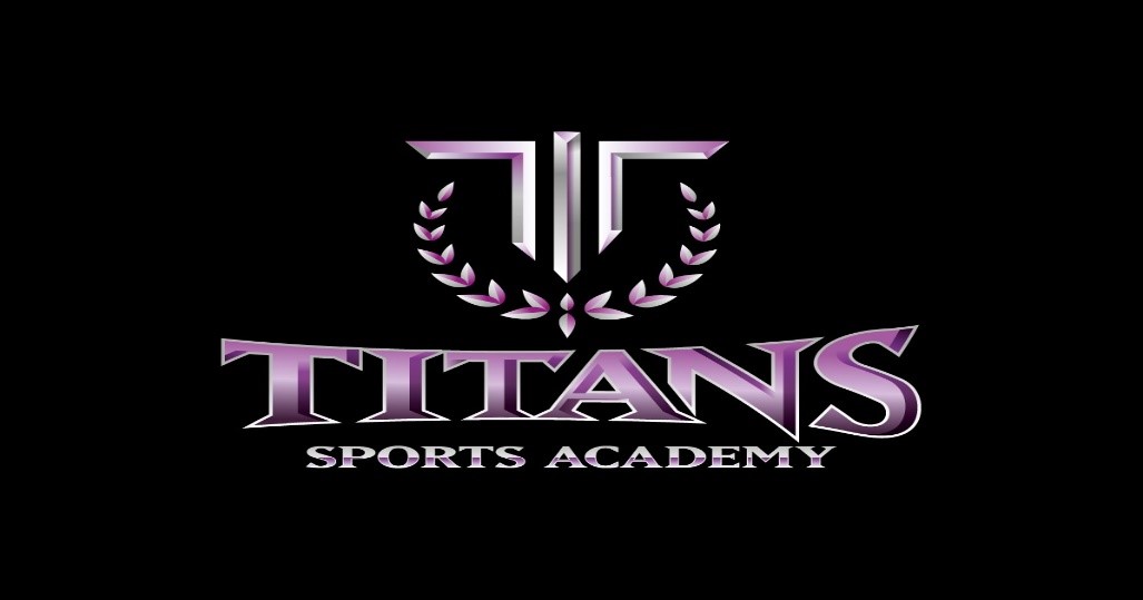
This unbeatable combination of purple and black shines through in all its glory. This logo is for a sports academy with a winning streak. Titan is undoubtedly a word made for such a powerful color and the metallic grey shading highlights a stately 3D effect. Power and strength are clear descriptors of this purple logo design.
7. EdQu
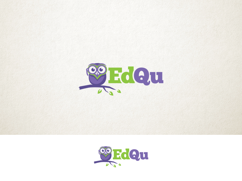
EdQu is a Swedish Education Tech company that uses a purple and green duo in a simple understated manner. Compared to all the earlier logos, this one is subtle and sweet. It shows the versatility of the color purple and how it can be utilized in a variety of ways such as child-like wisdom represented with an owl on a branch. This design uses purple to highlight education in a friendly and welcoming manner.
8. Cognitive Information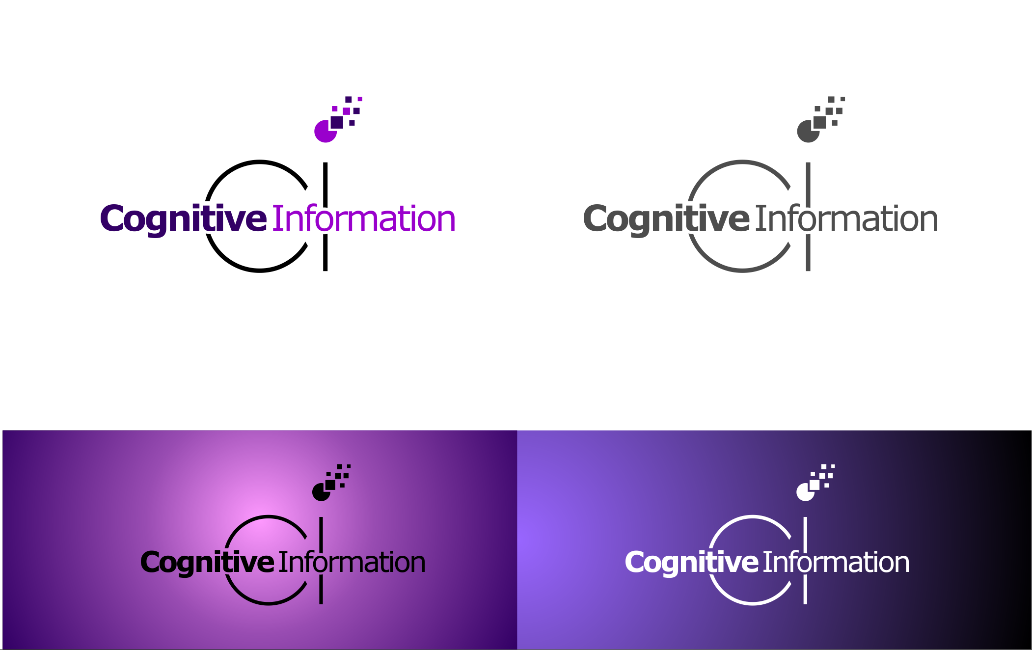
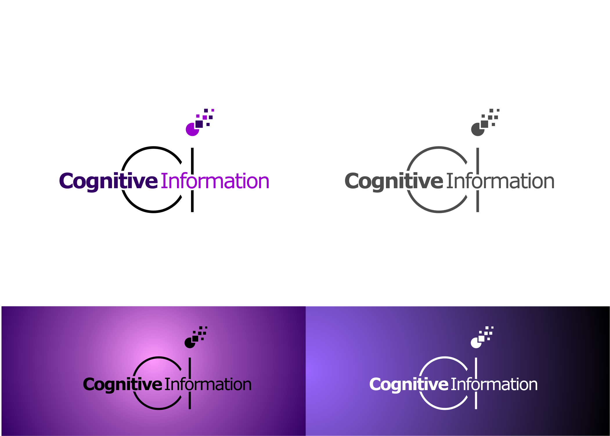
This winning logo for this Business Intelligence Consultation Enterprise uses shades of purple to depict technical excellence without being stark or grim. That’s the power of purple in this one especially when it plays with the light and the dark. The logos on top are sharp, distinct and straight-forward, without being harsh. And again, they stand for new age technology that’s intelligent and people-friendly.
9. Wisteria Farms
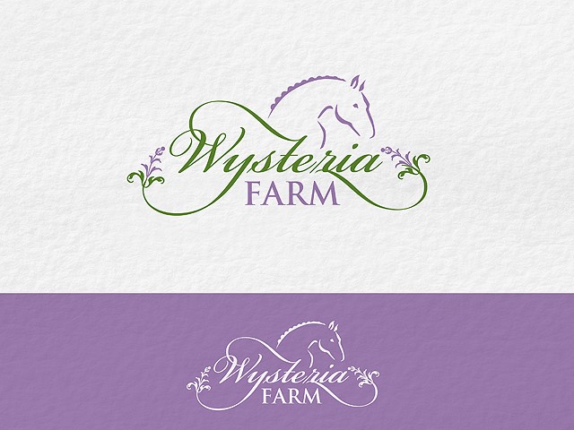
This charming logo for a horse breeding farm truly captures the graceful elegance of the subject matter by featuring wistful Wysteria. Purple plays the main role in its refined depiction while the flowing font and simple lines fulfill the client’s brief perfectly. The classic green and purple pairing is a very fresh design and shows the power of drawing color inspiration from key brand elements.
10. Kabloom

A florist company needed its creative, flowery side depicted in a logo that’s funky. Clearly purple hits the mark! The beauty of a blooming lotus-like flower is well integrated with the brand name, cleverly using two letters to represent the leaves. This is a great example of using shades from the same color family, such as purple and magenta. The shaded petals and gradient purple lettering make this an explosive logo design!
11. Cadbury
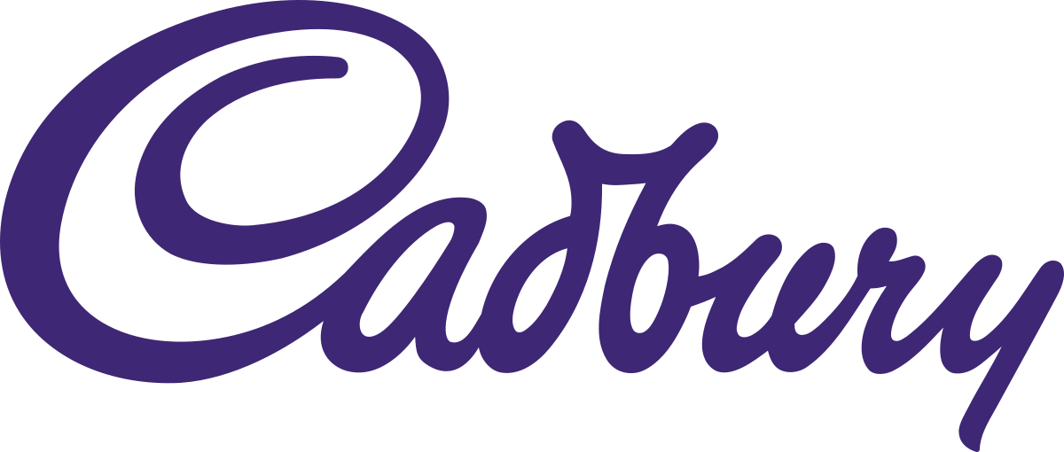
World famous melt-in-the-mouth Cadbury makes sure to use purple to tempt, tease and exude a feeling of richness. Isn’t that what good chocolate is all about? The luxury and richness of indulgence? No other color would suit Cadbury’s purpose which is why the brand has stuck to it over the years. In fact, most Cadbury products are wrapped in the lavish purple color and can be spotted a mile away. This is one major purple logo success story!
12. Asprey

This regal logo belongs to London-based Asprey, an elite emporium that supplies crowns and scepters among many items to a royal clientele. It means business and does it well. The purpose of purple in this one revolves around imperial grandiose and being a class apart. It has a dark sophisticated purple shade that makes it even more distinguished and proper.
13. Phoenix Fury Roller Girls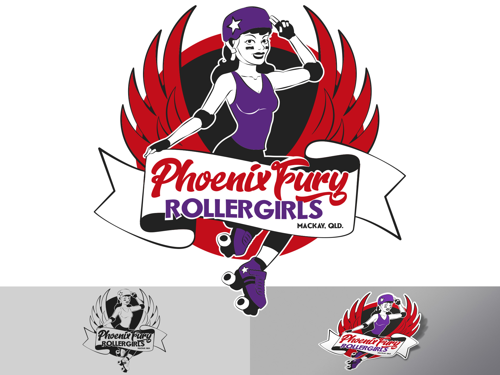
Though not entirely purple, this logo combines red and purple, another powerful teaming. The purple highlights the woman while the red surrounds her in the form of red phoenix wings. Her attire, safety pads and roller blades are all purple to really show her winning, unbeatable personality. Phoenix Fury is a 100% female roller derby league created in honor of women. They chose a logo that uses purple quite cleverly.
14. Monster
Another powerful purple logo belongs to Monster (not to be confused with .Monster), the online job portal giving employment opportunities to thousands of people across the world each month. This industry leader has been using purple in its logo to create a brand recall since its inception. Fonts have come and gone but the purple remains strong. Though the lettering is simple and clean, its the purple that gives it life, magnitude and potential.
15. Wizz

Wizz is a Hungarian aviation company that uses two shades of purple for their logo that they claim stands for the luxury that they offer their clients. The mix of the two colors and the unexpected exclamation mark in the middle of the word creates a joyful, speedy kind of excitement. Here, purple signifies a luxurious type of fun that takes care of you at any height. It also portrays a regal air that makes their clientele feel extra special.
16. Syfy
Syfy is the clever abbreviation that stands for sci-fi in the digital age and on our television screens. This logo’s purple depicts an enigmatic sensuality that their audiences like. Simple, with a bulky font, this logo is more than what meets the eye. But it’s the purple that stands out for its attractiveness and boldness at the end of the day.
17. Zoopla
Zoopla is another striking purple logo. They are a property search website that distinguishes itself as a leading search tool. Their ambition is clear with the combination of bright purple and a customized, quirky font. The name Zoopla equals fun and frolic buts the purple that grounds it shows it as a serious player. Its bold and its powerful because it is purple.
Conclusion
As seen in the above examples, purple has been used by both established and fresh brands, each with their own twist on this popular color. We’ve seen it paired with blacks, greys, reds, metallics or greens and they all look good! The attachment to purple is clear when brands take time to name a shade or never stray to another color no matter what the trend.
Purple caters to a myriad of generations and emotions that span across regal, sensual, beautiful, and bold. Every brand that has ever used purple aspires for something powerful. That’s the true essence of the color purple in the world of marketing.
Is it time for you to try a purple logo? Start your Purple Logo Design!